


 本文介绍两种在H5页面中实现加载动画的方法,一种通过元素的缩放变化,另一种利用透明度变化,以实现视觉上的旋转加载效果。
场景:在H5页面发送请求或者是其他需要反馈操作的时候,出来的加载效果。之前使用的时候图片,但是在适配的时候,图片的效果比较差,所以就手动写了两种效果。
第一种
代码
<!DOCTYPE html>
<html lang="en">
<head>
	<meta charset="UTF-8">
	<title>Dot1</title>
	<style type="text/css">
		* {
			margin: 0;
			padding: 0
		}
		body {
			margin: 0;
			height: 100vh;
			display: flex;
			align-items: center;
			justify-content: center;
			background-color: #EEE;
		}
		.box {
			width: 4em;
			height: 4em;
			position: relative;
			margin: auto;
		}

		.box .dots {
			width: 100%;
			height: 100%;
			position: absolute;
			left: 0;
			top: 0;
		}

		.box .dots:before {
			content: '';
			display: block;
			margin: 0 auto;
			width: 15%;
			height: 15%;
			background-color: #00BFFF;
			border-radius: 50%;
			animation: animate 1.2s infinite ease-in-out both;
		}

		.box .childDots2 {
			transform: rotate(30deg);
		}

		.box .childDots3 {
			transform: rotate(60deg);
		}

		.box .childDots4 {
			transform: rotate(90deg);
		}

		.box .childDots5 {
			transform: rotate(120deg);
		}

		.box .childDots6 {
			transform: rotate(150deg);
		}

		.box .childDots7 {
			transform: rotate(180deg);
		}

		.box .childDots8 {
			transform: rotate(210deg);
		}

		.box .childDots9 {
			transform: rotate(240deg);
		}

		.box .childDots10 {
			transform: rotate(270deg);
		}

		.box .childDots11 {
			transform: rotate(300deg);
		}

		.box .childDots12 {
			transform: rotate(330deg);
		}

		.box .childDots2:before {
			animation-delay: -1.1s;
		}

		.box .childDots3:before {
			animation-delay: -1s;
		}

		.box .childDots4:before {
			animation-delay: -0.9s;
		}

		.box .childDots5:before {
			animation-delay: -0.8s;
		}

		.box .childDots6:before {
			animation-delay: -0.7s;
		}

		.box .childDots7:before {
			animation-delay: -0.6s;
		}

		.box .childDots8:before {
			animation-delay: -0.5s;
		}

		.box .childDots9:before {
			animation-delay: -0.4s;
		}

		.box .childDots10:before {
			animation-delay: -0.3s;
		}

		.box .childDots11:before {
			animation-delay: -0.2s;
		}

		.box .childDots12:before {
			animation-delay: -0.1s;
		}

		@-webkit-keyframes animate {

			0%,
			80%,
			100% {
				transform: scale(0);
			}

			40% {
				transform: scale(1);
			}
		}

		@keyframes animate {

			0%,
			80%,
			100% {
				transform: scale(0);
			}

			40% {
				transform: scale(1);
			}
		}
	</style>
</head>
<body>
	<div class='box'>
		<div class='dots childDots1'></div>
		<div class='dots childDots2'></div>
		<div class='dots childDots3'></div>
		<div class='dots childDots4'></div>
		<div class='dots childDots5'></div>
		<div class='dots childDots6'></div>
		<div class='dots childDots7'></div>
		<div class='dots childDots8'></div>
		<div class='dots childDots9'></div>
		<div class='dots childDots10'></div>
		<div class='dots childDots11'></div>
		<div class='dots childDots12'></div>
	</div>
</body>
</html>
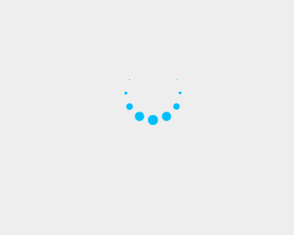
效果
第二种
代码
<!DOCTYPE html>
<html lang="en">
<head>
	<meta charset="UTF-8">
	<title>Dot2</title>
	<style type="text/css">
		* {
			margin: 0;
			padding: 0
		}
		body {
			margin: 0;
			height: 100vh;
			display: flex;
			align-items: center;
			justify-content: center;
			background-color: #EEE;
		}
		.box {
			position: relative;
			margin: auto;
			width: 4em;
			height: 4em;
		}

		.box .dots {
			position: absolute;
			left: 0;
			top: 0;
			width: 100%;
			height: 100%;
		}

		.box .dots:before {
			content: '';
			display: block;
			margin: 0 auto;
			width: 15%;
			height: 15%;
			background-color: #00BFFF;
			border-radius: 50%;
			animation: animate 1.2s infinite ease-in-out both;
		}

		.box .childDots2 {
			transform: rotate(30deg);
		}

		.box .childDots3 {
			transform: rotate(60deg);
		}

		.box .childDots4 {
			transform: rotate(90deg);
		}

		.box .childDots5 {
			transform: rotate(120deg);
		}

		.box .childDots6 {
			transform: rotate(150deg);
		}

		.box .childDots7 {
			transform: rotate(180deg);
		}

		.box .childDots8 {
			transform: rotate(210deg);
		}

		.box .childDots9 {
			transform: rotate(240deg);
		}

		.box .childDots10 {
			transform: rotate(270deg);
		}

		.box .childDots11 {
			transform: rotate(300deg);
		}

		.box .childDots12 {
			transform: rotate(330deg);
		}

		.box .childDots2:before {
			animation-delay: -1.1s;
		}

		.box .childDots3:before {
			animation-delay: -1s;
		}

		.box .childDots4:before {
			animation-delay: -0.9s;
		}

		.box .childDots5:before {
			animation-delay: -0.8s;
		}

		.box .childDots6:before {
			animation-delay: -0.7s;
		}

		.box .childDots7:before {
			animation-delay: -0.6s;
		}

		.box .childDots8:before {
			animation-delay: -0.5s;
		}

		.box .childDots9:before {
			animation-delay: -0.4s;
		}

		.box .childDots10:before {
			animation-delay: -0.3s;
		}

		.box .childDots11:before {
			animation-delay: -0.2s;
		}

		.box .childDots12:before {
			animation-delay: -0.1s;
		}

		@-webkit-keyframes animate {

			0%,
			39%,
			100% {
				opacity: 0;
			}

			40% {
				opacity: 1;
			}
		}

		@keyframes animate {

			0%,
			39%,
			100% {
				opacity: 0;
			}

			40% {
				opacity: 1;
			}
		}
	</style>
</head>
<body>
	<div class='box'>
		<div class='dots childDots1'></div>
		<div class='dots childDots2'></div>
		<div class='dots childDots3'></div>
		<div class='dots childDots4'></div>
		<div class='dots childDots5'></div>
		<div class='dots childDots6'></div>
		<div class='dots childDots7'></div>
		<div class='dots childDots8'></div>
		<div class='dots childDots9'></div>
		<div class='dots childDots10'></div>
		<div class='dots childDots11'></div>
		<div class='dots childDots12'></div>
	</div>
</body>
</html>
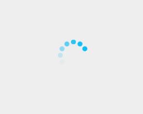
效果
总结
上面两种写法都是比较“蠢”的写法。都是在一开始就把所有的画好,让它们围成一个圆。然后通过改变css 的属性来达到视觉上的旋转加载的效果。第一种是通过放大缩小;第二种是使用透明度。
也可以通过只写几个固定的小圆点,在将大小或者透明度设置好,然后整体旋转Box 这个div来真正的“旋转”。
当然也有更多的写法,这两种就是最简单的把我的思路写出来,没有再去进一步修改。


 扫一扫
扫一扫


 6476
6476

 被折叠的 条评论
为什么被折叠?
被折叠的 条评论
为什么被折叠?
 到【灌水乐园】发言


