import numpy as np
import pandas as pd
import matplotlib
import matplotlib.pyplot as plt
import seaborn as sns
'''
figure(num=None, figsize=None, dpi=None, facecolor=None, edgecolor=None, frameon=True)
num:图像编号或名称,数字为编号 ,字符串为名称
figsize:指定figure的宽和高,单位为英寸;
dpi参数指定绘图对象的分辨率,即每英寸多少个像素,缺省值为80 1英寸等于2.5cm,A4纸是 21*30cm的纸张
facecolor:背景颜色
edgecolor:边框颜色
frameon:是否显示边框
'''
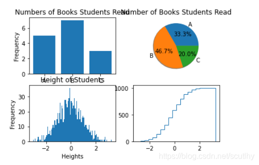
plt.figure(2)#数据
np.random.seed(sum(map(ord,"aesthetics")))
d1 =dict([['A',5],['B',7],['C',3]])
d2 = np.random.randn(1000)#randn 产生的是标准正态分布#条形图
plt.subplot(221)
plt.bar(d1.keys(),d1.values(),align='center')#,alpha=.7,color='g'#plt.bar(range(3),d1.values(),align='center')#plt.xticks(range(3),xticks)
plt.ylabel("Frequency")
plt.title("Numbers of Books Students Read")#饼图
plt.subplot(222)
plt.pie(d1.values(),labels=d1.keys(),autopct='%1.1f%%',shadow=True)
plt.title("Number of Books Students Read")'''
pie(x, explode=None, labels=None,
colors=('b', 'g', 'r', 'c', 'm', 'y', 'k', 'w'),
autopct=None, pctdistance=0.6, shadow=False,
labeldistance=1.1, startangle=None, radius=None,
counterclock=True, wedgeprops=None, textprops=None,
center = (0, 0), frame = False )
参数说明:
x (每一块)的比例,如果sum(x) > 1会使用sum(x)归一化
labels (每一块)饼图外侧显示的说明文字
explode (每一块)离开中心距离
startangle 起始绘制角度,默认图是从x轴正方向逆时针画起,如设定=90则从y轴正方向画起
shadow 是否阴影
labeldistance label绘制位置,相对于半径的比例, 如<1则绘制在饼图内侧
autopct 控制饼图内百分比设置,可以使用format字符串或者format function
'%1.1f'指小数点前后位数(没有用空格补齐)
pctdistance 类似于labeldistance,指定autopct的位置刻度
radius 控制饼图半径
返回值:
如果没有设置autopct,返回(patches, texts)
如果设置autopct,返回(patches, texts, autotexts)
'''#直方图
plt.subplot(223)
plt.hist(d2,100)
plt.xlabel('Heights')
plt.ylabel('Frequency')
plt.title('Height of Students')'''
官方API
https://matplotlib.org/api/_as_gen/matplotlib.pyplot.hist.html#matplotlib.pyplot.hist
matplotlib.pyplot.hist(
x, bins=10, range=None, normed=False,
weights=None, cumulative=False, bottom=None,
histtype=u’bar’, align=u’mid’, orientation=u’vertical’,
rwidth=None, log=False, color=None, label=None, stacked=False,
hold=None, **kwargs)
x : (n,) array or sequence of (n,) arrays
这个参数是指定每个bin(箱子)分布的数据,对应x轴
bins : integer or array_like, optional
这个参数指定bin(箱子)的个数,也就是总共有几条条状图
normed : boolean, optional
If True, the first element of the return tuple will be the counts normalized to form a probability density, i.e.,n/(len(x)`dbin)
这个参数指定密度,也就是每个条状图的占比例比,默认为1
color : color or array_like of colors or None, optional
这个指定条状图的颜色
'''#阶梯曲线/累积分布曲线
plt.subplot(224)
plt.hist(d2,20,normed=True,histtype='step',cumulative=True)
plt.xlabel('Heights')
plt.ylabel('Frequency')
plt.title('Heights of Students')
plt.subplots_adjust(left=0.08,right=0.95,wspace=0.25,hspace=0.45)#图间距
plt.show()'''
histtype{'bar', 'barstacked', 'step', 'stepfilled'}, default: 'bar'
The type of histogram to draw.
'bar' is a traditional bar-type histogram. If multiple data are given the bars are arranged side by side.
'barstacked' is a bar-type histogram where multiple data are stacked on top of each other.
'step' generates a lineplot that is by default unfilled.
'stepfilled' generates a lineplot that is by default filled.
'''


 本文深入探讨Python数据可视化,讲解如何使用matplotlib库创建条形图、饼图、直方图和阶梯图。通过实例代码展示各类图表的绘制过程,帮助读者理解数据的可视化表达。


 5021
5021

 被折叠的 条评论
为什么被折叠?
被折叠的 条评论
为什么被折叠?
 到【灌水乐园】发言


