


原文链接
下面我们开始今天的文章,还是老规矩,通过如下几点来说:
1,简介
2,用到的属性
3,实战
简介
Switch是一个可以在两种状态切换的开关控件。只有开关两种状态。
一般引用在手机应用的设置界面 做一些开关操作,或者某一个功能的开关操作。
用到的属性
Switch的共有XML属性还是继承自:Text
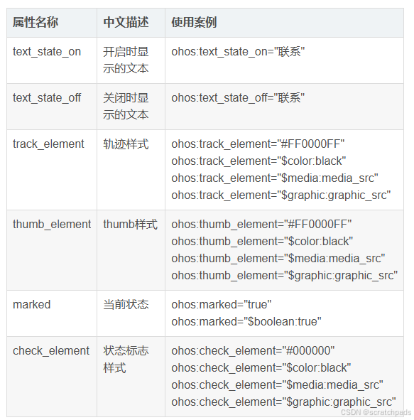
属性中 有两个比较重要 :
text_state_on // 开启显示的文本
text_state_off //关闭显示的文本
实战
先来创建一个基本的开关试试把。
1,开关默认效果
<Switch
    ohos:id="$+id:switch_opt"
    ohos:height="match_content"
    ohos:width="match_content"
    ohos:text_state_off="关闭"
    ohos:text_state_on="开启"
    ohos:padding="5vp"
    ohos:text_size="16fp"
    />
1,默认效果 添加了 几个属性,开启和关闭文字,字体大小
查看一下效果:

2,设置背景样式
ShapeElement elementThumbOn = new ShapeElement();
elementThumbOn.setShape(ShapeElement.OVAL);
elementThumbOn.setRgbColor(RgbColor.fromArgbInt(0xFF1E90FF));
elementThumbOn.setCornerRadius(50);
1,设置背景演示和圆角
3,设置背景状态
// 滑块样式的设置
private StateElement trackElementInit(ShapeElement on, ShapeElement off){
    StateElement trackElement = new StateElement();
    trackElement.addState(new int[]{ComponentState.COMPONENT_STATE_CHECKED}, on);
    trackElement.addState(new int[]{ComponentState.COMPONENT_STATE_EMPTY}, off);
    return trackElement;
}
1. 设置状态,状态是两种背景样式设置的切换
完整代码:
<?xml version="1.0" encoding="utf-8"?>
<DirectionalLayout
    xmlns:ohos="http://schemas.huawei.com/res/ohos"
    ohos:height="match_parent"
    ohos:width="match_parent"
    ohos:alignment="center"
    ohos:orientation="vertical">

    <Switch
        ohos:id="$+id:switch_opt"
        ohos:height="match_content"
        ohos:width="match_content"
        ohos:text_state_off="关闭"
        ohos:text_state_on="开启"
        ohos:padding="5vp"
        ohos:text_size="16fp"
        />

</DirectionalLayout>
代码逻辑:
package com.example.aswitch.slice;

import com.example.aswitch.ResourceTable;
import ohos.aafwk.ability.AbilitySlice;
import ohos.aafwk.content.Intent;
import ohos.agp.colors.RgbColor;
import ohos.agp.components.ComponentState;
import ohos.agp.components.Switch;
import ohos.agp.components.element.ShapeElement;
import ohos.agp.components.element.StateElement;

public class MainAbilitySlice extends AbilitySlice {
    @Override
    public void onStart(Intent intent) {
        super.onStart(intent);
        super.setUIContent(ResourceTable.Layout_ability_main);

        // 开启状态下滑块的样式
        ShapeElement elementThumbOn = new ShapeElement();
        elementThumbOn.setShape(ShapeElement.OVAL);
        elementThumbOn.setRgbColor(RgbColor.fromArgbInt(0xFF1E90FF));
        elementThumbOn.setCornerRadius(50);

        // 关闭状态下滑块的样式
        ShapeElement elementThumbOff = new ShapeElement();
        elementThumbOff.setShape(ShapeElement.OVAL);
        elementThumbOff.setRgbColor(RgbColor.fromArgbInt(0xFFFFFFFF));
        elementThumbOff.setCornerRadius(50);

        // 开启状态下轨迹样式
        ShapeElement elementTrackOn = new ShapeElement();
        elementTrackOn.setShape(ShapeElement.RECTANGLE);
        elementTrackOn.setRgbColor(RgbColor.fromArgbInt(0xFF87CEFA));
        elementTrackOn.setCornerRadius(50);

        // 关闭状态下轨迹样式
        ShapeElement elementTrackOff = new ShapeElement();
        elementTrackOff.setShape(ShapeElement.RECTANGLE);
        elementTrackOff.setRgbColor(RgbColor.fromArgbInt(0xFF808080));
        elementTrackOff.setCornerRadius(50);


        // 设置切换属性
        Switch btnSwitch = (Switch) findComponentById(ResourceTable.Id_switch_opt);
        btnSwitch.setTrackElement(trackElementInit(elementTrackOn, elementTrackOff));
        btnSwitch.setThumbElement(thumbElementInit(elementThumbOn, elementThumbOff));
    }

    // 滑块样式的设置
    private StateElement trackElementInit(ShapeElement on, ShapeElement off){
        StateElement trackElement = new StateElement();
        trackElement.addState(new int[]{ComponentState.COMPONENT_STATE_CHECKED}, on);
        trackElement.addState(new int[]{ComponentState.COMPONENT_STATE_EMPTY}, off);
        return trackElement;
    }
    // 轨迹样式的设置
    private StateElement thumbElementInit(ShapeElement on, ShapeElement off) {
        StateElement thumbElement = new StateElement();
        thumbElement.addState(new int[]{ComponentState.COMPONENT_STATE_CHECKED}, on);
        thumbElement.addState(new int[]{ComponentState.COMPONENT_STATE_EMPTY}, off);
        return thumbElement;
    }

    @Override
    public void onActive() {
        super.onActive();
    }

    @Override
    public void onForeground(Intent intent) {
        super.onForeground(intent);
    }
}
源码:
Switch : https://gitee.com/codegrowth/haomony-develop/tree/master/Switch
————————————————
版权声明:本文为博主原创文章,遵循 CC 4.0 BY-SA 版权协议,转载请附上原文出处链接和本声明。
原文链接:https://blog.youkuaiyun.com/jianpengxuexikaifa/article/details/118399361


 扫一扫
扫一扫


 3480
3480

 被折叠的 条评论
为什么被折叠?
被折叠的 条评论
为什么被折叠?
 到【灌水乐园】发言


