


 本文介绍了如何使用HTML、CSS和JavaScript实现一个简单的联动选项框效果,通过点击顶部按钮控制底部状态的切换。代码示例详细展示了响应式设计和状态管理的实现。
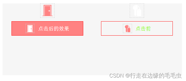
自己在写原生项目中遇到一个需求 一个需要联动的选项框 在这边记录一下 也分享一下
直接上代码 挺简单的
HTML
<div class="container">
				<div class="top-box">
					<div class="top-left-photo top-left-active-photo"></div>
					<div class="top-right-photo"></div>
				</div>
				<div class="bottom-box">
					<div class="bottom-left-box bottom-left-active-box"><div class="img"></div>未敲开门</div>
					<div class="bottom-right-box"><div class="img"></div>未入住</div>
				</div>
			</div>
css样式根据自己需要的地方自己调整
body,div{
	/* margin: 0; */
	/* padding: 0; */
	box-sizing: border-box;
}
.container{
	/* width: 500px; */
	/* height: 200px; */
	margin: 0 auto;
	background-color: #f6f6f6;
	/* margin-top: 50px; */
}
.top-box{
	width: 100%;
	height: 30px;
	display: flex;
	align-items: center;
	justify-content: space-around;
}
.top-left-photo, .top-right-photo{
	width: 30px;
	height: 30px;
	cursor: pointer;
	border: 1px dashed #ccc;
}
.top-left-photo{
	background: url(../images/Door.png) no-repeat center;
}
.top-left-active-photo{
	background: url(../images/Door_active.png) no-repeat center;
}
.top-right-photo{
	background: url(../images/hotel.png) no-repeat center;
}
.top-right-active-photo{
	background: url(../images/hotel_active.png) no-repeat center;
}


.bottom-box{
	width: 100%;
	height: 40px;
	display: flex;
	justify-content: space-around;
	align-items: center;
	font-size: 14px;
	margin-top: 10px;
}
.bottom-left-box, .bottom-right-box{
	width: 170px;
	height: 100%;
	text-align: center;
	border: 1px solid red;
	border-radius: 5px;
	display: flex;
	justify-content: center;
	align-items: center;
	color: #ff8282;
	border: 1px solid #ff8282;
}
.bottom-left-box .img{
	width: 25px;
	height: 25px;
	background: url(../images/Door_active.png) no-repeat center;
	background-size: 20px 20px;
	border: 1px dashed #ccc;
	margin-right: 10px;
}
.bottom-left-active-box{
	background-color: #ff8282;
	color: #fff;
}
.bottom-left-active-box .img{
	background: url(../images/Door.png) no-repeat center;
	background-size: 20px 20px;
}


.bottom-right-box .img{
	width: 25px;
	height: 25px;
	background: url(../images/hotel_active.png) no-repeat center;
	background-size: 20px 20px;
	border: 1px dashed #ccc;
	margin-right: 10px;
}
.bottom-right-active-box{
	background-color: #ff8282;
	color: #fff;
}
.bottom-right-active-box .img{
	background: url(../images/hotel.png) no-repeat center;
	background-size: 20px 20px;
}
js部分
<script>
			// 点击事件
			 let topBox = document.querySelector('.top-box');
			 let bottomBox = document.querySelector('.bottom-box');

			 console.log('top', topBox);
			 console.log('top-children', topBox.children)

			 for(let i=0; i<topBox.children.length; i++){
			 	let topItem = topBox.children[i];
			 	topItem.onclick = function() {
			 		topBox.children[0].classList.remove('top-left-active-photo');
			 		topBox.children[1].classList.remove('top-right-active-photo');
			 		bottomBox.children[0].classList.remove('bottom-left-active-box');
			 		bottomBox.children[1].classList.remove('bottom-right-active-box');

			 		if(i === 0){
			 			topItem.classList.add('top-left-active-photo');
			 			bottomBox.children[0].classList.add('bottom-left-active-box');
			 		}else{
			 			topItem.classList.add('top-right-active-photo');
			 			bottomBox.children[1].classList.add('bottom-right-active-box');
			 		}
			 	}
			 }
			 // 结束
		</script>


 扫一扫
扫一扫


 833
833

 被折叠的 条评论
为什么被折叠?
被折叠的 条评论
为什么被折叠?
 到【灌水乐园】发言


