


程序设计之道无远弗届,御晨风而返。———— 杰佛瑞 · 詹姆士
这里给大家分享几个有趣的渐变色,用来丰富页面。
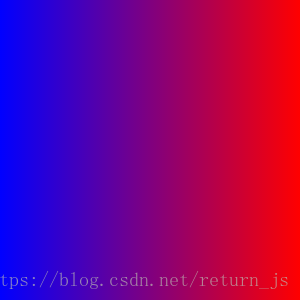
一、背景色渐变
经常用的就是给背景色增加渐变效果,这里的语法顺序不要错(牵扯到优雅降级和渐进增强,标准语法写到最后也是为了兼容各个版本浏览器,让浏览器先执行兼容在执行标准。),(right, red , blue) 这句话决定渐变方向是从右向左变色(效果如下)。( to right, red , blue) 的话就是要从左向右渐变,用CSS3的角度也可以改变渐变色的方向譬如: 50deg,也可以在颜色后面增加 50% 百分比来决定渐变位置,还有更多隐藏 buff 值得大家来探索。
html
<div class="box">
    <div class="main"></div>
</div>
css
  .box{width: 300px;height: 300px;
            background: -webkit-linear-gradient(right, red , blue); /* Safari 5.1 - 6.0 */
            background: -o-linear-gradient(right, red, blue); /* Opera 11.1 - 12.0 */
            background: -moz-linear-gradient(right, red, blue); /* Firefox 3.6 - 15 */
            background: linear-gradient(right, red , blue); /* 标准的语法(必须放在最后) */
        }
二、字体渐变色
字体渐变色是不是很酷炫,但是这个字体如果不够大不好看出渐变效果(可以配合下面镂空字体使用)。
html
<div class="box">
    <div class="main">优快云</div>
</div>
css
  .box{width: 300px;height: 300px;font-size: 100px;
            background-image: -webkit-linear-gradient(bottom, rgb(0, 0, 0), rgb(255, 255, 255));
            -webkit-background-clip: text;
            -webkit-text-fill-color: transparent;
        }

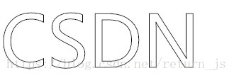
三、镂空字体
空心字体~
html
<div class="box">
    <div class="main">优快云</div>
</div>
css
.box{width: 300px;height: 300px;font-size: 100px;
 -webkit-text-fill-color:transparent;
            -webkit-text-stroke:1px #000;
        }
四、input框提示信息颜色
这里多说一个改变input框提示信息颜色的改变。
html
<input type="text" placeholder="优快云">
css
	  input::-webkit-input-placeholder { color: red; }/* WebKit browsers */
      input:-moz-placeholder {  color: red; }/* Mozilla Firefox 4 to 18 */
      input::-moz-placeholder { color: red; }/* Mozilla Firefox 19+ */
      input:-ms-input-placeholder {  color: red; }/* Internet Explorer 10+ */
五、给图片加上内阴影##
通过 box-shadow 属性可以给DIV增加外阴影,而 inset 这个属性则可以变为内阴影,这里有个小技巧通过给图片设置相对定位并给上叠层顺序为 -1 就可以实现图片内阴影。
html
<div class="demo">
    [外链图片转存失败(img-Xl9CU3Mv-1562233987491)(https://mp.youkuaiyun.com/mdeditor/demo.jpg)]
</div>
css
.demo{
            -webkit-box-shadow:inset 0 0 30px #FF1493;
            -moz-box-shadow:inset 0 0 30px #FF1493;
            box-shadow:inset 0 0 30px #FF1493;
            display:inline-block;
        }
.demo img{
            position:relative;
            z-index:-1;
            display: block;
        }

这里也给大家安利一个网址是快速组出背景渐变色的 http://www.colorzilla.com/gradient-editor/
这些效果是不是很炫酷,还有其他更多方法我就不一一列举了,CSS3还有很多功能等着去学习。


 扫一扫
扫一扫


 1386
1386


 到【灌水乐园】发言


