


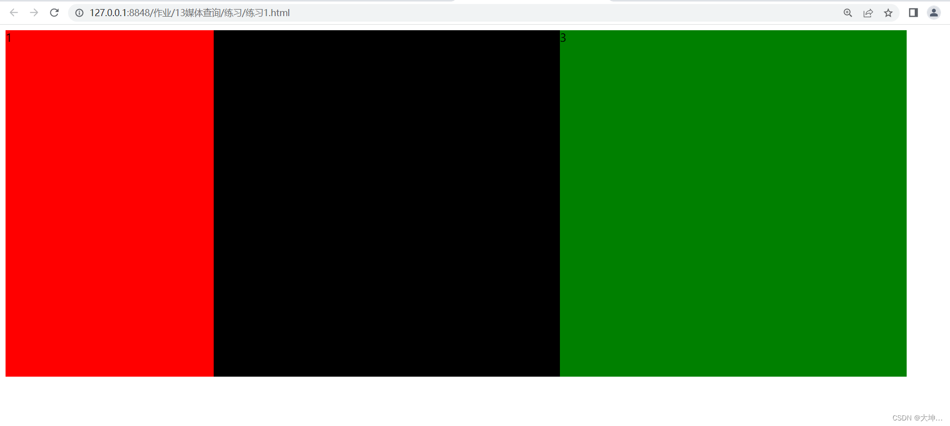
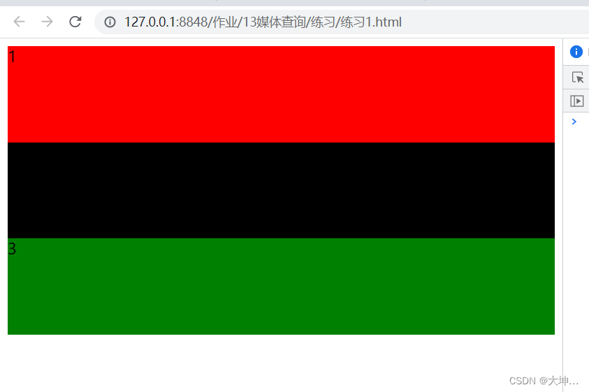
 这段代码展示了如何使用CSS媒体查询实现响应式布局。当屏幕宽度小于600px时,原本并排显示的三个div(.a、.b、.c)将变为堆叠显示,每个div占据全屏宽度并调整高度。
<!DOCTYPE html>
<html>
	<head>
		<meta charset="utf-8">
		<title></title>
		<style type="text/css">
			.a,.b,.c{
				width: 500px;
				height: 500px;
			}
			.a{
				width: 300px;
				height: 500px;
				background: red;
				float: left;
			}
			.b{
				background: black;
				float: left;
			}
			.c{
				background: green;
				float: left;
			}
			@media screen and (max-width:600px) {
				.a{
					clear: both;
					width: 100%;
					height: 100px;
				}
				.b{
					clear: both;
					height: 100px;
					width: 100%;
				}
				.c{
					height: 100px;
					clear: both;
					width: 100%;
				}
			}
		</style>
	</head>
	<body>
		<div class="box">
			<div class="div">
				<div class="a">
					1
				</div>
				<div class="b">
					2
				</div>
				<div class="c">
					3
				</div>
			</div>
		</div>
	</body>
</html>
格式:
@media screen and(max-width:600px){
}
@media screen and(max-width:600px){
最大 最小 宽度
}


 扫一扫
扫一扫


 1286
1286

 被折叠的 条评论
为什么被折叠?
被折叠的 条评论
为什么被折叠?
 到【灌水乐园】发言


