


 本文介绍了如何使用ECharts库在Vue应用中创建柱状图和环形图。柱状图展示了四个类别的数据,而环形图用于表示两个不同类别的比例分布。代码详细说明了配置选项,包括数据、样式和提示信息等,为前端开发者提供了一种可视化数据的方法。
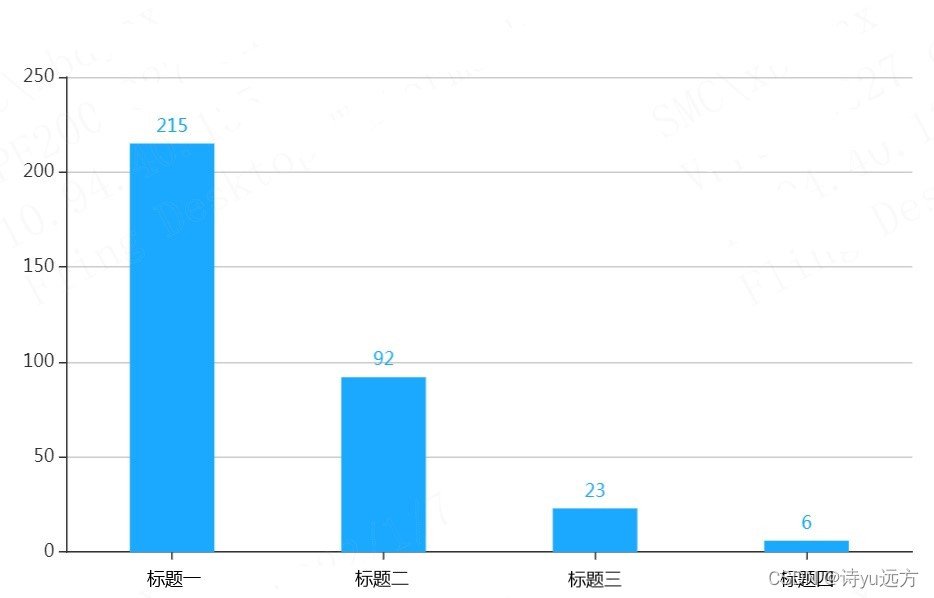
1、柱状图
<!-- 为ECharts准备一个具备大小(宽高)的Dom -->
<div ref="myEcharts" id="main" style="width: 600px;height:400px;"></div>
mounted(){
    this.myEacharts()
},
methods:{
    myEacharts(){
        // 基于准备好的dom,初始化echarts实例
      var myChart = this.$echarts.init(this.$refs.myechart)
      var uiData = [215,92,23,6] //纵坐标
      let option = {
        tooltip: {
          trigger: 'axis',
          axisPointer: {
            type: 'shadow',
          },
        },
        grid: {
          left: '3%',
          right: '4%',
          bottom: '3%',
          containLabel: true,
        },
        xAxis: [
          {
            type: 'category',
            data: ['标题一', '标题二', '标题三', '标题四'],//横坐标
            axisTick: {
              alignWithLabel: true,
            },
          },
        ],
        yAxis: [
          {
            type: 'value',
          },
        ],
        series: [
          {
            name: '数量',
            type: 'bar',
            barWidth: '40%',
            data: uiData,
            itemStyle: {
              color: '#1AA9FF',//柱子颜色
            },
            label: {
              show: true,
              position: 'top',
            },
          },
        ],
      }
      myChart && myChart.setOption(option)
    }
}
效果图
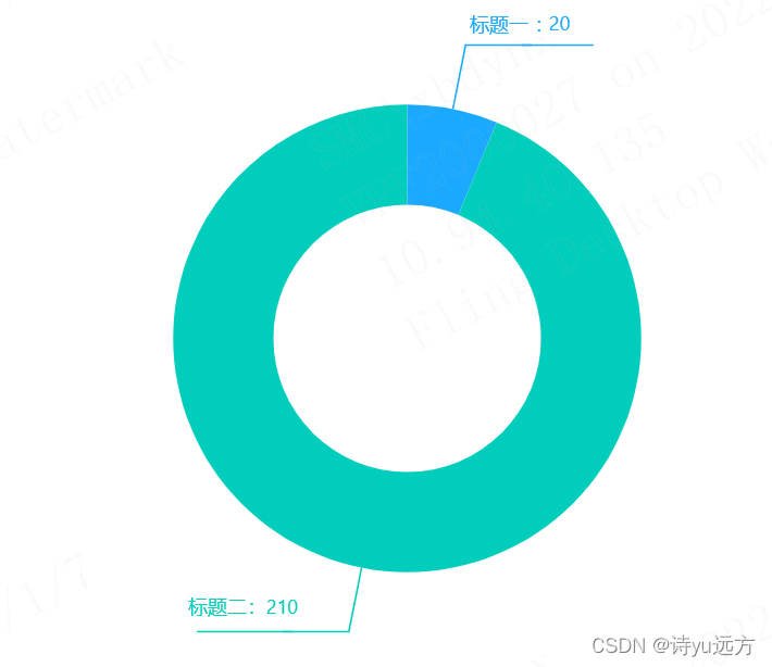
2、环形图
<div ref="myechart_right" id="main" style="width: 600px;height:400px;"></div>
mounted(){
    this.myEachartsRight()
},
methods:{
    myEachartsRight(){
        // 基于准备好的dom,初始化echarts实例
      var myChartRight = this.$echarts.init(this.$refs.myechart_right)
      var apiData = [
        {
          value: 20,
          name: '标题一',
        },
        {
          value: 210,
          name: '标题二',
        },
      ]
      let option = {
        tooltip: {
          trigger: 'item',
        },
        color: ['#1AA9FF', '#00CDBB'],
        series: [
          {
            type: 'pie',
            radius: ['40%', '70%'],
            avoidLabelOverlap: false,
            label: {
              normal: {
                show: true,
                position: 'outer',
                formatter: '{per|{b} : {c}}\n{hr|}\n{a|}',
                padding: [0, -10], //取消hr线跟延长线之间的间隙
                rich: {
                  a: {
                    color: '#999',
                    lineHeight: 20, //设置最后一行空数据高度,为了能让延长线与hr线对接起来
                    align: 'center',
                  },
                  hr: {
                    //设置hr是为了让中间线能够自适应长度
                    borderColor: 'auto', //hr的颜色为auto时候会主动显示颜色的
                    width: '105%',
                    borderWidth: 0.5,
                    height: 0.5,
                  },
                  per: {
                    //用百分比数据来调整下数字位置,显的好看些。如果不设置,formatter最后一行的空数据就不需要
                    padding: [4, 0],
                  },
                },
              },
              emphasis: {
                show: true,
                textStyle: {
                  fontSize: '30',
                  fontWeight: 'bold',
                },
              },
            },
            emphasis: {
              label: {
                show: true,
                fontSize: '40',
                fontWeight: 'bold',
              },
            },
            labelLine: {
              normal: {
                show: true,
                length: 40,
                length2: 40,
              },
            },
            data: apiData,
          },
        ],
      }
      myChartRight && myChartRight.setOption(option)
    }
}
效果图


 4025
4025

 被折叠的 条评论
为什么被折叠?
被折叠的 条评论
为什么被折叠?
 到【灌水乐园】发言


