


前言
我们都知道,在这个发展快速的互联网的发展时代,人们使用的浏览网页的方式不止pc,还有移动端用户,所以呢?什么样满足使用不同的浏览,所以就有了响应式布局的产生,想要深入了解,请看下面的文章。
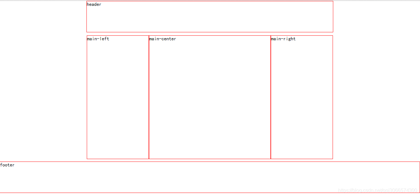
(1)在Body标签里添加三个主DIV标签,分别表示头部,内容和底部。然后,在内容DIV内又添加三个子DIV,分别表示左边,中间,右边。
(2)CSS代码和HTML代码如下
<!DOCTYPE html>
<html lang="en">
<head>
    <meta charset="UTF-8">
    <title>响应式布局</title>
    <style type="text/css">
    <!-----全局样式---->
    *{
        padding: 0px;
        margin: 0px;
        font-family: "楷体";
    }
        #header{
            height: 100px;
            border: solid 1px red;
            margin: 0px auto;
        }
        #main{
            margin: 10px auto;
            height: 400px;
        }
        #footer{
            margin: 0px;
            height: 100px;
            border: solid 1px red;
        }

		<!-----屏幕大于900px自适应----->
        @media screen and (min-width: 900px) {
            #header{
                width: 800px;
            }
            #main{
                width: 800px;
                height: 400px;
            }
            #main-left{
                width: 200px;
                height: 400px;
                border: solid 1px red;
                float: left;
            }
            #main-center{
                width: 394px;
                height: 400px;
                border: solid 1px red;
                float: left;
            }
            #main-right{
                width: 200px;
                height: 400px;
                border: solid 1px red;
                float: left;
            }
        }

		<!-----屏幕为600px--900px自适应----->
        @media screen and (min-width: 600px) and(max-width: 900px){
            #header,#footer{
                width: 600px;
            }
            #main{
                width: 600px;
                height: 400px;
            }
            #main-left{
                width: 200px;
                height: 400px;
                border: solid 1px red;
                float: left;
            }
            #main-center{
                width: 396px;
                height: 400px;
                border: solid 1px red;
                float: left;
            }
            #main-right{
                display: none;
            }
        }

		<!-----屏幕小于600px自适应----->
    @media screen and(max-width: 600px) {
        #header,#footer{
            width: 300px;
        }
        main{
            width: 300px;
            height: 400px;
        }
        #main-left{
            display: none;
        }
        #main-center{
            width: 300px;
            height: 400px;
            border: solid 1px red;
        }
        #main-right{
            display: none;
        }
    }
    </style>
</head>
<body>
<div id="header">header</div>
<div id="main">
    <div id="main-left">main-left</div>
    <div id="main-center">main-center</div>
    <div id="main-right">main-right</div>
</div>
<div id="footer">footer</div>
</body>
</html>
效果显示
希望这边文章能够帮到编程爱好者,谢谢观看!


 扫一扫
扫一扫


 275
275

 被折叠的 条评论
为什么被折叠?
被折叠的 条评论
为什么被折叠?
 到【灌水乐园】发言


