


 文章展示了如何使用HTML、CSS和JavaScript创建一个炫酷的文字渐入动画效果。通过CSS的动画属性和背景渐变结合,以及JavaScript来控制延迟,使得每个文字依次可见,创造出引人注目的视觉体验。
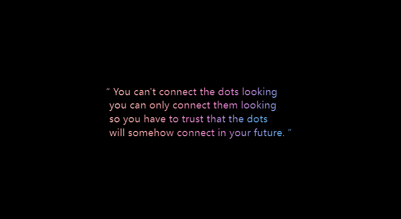
分享一个炫酷的文字渐入效果的代码实现
1、效果展示
2、代码分享
<!DOCTYPE html>
<html lang="en">
<head>
<meta charset="UTF-8">
<meta http-equiv="X-UA-Compatible" content="IE=edge">
<meta name="viewport" content="width=device-width, initial-scale=1.0">
<title>Document</title>
<style>
:root {
--fontBig: 7em;
--fontxxxl: 5.5em;
--fontxxl: 3.4375em;
--fontxl: 2.75em;
--fontlg: 1.9375em;
--fontmd: 1.375em;
--fontsm: 1.125em;
--fontxs: 1em;
--fontxxs: 0.75em;
--dark: #000000;
--grey: #666666;
--greyLight: #979797;
--offWhite: #eeeeee;
--white: #ffffff;
--blue: #0071e3;
--blueRgba: "0, 113, 227";
--fontL: "Source Sans Pro light";
--fontR: "Source Sans Pro";
--gradient: #35c3f3 0%, #8b9fe8 20%, #e681d8 39%, #ffa9a4 76%, #fed2ce 100%;
}
* {
padding: 0;
margin: 0;
}
.quote {
width: 100vw;
height: 100vh;
position: sticky;
display: flex;
justify-content: center;
align-items: center;
}
.TextContainer {
width: 100vw;
height: 100vh;
display: flex;
flex-direction: column;
justify-content: center;
align-items: center;
background-color: var(--dark);
color: var(--white);
}
.text {
width: 50%;
font-size: var(--fontlg);
position: relative;
height: var(--fontmd);
overflow: hidden;
}
span {
position: absolute;
transform: translateY(3rem);
animation-name: moveUp;
animation-duration: 2.5s;
animation-timing-function: ease;
animation-fill-mode: forwards;
font-family: var(--fontL);
background-image: linear-gradient(-45deg, var(--gradient));
background-clip: text;
-webkit-background-clip: text;
-webkit-text-fill-color: transparent;
}
@keyframes moveUp {
100% {
transform: translateY(0);
}
}
</style>
</head>
<body>
<section class="quote">
<div class="TextContainer">
<p class="text">
<span>“ You can't connect the dots looking forward;</span>
</p>
<p class="text">
<span> you can only connect them looking backward.</span>
</p>
<p class="text">
<span> so you have to trust that the dots</span>
</p>
<p class="text">
<span> will somehow connect in your future. ”</span>
</p>
</div>
</section>
<script>
const rows = document.querySelectorAll('span')
let delay = 0
for (let row of rows) {
row.style.setProperty('animation-delay', delay + 's')
delay = delay + 0.4
}
</script>
</body>
</html>


 扫一扫
扫一扫


 被折叠的 条评论
为什么被折叠?
被折叠的 条评论
为什么被折叠?
 到【灌水乐园】发言


