


 本文详细介绍了微信小程序的基础组件、视图组件、媒体组件、表单组件、路由组件的使用方法,包括各组件的属性、事件和样式。同时,讲解了自定义组件的创建、注册与使用,包括组件样式、数据通信、插槽和生命周期。内容涵盖了组件的属性绑定、事件处理和页面间的通信,为开发者提供全面的小程序组件开发指南。
一、微信小程序组件
组件就是小程序页面的组成结构,与html在web网页开发中的作用一样,铺设页面.可以参考其他UI库,像elementUI,vantUI组件
组件是视图层的基本组成单元。
组件自带一些功能与微信风格一致的样式。
一个组件通常包括 开始标签 和 结束标签,属性 用来修饰这个组件,内容 在两个标签之内。
    <tagname property="value">
        Content goes here ...
    </tagname>

组件具有公共属性和特殊属性,我们学习小程序组件其实就是小程序组件特殊属性
组件公共属性:
id class style hidden data-* bind* / catch*
组件的特殊属性详见组件的官方文档
1.1基础组件
-
icon
图标
<icon type="search" size="50" color="red"></icon>
-
text
文本 <text user-select>hello world</text> --> <text space="nbsp">hello world</text> <text decode>hello < > & '    world</text>
-
rich-text
富文本
<h1>我是标题</h1>
<text>{{str}}</text>
<rich-text>{{str}}</rich-text>
<rich-text nodes="{{str}}"></rich-text>
1.2视图组件
view
视图容器类似于div
<view
class="but"
hover-class="opacity"
hover-start-time="1000"
hover-stay-time="2000"
>提交</view>
.but{
width: 300rpx;
line-height: 120rpx;
background-color: green;
border-radius: 30rpx;
text-align: center;
color: white;
}
.opacity{
opacity: 0.3;
}
swiper
轮播图
<view class="banner">
    <!-- 轮播图区域 -->
    <swiper
        indicator-dots="{{false}}"
        autoplay
        interval="2000"
        circular
        indicator-active-color="red"
        vertical="{{false}}"
        bindchange="changeswiper"
    >
        <swiper-item wx:for="{{imgs}}" wx:key="*this">
            <image src="{{item}}"></image>
        </swiper-item>
    </swiper>
    <!-- m面板指点 -->
    <view class="dots">
        <view
            wx:for="{{imgs}}"
            wx:key="*this"
            class="{{activeIndex == index ? 'active' : ''}}"
        ></view>
    </view>

</view>

swiper{
    width: 100%;
    height: 350rpx;
}

swiper image{
    width: 100%;
    height: 350rpx;
}

.banner{
    position: relative;
}

.dots{
    position: absolute;
    width: 150rpx;
    height: 50rpx;
    /* border: 2rpx solid black; */
    margin: auto;
    left: 0;
    right:0;
    top: 240rpx;
    bottom: 0;
    display: flex;
    justify-content: space-around;
}

.dots view{
    width: 10rpx;
    height: 50rpx;
    background-color: black;
    transform: rotate(40deg);
    border-radius: 10rpx;
}

.dots .active{
    background-color: green;
}
scroll-view
滚动视图

<!-- 3.1竖向滚动  height 应用场景:商品分类 数据列表-->
<!-- <scroll-view scroll-y class="shu">
    <view>1</view>
    <view>2</view>
    <view>3</view>
</scroll-view> -->

<!-- 3.2横向滚动  应用场景:左滑删除 -->
<!-- <scroll-view scroll-x class="heng"
 父亲: white-space: nowrap; 第一次孩子: display: inline-block;  >
    <view>1</view>
    <view>2</view>
    <view>3</view>
</scroll-view> -->


.shu{
    height: 300rpx;
}
.shu view{
    width: 100%;
    height: 200rpx;
    background-color: green;
}

.heng{
    width: 100%;
    height: 300rpx;
    white-space: nowrap;
}

.heng view{
    display: inline-block;
    width: 100%;
    height: 300rpx;
}

.heng view:nth-of-type(1){
    background-color: pink;
}
.heng view:nth-of-type(2){
    background-color: green;
}
.heng view:nth-of-type(3){
    background-color: rgb(199, 115, 37);
}
1.3媒体组件
image
图片组件

<!-- 1.image -->
<!-- 1.1 图片的缩放模式  等比缩放 -->
<!-- <image src="../../images/0.jpg" class="img" mode="widthFix"></image> -->

<!-- 1.2懒加载 lazy_load (都会预加载上中下三屏数据)-->
<!-- <image src="../../images/0.jpg" bindload="imgLoad" lazy-load></image>
<image src="../../images/0.jpg" bindload="imgLoad" lazy-load></image>
<image src="../../images/0.jpg" bindload="imgLoad" lazy-load></image>
<image src="../../images/0.jpg" bindload="imgLoad" lazy-load></image>
<image src="../../images/0.jpg" bindload="imgLoad" lazy-load></image>
<image src="../../images/0.jpg" bindload="imgLoad" lazy-load></image>
<image src="../../images/0.jpg" bindload="imgLoad" lazy-load></image>
<image src="../../images/0.jpg" bindload="imgLoad" lazy-load></image>
<image src="../../images/0.jpg" bindload="imgLoad" lazy-load></image>
<image src="../../images/0.jpg" bindload="imgLoad" lazy-load></image>
<image src="../../images/0.jpg" bindload="imgLoad" lazy-load></image>
<image src="../../images/0.jpg" bindload="imgLoad" lazy-load></image>
<image src="../../images/0.jpg" bindload="imgLoad" lazy-load></image>
<image src="../../images/0.jpg" bindload="imgLoad" lazy-load></image>
<image src="../../images/0.jpg" bindload="imgLoad" lazy-load></image>
<image src="../../images/0.jpg" bindload="imgLoad" lazy-load></image>
<image src="../../images/0.jpg" bindload="imgLoad" lazy-load></image>
<image src="../../images/0.jpg" bindload="imgLoad" lazy-load></image>
<image src="../../images/0.jpg" bindload="imgLoad" lazy-load></image> -->

<!-- 3. 识别图片中的二维码(小程序码) -->
<!-- <image src="../../images/ma.jpg" show-menu-by-longpress></image> -->


// 监听图片载入成功
imgLoad(e){
    console.log(1)
    // console.log(e.detail)
},

.img{
    width: 100%;
    /* height: ; */
}
1.4表单组件
如何获取每一个表单的元素的value;
如何获取表单提交后的数据;
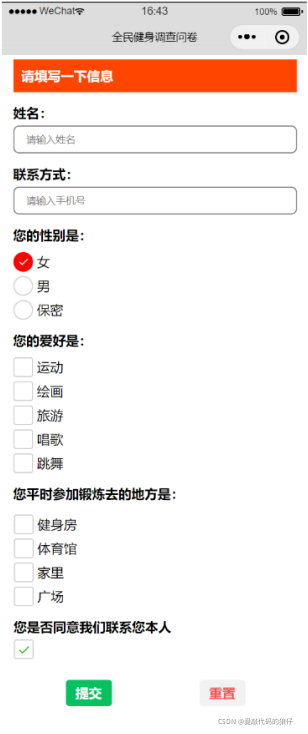
1.input输入框
1.借鉴了react-native的语法 默认不显示边框 需要手动添加
2.实时获取input的value值:
	2.1.给input绑定监听用户输入的事件bindinput ,通过this.setData()重新赋值
	2.2.简易的双向绑定,model:value
		注意,基础库 2.9.3 开始支持

3.注意设置confirm-typ时,type类型一定是text


 userName:'',
 userPhone:'',

<view class="row">
    <text>姓名:</text>
    <input
        value="{{userName}}"
        type="text"
        confirm-type="done"
        password="{{false}}"
        maxlength="5"
        placeholder="请输入姓名"
        placeholder-class="placeholder"
        disabled="{{false}}"
        bindinput="changeValue"
     />
</view>

<view class="row">
    <text>联系方式:</text>
    <input
        type="text"
        confirm-type="done"
        password="{{false}}"
        maxlength="11"
        placeholder="请输入手机号"
        placeholder-class="placeholder"
        disabled="{{false}}"
        model:value="{{userPhone}}"
     />
</view>

<view>用户的姓名是:{{userName}}</view>
<view>用户的手机号是:{{userPhone}}</view>

// 实时获取用户姓名
    changeValue(e){
        // 模拟双向绑定
        this.setData({userName:e.detail.value})
    },
2.radio/radio-group单选项目及组
 userSex:[
            {name:'男',value:0,checked:true,color:'green'},
            {name:'女',value:1,color:'red'},
            {name:'保密',value:2,color:'pink'},
        ],

<view class="row">
    <text>您的性别是</text>
    <radio-group bindchange="changeSex">
        <radio
            wx:for="{{userSex}}"
            wx:key="value"
            value="{{item.value}}"
            checked="{{item.checked}}"
            color="{{item.color}}"
        >{{item.name}}</radio>
    </radio-group>
</view>

  // 实时获取用户的性别
    changeSex(e){
        console.log(e.detail.value)
    },
3.checkbox/checkbox-group多选项目及组
userhopy:[
            {name:'运动',value:0,checked:true,color:'green'},
            {name:'唱歌',value:1,color:'red'},
            {name:'代码',value:2,color:'pink'},
            {name:'游戏',value:3,disabled:true,color:'blue'},
        ],

<view class="row">
    <text>您的爱好是</text>
    <checkbox-group bindchange="changeHopy">
        <checkbox
            wx:for="{{userhopy}}"
            wx:key="value"
            value="{{item.value}}"
            checked="{{item.checked}}"
            disabled="{{item.disabled}}"
            color="{{item.color}}"
        >{{item.name}}</checkbox>
    </checkbox-group>
</view>

// 实时获取用户的爱好
    changeHopy(e){
        console.log(e.detail.value)
    },
4.picker底部弹起选择器
  region: ['北京市', '北京市', '昌平区'],
        storylist: [
            {
              "classify": "儿童小故事",
              "classifyId": "1"
            },
            {
              "classify": "安徒生童话",
              "classifyId": "2"
            },
            {
              "classify": "格林童话",
              "classifyId": "3"
            },
            {
              "classify": "一千零一夜",
              "classifyId": "4"
            },
            {
              "classify": "经典童话",
              "classifyId": "5"
            },
            {
              "classify": "成语故事",
              "classifyId": "6"
            },
            {
              "classify": "寓言故事",
              "classifyId": "7"
            },
            {
              "classify": "民间故事",
              "classifyId": "8"
            },
            {
              "classify": "童话故事",
              "classifyId": "9"
            },
            {
              "classify": "王尔德童话",
              "classifyId": "10"
            }
          ],
        index:0,//设置默认展示故事分类

 <view class="row">
    <text>您的住址是</text>
    <picker
        mode="region"
        bindchange="bindRegionChange"
        value="{{region}}"
    >
      当前选择:{{region[0]}},{{region[1]}},{{region[2]}}
  </picker>
</view>

<view class="row">
    <text>您的喜欢故事是</text>
    <picker
        mode="selector"
        range="{{storylist}}"
        range-key="classify"
        value="{{index}}"
        bindchange="bindChangeStory"
        value="{{region}}"
    >
      当前选择:{{storylist[index].classify}}
  </picker>
</view>


  // 实时获取故事类型
    bindChangeStory(e){
        this.setData({index:e.detail.value})
    },

    // 实时获取用户的住址
    bindRegionChange(e){
        this.setData({region:e.detail.value})
    },
5.switch开关选择器
<view class="row">
    <text>是否同意联系您本人</text>
    <switch type="checkbox" bindchange="changeBuffer"></switch>
</view>

// 实时获取开关value
    changeBuffer(e){
        console.log(e.detail.value)
    },
6.button
button组件不只有按钮,还具有一定的开发能力比如获取用户的头像昵称 、用户的手机号  微信步数

loadBuffer:false,//设置提交控制开关

<view class="but">
    <button
        size="mini"
        type="primary"
        loading="{{loadBuffer}}"
        form-type="submit"

    >提交</button>
    <button
        size="mini"
        type="warn"
        plain
        form-type="reset"
    >重置</button>
</view>
7.form表单组件
表单提交流程:
	1.首先给button添加form-type属性
	2.将表单元素添加到form组件中
	3.给所有的表单元素添加name属性
	4.给form组件绑定bindsubmit事件


    // 监听表单重置
    reset(){
        // 可以再次处理一些业务逻辑比如还原picker上默认数据
        console.log(111)
    },

    // 获取表单提交的数据
    submit(e){
        // 开启提交加载动画
        this.setData({loadBuffer:true})
        console.log(e.detail.value);

        // 表单数据校验

        // 当数据成功提交到服务端后关闭加载动画(模拟)
        setTimeout(()=>{
            this.setData({loadBuffer:false})
        },2000)
    }
1.5路由组件
微信小程序中提供了导航组件(vue:router-link)和 路由api函数(vue::this.$router.push)两种跳转方式,帮助开发者实现小程序内部的页面之间的跳转以及小程序与小程序之间的跳转,这两种方式在功能上完全一致,只不过是两种不同实现方式而已;
官方对于导航组件的功能介绍比较少,建议结合路由api的文档来学习页面跳转功能
1.导航组件
基本语法:
 <!-- 1.普通页面之间的跳转
    保留当前页面,跳转到应用内的某个页面。但是不能跳到 tabbar 页面。
    使用 wx.navigateBack 可以返回到原页面。小程序中页面栈最多十层。
-->
<navigator target="self" url="../form/form?name=李白&age=20" open-type="navigate">跳转到form页面</navigator>
<!--错误实例 <navigator target="self" url="../index/index" open-type="navigate">跳转到index页面</navigator> -->


<!-- 2.重定向 -->
<!-- 关闭当前页面,跳转到应用内的某个页面。但是不允许跳转到 tabbar 页面 -->
<navigator target="self" url="../form/form?name=李白&age=20" open-type="redirect">定向到form</navigator>


<!-- 3.跳转选项卡页面 -->
<!-- 跳转到 tabBar 页面,并关闭其他所有非 tabBar 页面  路径后不能带参数。-->
<navigator target="self" url="../index/index" open-type="switchTab">跳转到index</navigator>


<!-- 4.重新打开页面 -->
<!--  -->
<navigator target="self" url="../form/form?name=李白&age=20" open-type="reLaunch">跳转到form</navigator>
<!-- <navigator target="self" url="../index/index?name=李白&age=20" open-type="reLaunch">跳转到index</navigator> -->


<!-- 5.返回某个(可以返回n层页面)页面 -->
<navigator delta="1" open-type="navigateBack">返回</navigator>


<!-- 6.跳转到外部微信小程序 -->
<navigator
    target="miniProgram"
    app-id="wx2f26909d14cc3fdf"
    version="release"
>跳转到菜谱小程序</navigator>
2.路由API
基本语法:
/**
     * 页面的初始数据
     */
    data: {
        user:{id:1001,name:'张三'}
    },

    // 跳转到外部小程序
    miniProgramTo(){
        wx.navigateToMiniProgram({
            appId:"wx2f26909d14cc3fdf",
            success:res=>{console.log(res)}
        })
    },

    // reLaunchTo 重新打开
    reLaunchTo(){
        wx.reLaunch({
          url: '../form/form',
        })
    },

    // switchTo  跳转选项卡页面
    switchTo(){
        wx.switchTab({
          url: '../index/index',
        })
    },
    // redirectTo  重定向
    redirectTo(){
        wx.redirectTo({
          url: '../form/form?age=20',
        })
    },

    // navigateTo 普通跳转
    navigateTo(){
        wx.navigateTo({
        //错误实例   url: '../form/form?user='+this.data.user,
          url: '../form/form?user='+JSON.stringify(this.data.user),
          success:res=>{},
          fail:err=>{},
          complete:result=>{}
        })
    },

    /**
     * 生命周期函数--监听页面加载
     */
    onLoad: function (options) {
        // 获取小程序页面栈
        console.log(getCurrentPages());
    },
3.路由传参
注意get地址传值(不要加空格) 如:pages/index/index?name=李四&age=20
4.接收路由传参
目标页面的onLoad(options)生命周期中获取参数
5.总结路由规则
地址:
-
navigateTo,redirectTo只能打开非 tabBar 页面,可以传参 -
switchTab只能打开 tabBar 页面,不能传参。 -
reLaunch可以打开任意页面,可以传参。 -
页面底部的 tabBar 由页面决定,即只要是定义为 tabBar 的页面,底部都有 tabBar。
-
调用页面路由带的参数可以在目标页面的
onLoad中获取。
6.获取页面栈记录
 console.log(getCurrentPages())  //array[route1,route2.....]
 页面栈一共10层,超多10层将会导致页面跳转失败
二、自定义组件
同vue语法相似
1.概述
小程序支持简洁的组件化编程,开发者可以将页面内的功能模块抽象成自定义组件,以便在不同的页面中重复使用;自定义组件在使用时与小程序原生提供的组件非常相似,自定义组件的创建及页面构成基本同普通页面;
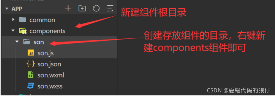
2.创建自定义组件
组件页面也是有.js .json.wxml .wxss四个文件构成
3.组件注册与使用
1.全局注册(app.json)
	可以在项目的所有页面使用
	 "usingComponents": {
      	"sonComp":"./components/son/son"
    }

2.页面注册(页面的.json)
	可以在当前页面使用
   	"usingComponents": {
        "son_Comp":"../../components/son/son"
      }
3.页面使用组件
	<sonComp></sonComp>
4.组件样式(wxss)
在组件中不要使用组件的(微信小程序封装的组件,view text)名称 、id作为选择器,建议使用class,其他同普通页面语法

/* 基本同普通页面,注意不建议使用id和组件的名称作为样式选择器 建议使用class */
5.组件页面(wxml)
组件页面.wxml语法同普通页面的语法
6.组件逻辑(js)
组件页面使用component方法进行构造,区别于页面的page方法;

properties:是组件对外的属性,可用于页面之间的通信,如父传子,其他与data无异;
data:组件页面的数据,通过普通页面中的data;
methods:组件页面的自定义事件,语法同普通页面,包含页面重新赋值(this.setData({}))
7.slot插槽使用
插槽分为单插槽和多插槽,语法和vue相似
7.1单插槽
<slot></slot>
7.2多插槽
// 给自定义组件添加配置
options:{
	multipleSlots:true,//允许使用多插槽
}

<slot name='head'></slot>
<view slot='head'>我是头部</view>
8.组件间通信
语法同vue相似
8.1父传子
props
8.2子传父
事件传递
this.triggerEvent('channel',{name:'我是孩子son'})
8.3获取组件实例
this.selectComponent('组件的class名称')
9.observers数据监听器
用于监听组件中data数据和props属性的变化,类似于watch监听器,区别是不管值是否发生变化更改,只要监听了都会触发;数据监听器使用 可以监听单一的数值也可以监听全部数据的变化
  // 用于监听组件中data数据和props属性的变化   只能获取修改后值
    observers:{
        // 监听单一数据的变化
        // 'name'(param){
        //     console.log(param)
        // },
        // 监听对象中的某一个数据变化
        // 'user.id'(param){
        //     console.log(param)
        // },
        // 监听user对象中所有数据变化
        'user.**'(param){
            console.log(param)
        },
        // 监听data和props中所有数据的变化
        '**'(param){
            console.log(param)
        }
    },
10.组件的生命周期(了解)
-
created
:组件实例刚刚被创建好时,created生命周期被触发。此时还不能调用setData` 。 通常情况下,这个生命周期只应该用于给组件 this 添加一些自定义属性字段。 -
attached
:在组件完全初始化完毕、进入页面节点树后,attached生命周期被触发。此时,this.data` 已被初始化完毕。这个生命周期很有用,绝大多数初始化工作可以在这个时机进行。 -
detached
:在组件离开页面节点树后,detached生命周期被触发。退出一个页面时,如果组件还在页面节点树中,则detached` 会被触发。


 扫一扫
扫一扫


 5301
5301

 被折叠的 条评论
为什么被折叠?
被折叠的 条评论
为什么被折叠?
 到【灌水乐园】发言


