


 本文详细介绍了HTML5的新特性,包括语义化标签、多媒体标签(<video>、<audio>)、input类型和表单属性。同时,深入探讨了CSS3的选择器(属性选择器、结构伪类选择器、伪元素选择器)、盒子模型、过渡效果以及其他特性,如模糊效果和计算盒子大小。并给出了实际案例和课后作业,帮助读者理解和应用这些新特性。
目录
一、HTML5的新特性
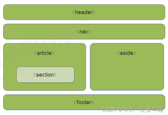
1.1 HTML5新增的语义化标签
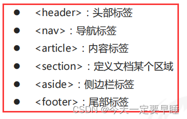
1.2 HTML5新增的多媒体标签
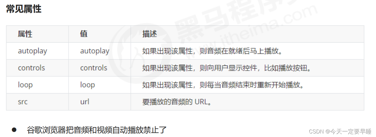
新增的多媒体标签主要包含两个:音频:<audio> 、视频:<video>
使用它们可以很方便的在页面中嵌入音频和视频,而不再去使用 flash 和其他浏览器插件。
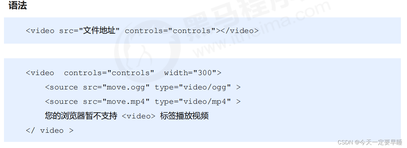
(1)视频:<video>
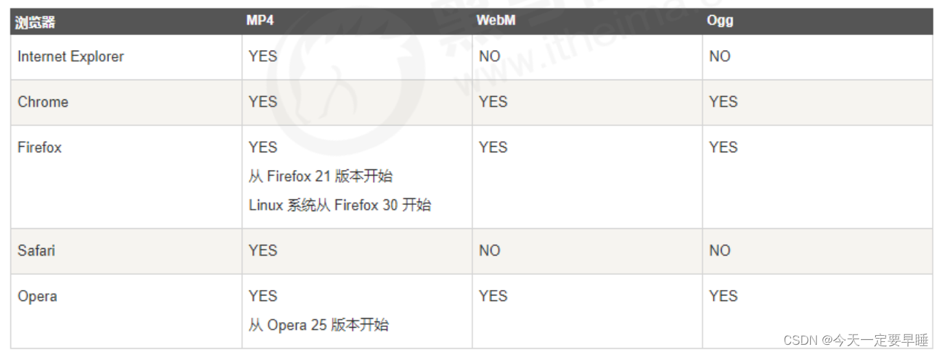
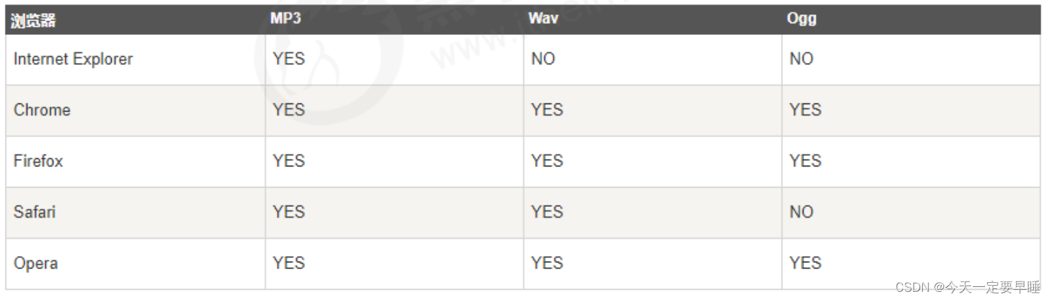
当前 <video> 元素支持三种视频格式: 尽量使用 MP4格式
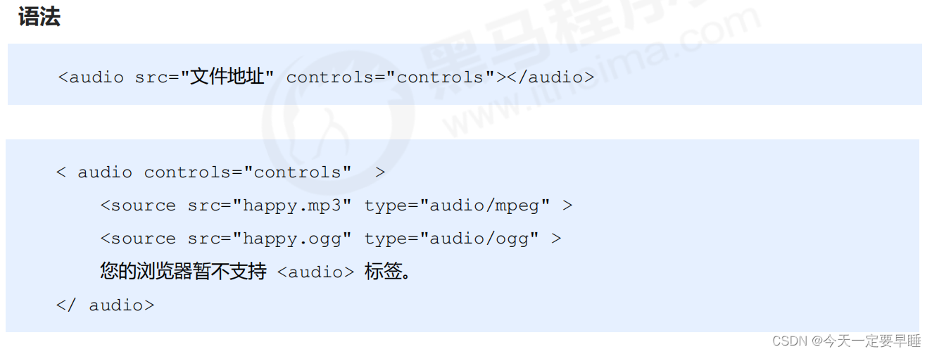
(2)音频:<audio>
当前 <audio> 元素支持三种音频格式: 尽量使用 MP3格式
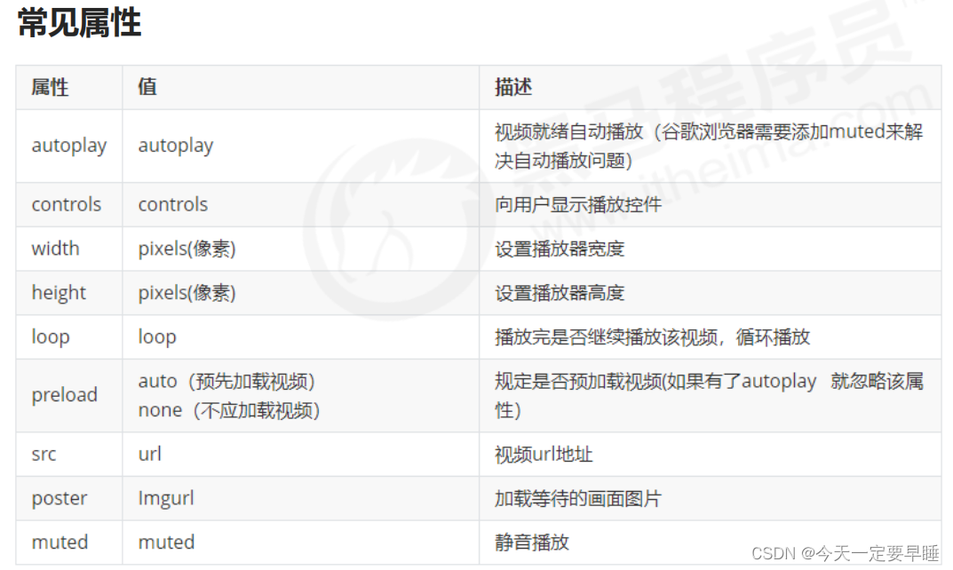
(3) 多媒体标签总结
1 音频标签和视频标签使用方式基本一致,浏览器支持情况不同
2 谷歌浏览器把音频和视频自动播放禁止了
3 可以给视频标签添加 muted 属性来静音播放视频,音频不可以(可以通过JavaScript解决)
4 视频标签是重点,我们经常设置自动播放、循环和设置大小属性,而不使用 controls 控件
1.3 HTML5新增的input类型
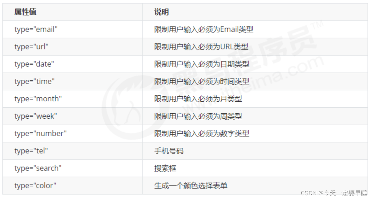 ※ 重点记住: number tel search 这三个
代码:
<!DOCTYPE html>
<html lang="en">
<head>
<meta charset="UTF-8">
<meta name="viewport" content="width=device-width, initial-scale=1.0">
<meta http-equiv="X-UA-Compatible" content="ie=edge">
<title>input表单的多个类型</title>
</head>
<body>
<!-- 我们验证的时候必须添加form表单域 -->
<form action="">
<ul>
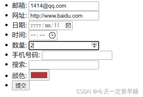
<li>邮箱: <input type="email" /></li>
<li>网址: <input type="url" /></li>
<li>日期: <input type="date" /></li>
<li>时间: <input type="time" /></li>
<li>数量: <input type="number" /></li>
<li>手机号码: <input type="tel" /></li>
<li>搜索: <input type="search" /></li>
<li>颜色: <input type="color" /></li>
<!-- 当我们点击提交按钮就可以验证表单了 -->
<li> <input type="submit" value="提交"></li>
</ul>
</form>
</body>
</html>效果:
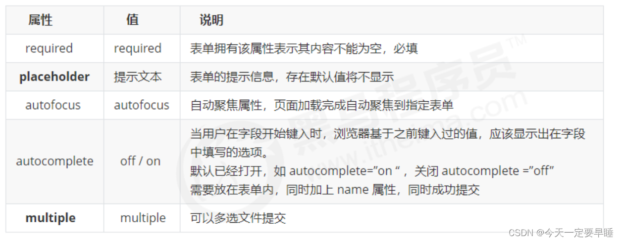
1.4 HTML5新增的表单属性
可以通过以下设置方式修改placeholder里面的字体颜色:
input::placeholder {
     color: pink;
}
代码:
<!DOCTYPE html>
<html lang="en">
<head>
<meta charset="UTF-8">
<meta name="viewport" content="width=device-width, initial-scale=1.0">
<meta http-equiv="X-UA-Compatible" content="ie=edge">
<title>HTML5新增-表单的多个属性</title>
<style>
/* 为框内的默认文字设置颜色 */
input::placeholder {
color: pink;
}
/* 取消光标点至搜索框时的边框 */
input {
outline: none;
}
</style>
</head>
<body>
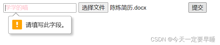
<form action="">
<!-- 搜索框,必须填写内容required、默认框内文字显示placeholder、打开网页光标定至搜索框autofocus、关闭历史输入内容显示autocomplete -->
<input type="search" name="sear" id="" required="required" placeholder="学学的喵" autofocus="autofocus"
autocomplete="off">
<!-- 提交多个文件 -->
<input type="file" name="" id="" multiple="multiple">
<!-- 提交按钮 -->
<input type="submit" value="提交">
</form>
</body>
</html>效果:
二、CSS3的新特性
2.1 CSS3 新增选择器
(1)属性选择器 "[ ]"
属性选择器可以根据元素特定属性的来选择元素。 这样就可以不用借助于类或者id选择器。
四种写法:
1) input [ 属性 ] ,选择的是所有同属性的元素
2) input [ type=值 ],选择的是属性=值的元素
3) div [ class^=icon ] ,选择的是div标签中class = “icon” 开头的元素
4) div [ class$=data ] ,选择的是div标签中class = “data” 开头的元素
5) div [ class*=val] ,选择的是div标签中class= “”中,含有val的元素
注意:
类选择器、属性选择器、伪类选择器,权重都是10
代码:
<!DOCTYPE html>
<html lang="en">
<head>
<meta charset="UTF-8">
<meta name="viewport" content="width=device-width, initial-scale=1.0">
<meta http-equiv="X-UA-Compatible" content="ie=edge">
<title>CSS3新增-属性选择器</title>
<style>
input {
outline: none;
}
/* 选择所有 含有value属性的input */
input[value] {
color: rgb(37, 170, 30);
}
/* 选择所有 type=password的input */
input[type=password] {
color: pink;
}
/* 选择所有 class=以icon开头的 div */
div[class^=icon] {
color: red;
}
/* 选择所有 class=以data结尾的 section */
section[class$=data] {
color: blue;
}
/* 类选择器 属性选择器 伪类选择器 权重都是 10 */
</style>
</head>
<body>
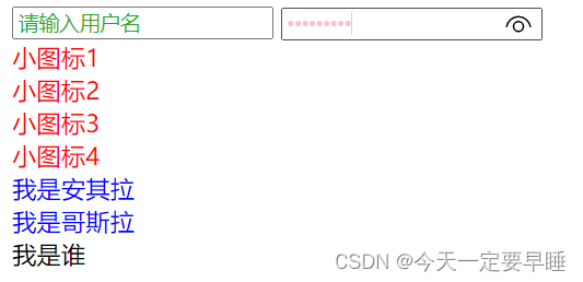
<!-- 1. 利用属性选择器就可以不用借助于类或者id选择器 -->
<input type="text" value="请输入用户名">
<!-- 2. 属性选择器还可以选择属性=值的某些元素 重点务必掌握的 -->
<input type="password" name="" id="">
<!-- 3. 属性选择器可以选择属性值开头的某些元素 -->
<div class="icon1">小图标1</div>
<div class="icon2">小图标2</div>
<div class="icon3">小图标3</div>
<div class="icon4">小图标4</div>
<!-- 4. 属性选择器可以选择属性值结尾的某些元素 -->
<section class="icon1-data">我是安其拉</section>
<section class="icon2-data">我是哥斯拉</section>
<section class="icon3-ico">我是谁</section>
</body>
</html>效果:
(2)结构伪类选择器 ":"
结构伪类选择器主要根据文档结构来选择器元素, 常用于选择父级选择器里面的子元素(E) ,可以选择某个父元素的一个或多个特定的子元素
1) ul li:first-child ,选择ul 的第一个小li
2) ul li:last-child ,选择ul 的最后一个小li
3)ul li:nth-child(数字),表示选择ul的第n个小li (数字只写括号里面的)
括号里还可以是关键字 和 公式:
关键字:小括号里可以是偶数(even)、奇数(odd),表示选择所有的偶数/奇数
公式:小括号里必须包含n,不能是其他的字母
如果是n,表示选择了所有的孩子(n从0开始,会自加一,相当于n++,第0个和超出的元素会自动忽略掉)
如果是2n,就是选择所有的偶数(等价于even);
如果是2n+1,就是选择所有的奇数(等价于odd);
5n,表示选择5的倍数
n+5 ,表示选择从第5个开始到最后(包含第五个)
-n+5 ,表示选择前五个
4)E: first-of-type ,表示指定类型E的第一个
5) E: last-of-type ,表示指定类型E的最后一个
6) E: nth-of-type ,表示指定类型E的第n个
代码(选择第一个/最后一个/任意第几个孩子):
<!DOCTYPE html>
<html lang="en">
<head>
<meta charset="UTF-8">
<meta name="viewport" content="width=device-width, initial-scale=1.0">
<meta http-equiv="X-UA-Compatible" content="ie=edge">
<title>CSS3新增结构伪类选择器( first last 数字)</title>
<style>
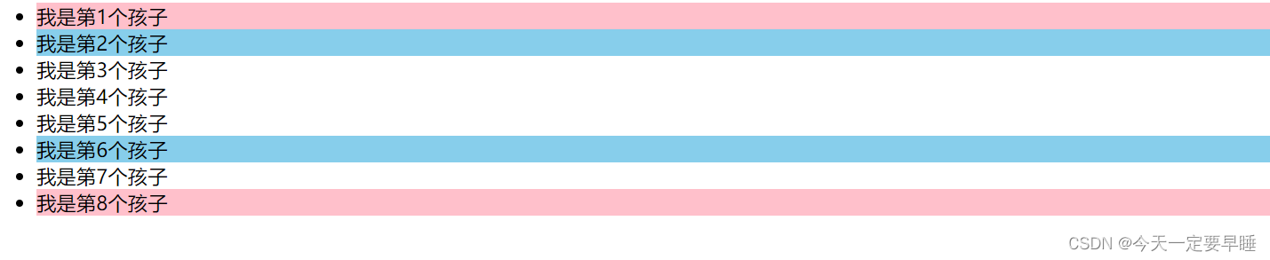
/* 1. 选择ul里面的第一个孩子 小li */
ul li:first-child {
background-color: pink;
}
/* 2. 选择ul里面的最后一个孩子 小li */
ul li:last-child {
background-color: pink;
}
/* 3. 选择ul里面的第2个孩子 小li */
ul li:nth-child(2) {
background-color: skyblue;
}
ul li:nth-child(6) {
background-color: skyblue;
}
</style>
</head>
<body>
<ul>
<li>我是第1个孩子</li>
<li>我是第2个孩子</li>
<li>我是第3个孩子</li>
<li>我是第4个孩子</li>
<li>我是第5个孩子</li>
<li>我是第6个孩子</li>
<li>我是第7个孩子</li>
<li>我是第8个孩子</li>
</ul>
</body>
</html>效果:
代码(选择所有孩子、奇数/偶数孩子、前几个/后几个孩子):
<!DOCTYPE html>
<html lang="en">
<head>
<meta charset="UTF-8">
<meta name="viewport" content="width=device-width, initial-scale=1.0">
<meta http-equiv="X-UA-Compatible" content="ie=edge">
<title>CSS3新增结构伪类选择器 nth-child(n) </title>
<style>
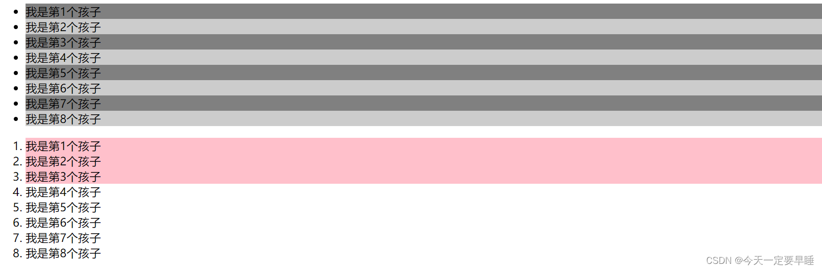
/* n可以为关键字:odd\even */
/* 也可为n或者是含n的公式 */
/* 1.把所有的偶数 even的孩子选出来 */
ul li:nth-child(even) {
background-color: #ccc;
}
/* 2.把所有的奇数 odd的孩子选出来 */
ul li:nth-child(odd) {
background-color: gray;
}
/* 3.nth-child(n) 从0开始每次加1,往后计算选择了所有的孩子 括号里面必须是n,不能是其他的字母 */
/* ol li:nth-child(n) {
background-color: pink;
} */
/* 4.选择了所有的偶数孩子 等价于 even*/
/* ol li:nth-child(2n) {
background-color: pink;
}
/* 5.选择了所有的奇数孩子 等价于 odd*/
/* ol li:nth-child(2n+1) {
background-color: skyblue;
} */
/* 6.选择后三个孩子 */
/* ol li:nth-child(n+3) {
background-color: pink;
} */
/* 7.选择前三个孩子 */
ol li:nth-child(-n+3) {
background-color: pink;
}
</style>
</head>
<body>
<ul>
<li>我是第1个孩子</li>
<li>我是第2个孩子</li>
<li>我是第3个孩子</li>
<li>我是第4个孩子</li>
<li>我是第5个孩子</li>
<li>我是第6个孩子</li>
<li>我是第7个孩子</li>
<li>我是第8个孩子</li>
</ul>
<ol>
<li>我是第1个孩子</li>
<li>我是第2个孩子</li>
<li>我是第3个孩子</li>
<li>我是第4个孩子</li>
<li>我是第5个孩子</li>
<li>我是第6个孩子</li>
<li>我是第7个孩子</li>
<li>我是第8个孩子</li>
</ol>
</body>
</html>效果:
代码(选择指定类型元素的子孩子):
<!DOCTYPE html>
<html lang="en">

<head>
    <meta charset="UTF-8">
    <meta name="viewport" content="width=device-width, initial-scale=1.0">
    <meta http-equiv="X-UA-Compatible" content="ie=edge">
    <title>CSS3新增选择器nth-type-of</title>
    <style>
        ul li:first-of-type {
            background-color: pink;
        }
        ul li:last-of-type {
            background-color: rgb(131, 80, 89);
        }
        ul li:nth-of-type(even) {
            background-color: skyblue;
        }

        /* :nth-child()和nth-of-type() 的区别 */

        /* nth-child 会把所有的子盒子都排列序号 */
        /* 执行的时候首先看:nth-child(1) ,再匹配前面的div */
        /* 由于nth-child(1)是p,而不是div,所以不执行样式 */
        section div:nth-child(1) {
            background-color: red;
        }

        /* nth-of-type 会把指定元素的子盒子排列序号 */
        /* 执行的时候首先看div指定的元素,再匹配:nth-of-type(1)第几个孩子 */
        section div:nth-of-type(1) {
            background-color: blue;
        }
    </style>
</head>

<body>
    <ul>
        <li>我是第1个孩子</li>
        <li>我是第2个孩子</li>
        <li>我是第3个孩子</li>
        <li>我是第4个孩子</li>
        <li>我是第5个孩子</li>
        <li>我是第6个孩子</li>
        <li>我是第7个孩子</li>
        <li>我是第8个孩子</li>
    </ul>
    <!-- 区别 -->
    <section>
        <p>光头强</p>
        <div>熊大</div>
        <div>熊二</div>
    </section>
</body>

</html>
效果:
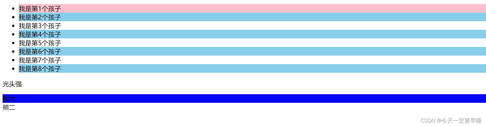
小结 :
结构伪类选择器一般用于选择父级里面的第几个孩子;
无序列表ul,肯定用nth-child更多;
关于nth-child (n),括号里面的n是从0开始的,且括号里只能是n;
nth-child 是对父元素里面所有的孩子进行排序选择,先找第n个,再看类型和E是否匹配;
nth-of-type 是对父元素里指定类型的孩子进行排序选择,先去匹配E,再找E的第n个孩子;
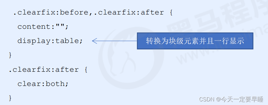
(3)伪元素选择器 “::”
伪元素选择器可以帮助我们利用CSS创建新标签元素,而不需要HTML标签,从而简化HTML结构。
语法:element可以是任何标签,content属性必须写。
 element::before {
        content : ' ';
}
 element::after  {
        content : ' ';
} , 注:
1 新创建的这个元素在文档树中是找不到的,所以我们称为伪元素
2 before 在父元素内容的前面创建元素,after 在父元素内容的后面插入元素
3 伪元素选择器和标签选择器一样,权重为 1 (div::after 的权重是2 )
使用场景1:用伪元素来设置字体图标
代码:
<!DOCTYPE html>
<html lang="en">
<head>
<meta charset="UTF-8">
<meta http-equiv="X-UA-Compatible" content="IE=edge">
<meta name="viewport" content="width=device-width, initial-scale=1.0">
<title>伪元素使用场景1(字体图标</title>
<style>
/* 字体图标的声明 */
@font-face {
font-family: 'icomoon';
src: url('fonts/icomoon.eot?rdxmah');
src: url('fonts/icomoon.eot?rdxmah#iefix') format('embedded-opentype'),
url('fonts/icomoon.ttf?rdxmah') format('truetype'),
url('fonts/icomoon.woff?rdxmah') format('woff'),
url('fonts/icomoon.svg?rdxmah#icomoon') format('svg');
font-weight: normal;
font-style: normal;
font-display: block;
}
div {
position: relative;
height: 30px;
width: 200px;
border: 2px solid red;
}
div::after {
/* 子绝父相 */
position: absolute;
top: 8px;
right: 10px;
font-size: 16px;
font-weight: 700;
/* 以下两行是使用字体图标必须的 */
font-family: 'icomoon';
content: '\ea42';
/* content:''; */
color: red;
}
</style>
</head>
<body>
<!-- 这样就不用再div里添加其他的盒子了 -->
<div></div>
</body>
</html>效果:
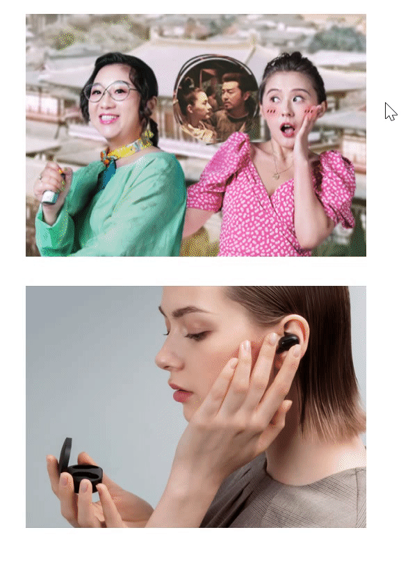
使用场景2:用伪元素来设置土豆网-遮罩层
代码:
<!DOCTYPE html>
<html lang="en">

<head>
    <meta charset="UTF-8">
    <meta http-equiv="X-UA-Compatible" content="IE=edge">
    <meta name="viewport" content="width=device-width, initial-scale=1.0">
    <title>伪元素使用场景2(土豆网遮罩层)</title>
    <style>
        div {
            position: relative;
            width: 350px;
            height: 249px;
            margin: 30px auto;
        }

        img {
            width: 100%;
            height: 100%;
        }

        /* 伪元素 */
        div::after {
            /* 子绝父相,加了绝对定位的可以直接设置高度和宽度 */
            position: absolute;
            top: 0;
            right: 0;
            width: 100%;
            height: 100%;
            /* 遮罩层的设置,背景色和背景图可以一起设置 */
            background: rgba(0, 0, 0, .6) url(images/arr.png) no-repeat center;
            /* content是伪元素必有的,就算里面为空 */
            content: '';
            /* 隐藏伪元素 */
            display: none;
        }

        /* 鼠标经过div时,将div里面的伪元素显示出来 */
        div:hover::after {
            display: block;
        }
    </style>
</head>

<body>
    <div>
        <img src="images/tudou.jpg" alt="">
    </div>
    <div>
        <img src="images/airdots.jpg" alt="">
    </div>
</body>

</html>
效果:
使用场景3:用伪元素来清除浮动
第一种清除浮动的方法:额外标签法
第二种清除浮动的方法:

第三种清除浮动的方法:
注 :后面两种伪元素清除浮动是额外标签法(在最后一个盒子后面添加一个盒子(必须是块级元素),设置clear:both;)的升级和优化。
2.2 CSS3 盒子模型
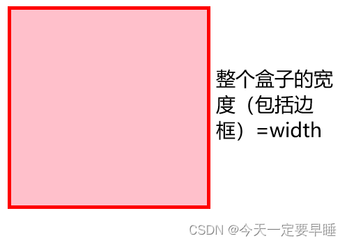
CSS3 中可以通过 box-sizing 来指定盒模型。
可以分成两种情况:
1. box-sizing: content-box 盒子大小为 width + padding + border (以前默认的)
2. box-sizing: border-box 盒子大小为 width
注:
如果盒子模型我们改为了box-sizing: border-box , 那padding和border就不会撑大盒子
(前提是padding和border不会超过width宽度)
代码:
<!DOCTYPE html>
<html lang="en">

<head>
    <meta charset="UTF-8">
    <meta http-equiv="X-UA-Compatible" content="IE=edge">
    <meta name="viewport" content="width=device-width, initial-scale=1.0">
    <title>CSS3-盒子模型</title>
    <style>
        div {
            width: 200px;
            height: 200px;
            border: 4px solid red;
            background-color: pink;
            /* 盒子大小=width 和 height */
            box-sizing: border-box;
            /* 盒子大小默认=盒子+内外边距 */
            box-sizing: content-box;
        }
    </style>
</head>

<body>
    <div></div>
</body>

</html>
效果:
2.3 CSS3 的其他特性(了解)
1)图片变模糊 blur( )函数
括号里的数值越大,越模糊,数值要加单位px。
代码:
<!DOCTYPE html>
<html lang="en">

<head>
    <meta charset="UTF-8">
    <meta http-equiv="X-UA-Compatible" content="IE=edge">
    <meta name="viewport" content="width=device-width, initial-scale=1.0">
    <title>CSS3-图片变模糊函数</title>
    <style>
        img {
            width: 300px;
            filter: blur(5px);
        }
    </style>
</head>

<body>
    <img src="images/airdots.jpg" alt="">
</body>

</html>
效果:

2)计算盒子大小 calc( ) 函数
括号里面可以使用 + - * / 来进行计算。
代码:
<!DOCTYPE html>
<html lang="en">

<head>
    <meta charset="UTF-8">
    <meta http-equiv="X-UA-Compatible" content="IE=edge">
    <meta name="viewport" content="width=device-width, initial-scale=1.0">
    <title>CSS3-calc函数计算大小</title>
    <style>
        .father {
            width: 200px;
            height: 200px;
            background-color: pink;
        }

        .son {
            /* 设置子元素的宽度永远比父元素的宽度多10px */
            width: calc(100% - 60px);
            height: calc(10px + 10px);
            background-color: aqua;
        }
    </style>
</head>

<body>
    <div class="father">
        <div class="son"></div>
    </div>
</body>

</html>
效果:
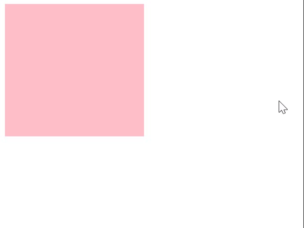
2.4 CSS3 过渡(重点)
过渡动画: 是从一个状态 渐渐的过渡到另外一个状态,经常和 :hover 一起 搭配使用
过渡可以让页面更好看,更动感十足,虽然 低版本浏览器不支持(ie9以下版本) 但是不会影响页面布局。
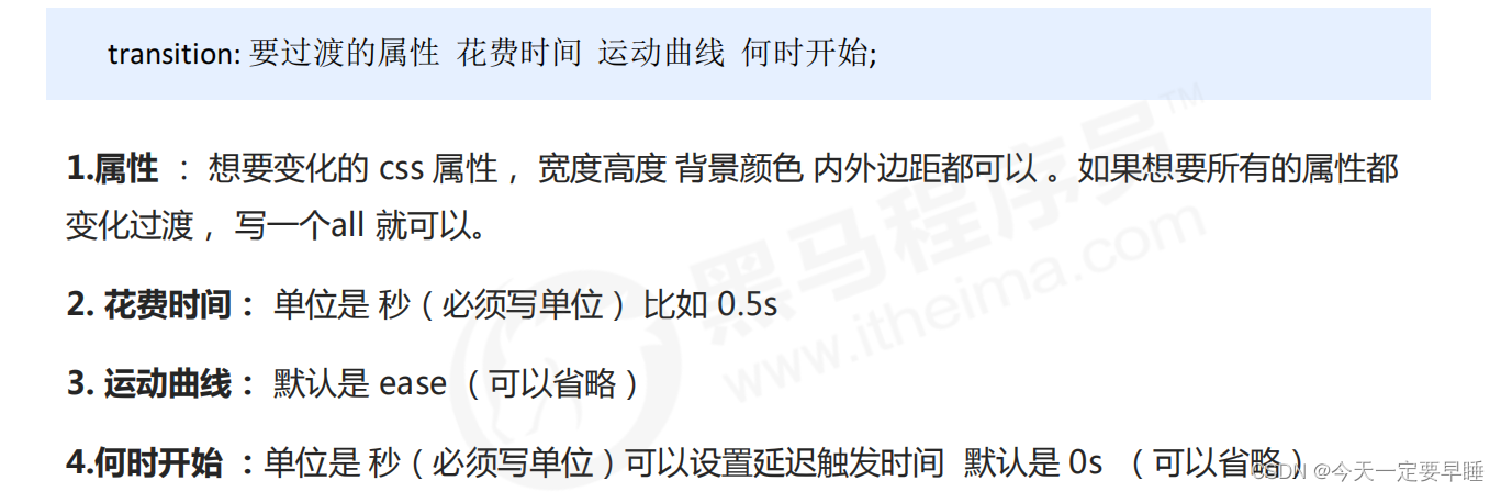
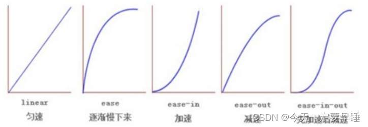
注 :谁做过渡给谁加transition。
代码:
<!DOCTYPE html>
<html lang="en">

<head>
    <meta charset="UTF-8">
    <meta http-equiv="X-UA-Compatible" content="IE=edge">
    <meta name="viewport" content="width=device-width, initial-scale=1.0">
    <title>CSS3-过渡</title>
    <style>
        div {
            width: 200px;
            height: 190px;
            background-color: pink;
            /* transition: 变化属性 花费时间 变化曲线 何时开始;
               注意时间的单位一定要加
               写all(是所有属性都要变) */
            /* transition: all 0.5s ease 1s; */
            /* 变化多个属性用逗号隔开 */
            transition: width 0.5s ease 1s, height 0.5s ease 1s;
        }

        div:hover {
            width: 300px;
            height: 290px;
        }
    </style>
</head>

<body>
    <div></div>
</body>

</html>
效果:
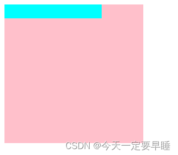
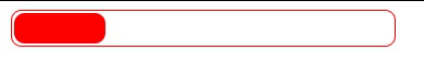
例:进度条的做法
代码:
<!DOCTYPE html>
<html lang="en">

<head>
    <meta charset="UTF-8">
    <meta http-equiv="X-UA-Compatible" content="IE=edge">
    <meta name="viewport" content="width=device-width, initial-scale=1.0">
    <title>CSS3过渡练习-进度条</title>
    <style>
        .bar {
            width: 249px;
            height: 20px;
            border-radius: 7px;
            border: 1px solid red;
            padding: 1px;
        }

        .bar_in {
            width: 60px;
            height: 100%;
            border-radius: 7px;
            background-color: red;
            /* 谁做过渡给谁加 */
            transition: width 0.5s;
        }

        .bar:hover .bar_in {
            width: 150px;
        }
    </style>
</head>

<body>
    <div class="bar">
        <div class="bar_in"></div>
    </div>

</body>

</html>
效果:
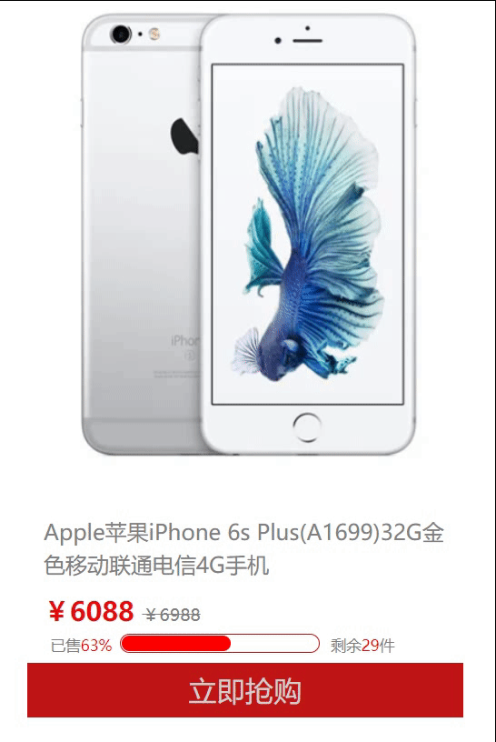
课后作业1 :侧边布局(含进度条)
代码:
<!DOCTYPE html>
<html lang="en">

<head>
    <meta charset="UTF-8">
    <meta http-equiv="X-UA-Compatible" content="IE=edge">
    <meta name="viewport" content="width=device-width, initial-scale=1.0">
    <title>过渡练习-侧面布局含进度条</title>
    <style>
        .box {
            width: 400px;
            height: 700px;
            /* background-color: rgb(250, 156, 156); */
            margin: 20px auto;
        }

        header {
            height: 435px;
            background: white url("images/iphone6.png") no-repeat center;
        }

        section {
            width: 100%;
            height: 90px;
        }

        h4 {
            height: 30px;
            line-height: 30px;
            font-weight: 400;
            font-size: 20px;
            padding: 15px;
            color: gray;
        }

        .price {
            margin-left: 15px;
            font-weight: 700;
            font-size: 24px;
            color: rgb(228, 13, 13);
        }

        .price::after {
            content: "¥6988";
            font-weight: 400;
            font-size: 16px;
            color: gray;
            text-decoration: line-through;
        }

        .quantity {
            position: relative;
            width: 179px;
            height: 14px;
            border: 1px solid rgb(191, 21, 21);
            border-radius: 10px;
            padding: 1px;
            margin: 5px 0 0 85px;

        }

        .quantity .bar_in {
            width: 100px;
            height: 100%;
            border-radius: 10px;
            background-color: red;
            transition: width 0.5s;
        }

        .quantity .already,
        .quantity .last {
            position: absolute;
            font-size: 14px;
            color: gray;
        }

        .quantity .already {
            top: 0;
            left: -65px;
        }

        .quantity .last {
            top: 0;
            right: -70px;
        }

        .quantity .already span,
        .quantity .last span {
            color: red;
        }

        .quntity:hover .bar_in {
            width: 120px;
        }

        footer {
            width: 100%;
            height: 50px;
            line-height: 50px;
            text-align: center;
            font-size: 26px;
            margin-top: 60px;
            color: #d2cfcf;
            background-color: rgb(191, 21, 21);
        }
    </style>
</head>

<body>
    <div class="box">
        <header></header>
        <section>
            <h4>Apple苹果iPhone 6s Plus(A1699)32G金色移动联通电信4G手机</h4>
            <div class="price">¥6088 </div>
            <div class="quantity">
                <div class="bar_in"></div>
                <div class="already">已售<span>63%</span></div>
                <div class="last">剩余<span>29</span>件</div>
            </div>
        </section>
        <footer>立即抢购</footer>
    </div>
</body>

</html>
效果:
课后作业2:利用过渡做小米图标的变化
代码:
<!DOCTYPE html>
<html lang="en">
<head>
<meta charset="UTF-8">
<meta http-equiv="X-UA-Compatible" content="IE=edge">
<meta name="viewport" content="width=device-width, initial-scale=1.0">
<title>过渡练习-小米图标的变化</title>
<style>
/* 字体声明 */
@font-face {
font-family: 'icomoon';
src: url('fonts/icomoon.eot?cea4rv');
src: url('fonts/icomoon.eot?cea4rv#iefix') format('embedded-opentype'),
url('fonts/icomoon.ttf?cea4rv') format('truetype'),
url('fonts/icomoon.woff?cea4rv') format('woff'),
url('fonts/icomoon.svg?cea4rv#icomoon') format('svg');
font-weight: normal;
font-style: normal;
font-display: block;
}
body {
background-color: rgb(142, 183, 226);
}
.box {
position: relative;
width: 130px;
height: 57px;
margin-left: 30px;
}
.logo1,
.logo2 {
/* 让两个盒子在一行,一左一右 */
display: inline-block;
/* 让两个盒子圆角 */
border-radius: 10px;
}
.logo1 {
position: absolute;
top: 0;
left: 0;
width: 65px;
height: 57px;
background-image: url("images/xiaomi.png");
background-repeat: no-repeat;
}
.logo2 {
position: absolute;
top: 0;
right: 0;
width: 65px;
height: 57px;
/* 字体图标水平居中,垂直居中 */
line-height: 57px;
text-align: center;
/* 字体图标必要的一步: */
font-family: 'icomoon';
font-size: 45px;
font-weight: 400;
color: rgb(255, 255, 255);
background-color: rgb(255, 105, 0);
/* 过渡效果 */
transition: left 5s ease 0.1s;
/* 暂时隐藏 */
display: none;
}
.box:hover .logo2 {
/* 鼠标点到的时候再显示 */
display: block;
left: 0px;
}
</style>
</head>
<body>
<div class="box">
<div class="logo1"></div>
<div class="logo2"></div>
</div>
</body>
</html>效果:


 扫一扫
扫一扫


 518
518

 被折叠的 条评论
为什么被折叠?
被折叠的 条评论
为什么被折叠?
 到【灌水乐园】发言


