


 本文详细介绍了Flutter中的TextField组件,特别是decoration属性如何控制输入框的提示信息样式,包括icon、labelText、helperText、errorText、hintText等属性的用法,以及InputDecoration如何调整输入框的外边框样式。
浅识Flutter 基本组件之TextField组件 输入框decoration属性
decoration
decoration属性用于设置输人框的修饰。该属性值为InputDecoration类型。控制输入框外观以及提示信息的样式。
InputDecoration控制输人框提示信息样式的常用属性
如下:
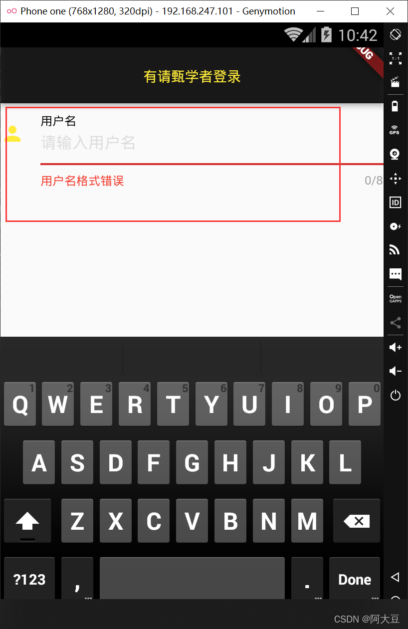
(1)icon:设置输人框左侧显示图标。
(2) labelText:设置输入框描述信息,当输入框获取焦点时默认会浮动到上方。
(3) helperText: 设置输人框辅助信息,位于输人框下方。
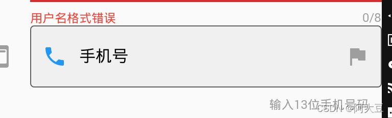
(4)errorText:设置输人框中内容输人错误时的错误提示信息。
(5) hintText: 设置输人框内的提示信息。该属性可以与hintStyle属性配合使用,intStyle属性用于设置输人框内提示信息的文本样式,它的属性值为TextStyle类型。
    decoration: InputDecoration(
            icon: Icon(Icons.person),
            labelText: '用户名',
            labelStyle: TextStyle(color: Colors.black),
            helperText: '用户名只能由字母和数字组成',
            helperStyle: TextStyle(color: Colors.grey),
            errorText: '用户名格式错误',
          errorStyle: TextStyle(color:Colors.red),
          hintText: '请输入用户名',
          hintStyle: TextStyle(color: Colors.black12)
        ),
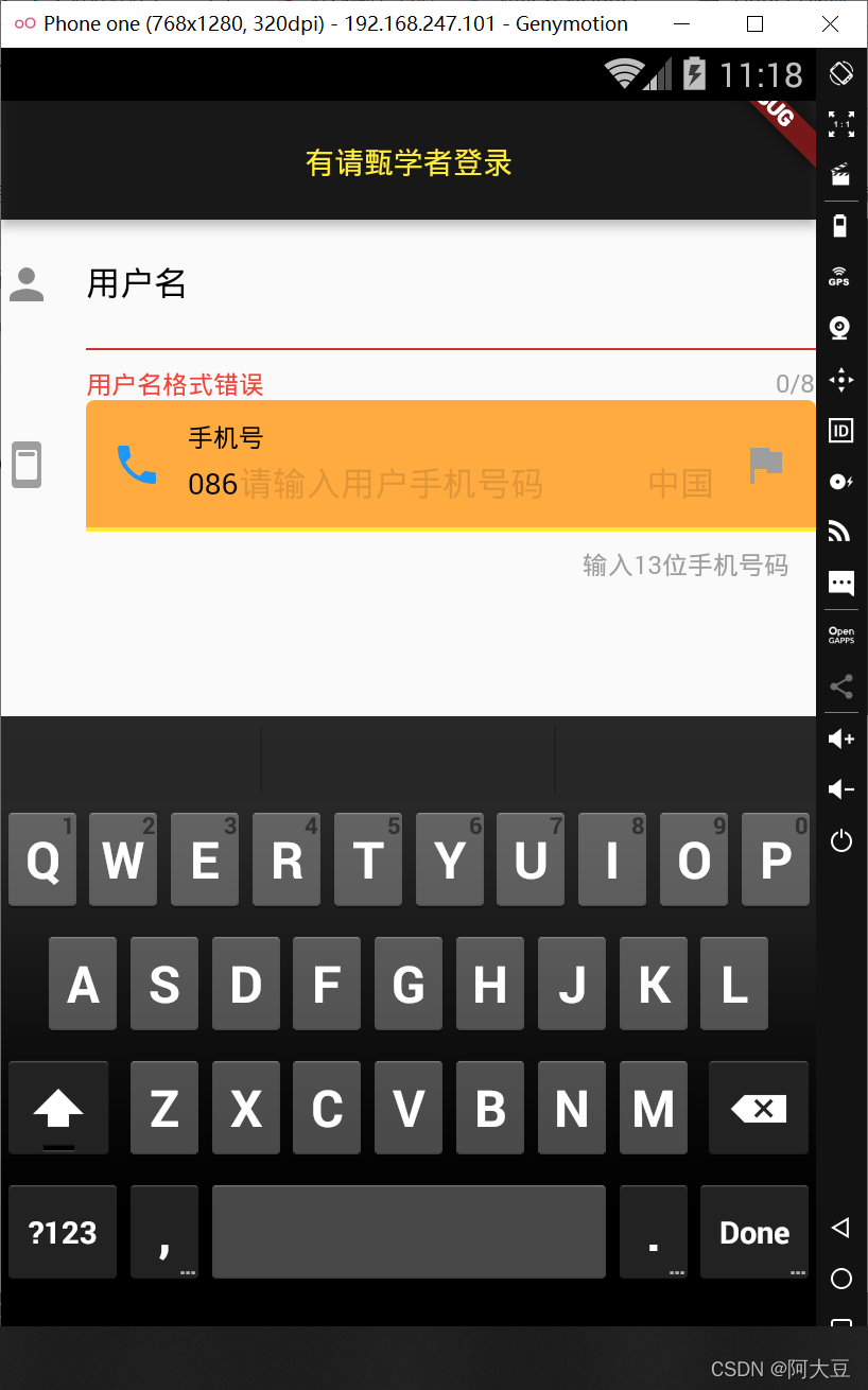
(6)prefixlcon:设置输人框内的前置图标,使用方法与icon属性一样,但图标位于icon属性所设置图标的右侧。
(7) prefixText: 设置输入框内的前置文本,该属性可以与prefixStyle属性配合使用,prefixStyle属性用于 设置输人框内前置的文本样式,它的属性值为TextStyle类型。
(8)suffixlcon:设置输人框内的后置图标,使用方法与icon属性一样,但图标位于输入框的右侧。
(9) suffixText: 设置输 人框内的后置文本,该属性可以与suffixStyle属性配合使用,prefixStyle属性 用于设置输入框内后置的文本样式,它的属性值为TextStyle类型。
(10) counterText: 设置输人框右下方显示的文本,常用于显示输入的字符数量,该属性可以与counterStyle属性配合使用,counterStyle属性用于设置输人框右下方的文本样式,它的属性值为TextStyle类型。
(11) counter: 设置输人框右下方的Widget小组件, 但不能与counterText同时使用.
(12) filled: 设置填充输人框的背景色,如果它的值为true,则用fllColor属性指定的颜色作为输人框的背景色。fllColor属性用 于设置输人框的背景颜色,它的属性值类型为Color类型.
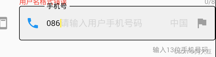
TextField(
maxLength: 13,
maxLengthEnforced: false,
maxLines: 1,
// obscureText: true,
enableInteractiveSelection: false,
textCapitalization: TextCapitalization.words,
// keyboardType:TextInputType.emailAddress// 设置输入内容时软键盘的类型
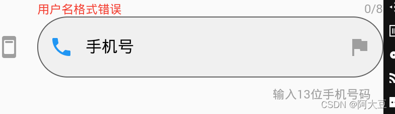
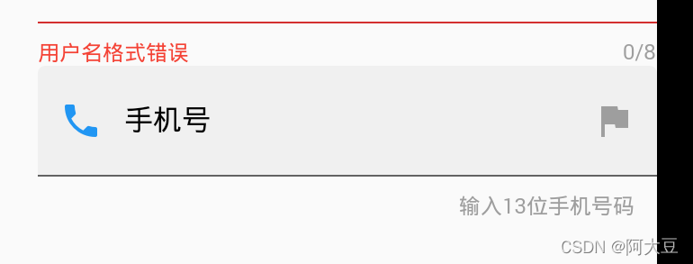
decoration: InputDecoration(
icon: Icon(Icons.ad_units_rounded,color: Colors.grey ,),
labelText: '手机号',
labelStyle: TextStyle(color: Colors.black),
hintText: '请输入用户手机号码',
hintStyle: TextStyle(color: Colors.black12),
prefixText: '086',
prefixStyle: TextStyle(color: Colors.black),
prefixIcon: Icon(Icons.phone,color: Colors.blue,),
suffixText: '中国',
suffixIcon: Icon(Icons.flag,color: Colors.grey),
counterText: '输入13位手机号码',
counterStyle: TextStyle(color: Colors.grey),
// counter: Text('输入13位手机号码')
filled: true,
fillColor: Colors.orangeAccent
),
),
InputDecoration控制输入
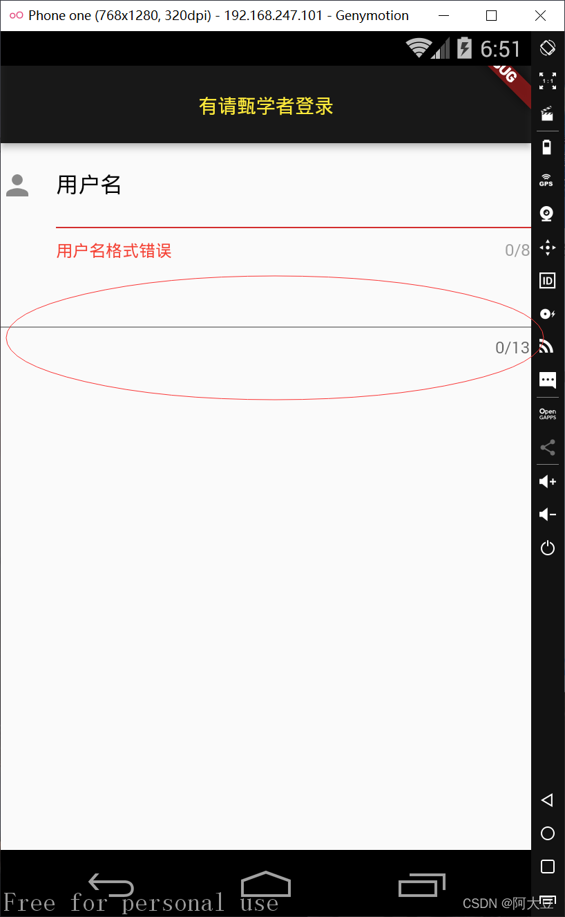
框外边框样式的常用属性.
外边框的默认样式是一个灰色的

(1) border: 设置输人框的边框线。默认有边框线,在输人框没有获得焦点时,外边框线为灰色;在输入框获得焦点时,外边框线为主题色。
该属性值可以为:
border:InputBorder.none,设置输人框无边框线;

border: OutlineInputBorder(),设置输人框边框线样式;
设置外边框的样式:
    border: OutlineInputBorder(
      borderRadius: BorderRadius.all(Radius.circular(30))//边角为30的方框
    )
UnderlineInputBorder,设置输人框下边框线样式,
(2) enabledBorder:设置可用状态输入框的边框线颜色、边角弧度等,该属性值与border属性相同。
enabledBorder: OutlineInputBorder(
          borderRadius: BorderRadius.all(Radius.circular(60)), //边角为30的方框
          borderSide: BorderSide(color: Colors.red,width:10)//设置边框线的颜色和粗细
      )
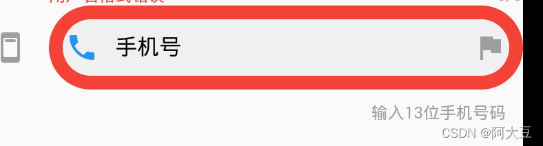
(3) focusedBorder:
设置获得焦点时输入框的边框线的颜色、边角弧度等,使用方法与enabledBorder属性相同。
focusedBorder:OutlineInputBorder()
点击前
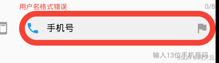
点击输入后

完整代码:
import 'package:flutter/cupertino.dart';
import 'package:flutter/material.dart';

class denglupage extends StatelessWidget {
  InputDecoration inputDecoration = InputDecoration(
      icon: Icon(
        Icons.ad_units_rounded,
        color: Colors.grey,
      ),
      labelText: '手机号',
      labelStyle: TextStyle(color: Colors.black),
      hintText: '请输入用户手机号码',
      hintStyle: TextStyle(color: Colors.black12),
      prefixText: '086',
      prefixStyle: TextStyle(color: Colors.black),
      prefixIcon: Icon(
        Icons.phone,
        color: Colors.blue,
      ),
      suffixText: '中国',
      suffixIcon: Icon(Icons.flag, color: Colors.grey),
      counterText: '输入13位手机号码',
      counterStyle: TextStyle(color: Colors.grey),
      // counter: Text('输入13位手机号码')
      filled: true, //设置填充输人框的背景色,
      // fillColor: Colors.orangeAccent
      // border: UnderlineInputBorder( )
      enabledBorder: OutlineInputBorder(
          borderRadius: BorderRadius.all(Radius.circular(60)), //边角为30的方框
          borderSide: BorderSide(color: Colors.red,width:10)//设置边框线的颜色和粗细
      ),
      focusedBorder:OutlineInputBorder()
  );
  @override
  Widget build(BuildContext context) {
    return Scaffold(
        appBar: AppBar(
          centerTitle: true,
          title: Text('有请甄学者登录'),
          titleTextStyle: TextStyle(color: Colors.yellow),
          backgroundColor: Colors.black87,
        ),
        body: Column(children: <Widget>[
          TextField(
            maxLength: 8,
            maxLengthEnforced: false,
            maxLines: 1,
            // obscureText: true,
            enableInteractiveSelection: false,
            textCapitalization: TextCapitalization.words,
            // keyboardType:TextInputType.emailAddress// 设置输入内容时软键盘的类型
            decoration: InputDecoration(
                icon: Icon(Icons.person),
                labelText: '用户名',
                labelStyle: TextStyle(color: Colors.black),
                helperText: '用户名只能由字母和数字组成',
                helperStyle: TextStyle(color: Colors.grey),
                errorText: '用户名格式错误',
                errorStyle: TextStyle(color: Colors.red),
                hintText: '请输入用户名',
                hintStyle: TextStyle(color: Colors.black12)),
          ),
          TextField(
            maxLength: 13,
            maxLengthEnforced: false,
            maxLines: 1,
            // obscureText: true,
            enableInteractiveSelection: false,
            textCapitalization: TextCapitalization.words,
            // keyboardType:TextInputType.emailAddress// 设置输入内容时软键盘的类型
            decoration: inputDecoration,
          ),
        ]

            // TextField delegate method
            ));
    // theme:ThemeData(primaryColor: Colors.black38)));
  }
}


 扫一扫
扫一扫


 4840
4840

 被折叠的 条评论
为什么被折叠?
被折叠的 条评论
为什么被折叠?
 到【灌水乐园】发言


