


3.1 view组件
view===>视图容器,相当于HTML中的div标签
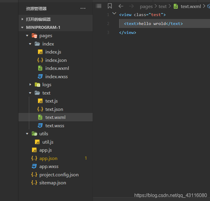
示例代码:
wxml:
    <view class="test">
      <text>hello world</text>
    </view>

wxcss:
    .test{
      background-color: aqua;
    }
代码位置与格式如下图
3.2 icon组件
icon===>图标
示例代码:
<icon type="success" size="40" color="red"/>
3.3 progress组件
progress===>进度条
示例代码:
<progress percent="20" show-info />
<progress percent="40" stroke-width="12" />
<progress percent="60" color="pink" />
<progress percent="80" active />
3.4 text组件
text===>文本
示例代码:
<text selectable='true' space='nbsp'>hello world</text>
3.5 scroll-view组件
scroll-view===>可滚动视图区域。使用竖向滚动时,需要给scroll-view一个固定高度,通过 WXSS 设置 height。组件属性的长度单位默认为px,2.4.0起支持传入单位(rpx/px)。
示例代码:
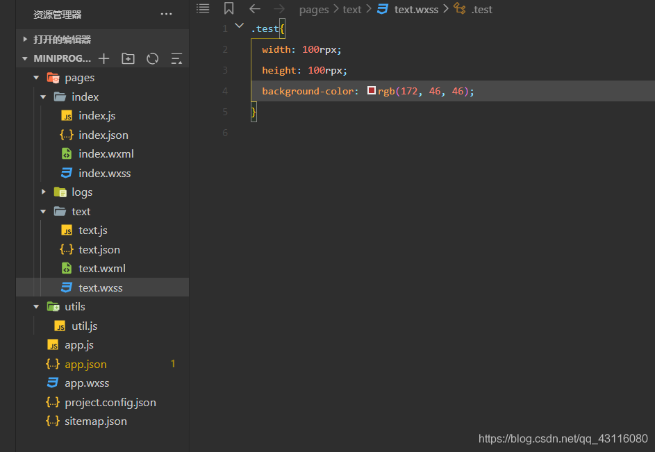
注:css样式的类名称为了方便随便起的,平时写代码不建议这么做
.e{
  height: 400rpx;
  width: 200rpx;

 background-color: rgb(230, 26, 26);
}
.aa{
  height: 200rpx;
  width: 300rpx;
background-color: rgb(221, 238, 74);
}
.bb{
  width: 200rpx;
  height: 200rpx;
background-color: rgb(37, 131, 68);
}
.cc{
  width: 200rpx;
  height: 200rpx;
background-color: rgba(105, 46, 160, 0.473);
}
wxml
<scroll-view  scroll-y="true" scroll-x="true" class="e" >
  <view class="aa"></view>
  <view class="bb"></view>
  <view class="cc"></view>
</scroll-view>
3.6 swiper组件
swiper===>滑块视图容器。其中只可放置swiper-item组件,否则会导致未定义的行为。
示例代码:
<swiper indicator-dots="true" autoplay="true" circular="true" duration="100" >
  <swiper-item><view class="aa"></view></swiper-item>
  <swiper-item><view class="bb"></view></swiper-item>
  <swiper-item><view class="cc"></view></swiper-item>
</swiper>
wxss样式一如3.5scroll-view中的代码
scroll-view组件的高度为400rpx宽度为200rpx
三个view块高度均为200rpx
黄色宽度是300rpx
其余宽度为200rpx
注:只有当scroll-view内容器的大小超出为scroll-view组件设置的大下时才会显示滚动条
效果图如下
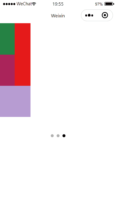
重新看过后觉得可拖拽滑块scroll-view那里没写清楚,他就是相当于一个区域,你给定他宽高,当里面的view1的比区域的宽时,view可以左右拖拽这时,与区域同宽度的view2会随着view1被拖动,如上面的gif,露出的红色部分则为区域的颜色。


 扫一扫
扫一扫


 被折叠的 条评论
为什么被折叠?
被折叠的 条评论
为什么被折叠?
 到【灌水乐园】发言


