


 本文介绍如何使用纯CSS3实现一个小人来回移动并碰到小球使其消失的动画效果。通过巧妙利用CSS3的transform、animation及@keyframes属性,详细展示了小人嘴巴开合、左右移动及小球透明度变化的动画制作过程。
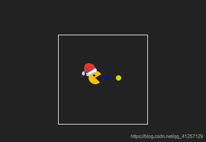
纯css3的动画做效果:
小人来回移动,碰到小球时,小球消失。
首先,html搭建结构:
<body>
    <div class="wrapper">
        <div class="move-box">
            <div class="move-top"></div>
            <div class="move-down"></div>
            <div class="eyes"></div>
            <img src="images/hat.png" alt="">
        </div>
        <ul>
            <li></li>
            <li></li>
            <li></li>
        </ul>
    </div>
</body>
css布局:
要点1:
这个移动的小人是用两个半圆来实现:move-top和move-down这两个子。看似一个圆构成,但要做出嘴巴张开与闭合这个效果,一个圆是不能做出来的,采用两个圆定位重叠,用css的clip属性将一个圆的上半部分裁掉,将另一个圆的下半部分裁掉,这样形成一个整圆。
小人在移动过程中,嘴巴的张开与闭合这个效果,用到css3中的
transform:rotate(),move-top上半圆使用rotate(-30deg),move-down下半圆使用rotate(45deg),在配合使用css3的animation动画来实现嘴巴的重复的张开和闭合。animation的关键帧@keyframes animation-move-top{…}实现过程如下。
要点2:
小人来回移动也是css3动画实现。在这一过程中最要注意的是小人在左右旋转的位置,以及小人位置的变化(left的变化)。这个动画的最好的多分几个时期,这里我使用了5个阶段。animation的关键帧@keyframes animation-move-box{…}代码如下。
要点3:
小球的显示与消失,也同样是css3动画实现。主要的是用opacity透明度来实现。animation的关键帧 @keyframes animation-opacity{…}如下。
小结: 这个纯css3实现的一个loading,核心就是使用css3的一些属性,
transform、animation以及@keyframes.设置动画时,要注意其动画持续时间、动画播放次数、动画的延迟、动画反方向问题。
 <style>
        * {
            padding: 0;
            margin: 0;
            list-style: none;
        }
        body,html {
            height: 100%;
            width: 100%;
            background-color: #222;
        }
        .wrapper {
            width: 200px;
            height: 200px;
            border:1px solid #ffffff;
            margin: 100px auto;
            position: relative;
        }
        .wrapper .move-box {
            position: absolute;
            width: 30px;
            height: 30px;
            top: 40%;
            left: 25%;
            z-index: 99;
            animation: animation-move-box 7s infinite linear ;
        }
        .move-box .move-top,
        .move-box .move-down
         {
            position: absolute;
            top: 0;
            left: 0;
            width: 30px;
            height: 30px;
            /* border: 1px solid #fff; */
            background-color: #FBBC05;
            border-radius: 50%;
        }
        .move-box .move-top {
            clip:rect(0px,30px,15px,0px);
            /* 旋转-30deg */
            /* transform: rotate(-30deg); */
            animation: animation-move-top 0.4s infinite ease alternate;
        }
        .move-box .move-down {
            clip:rect(15px,30px,30px,0);
            /* 旋转45deg */
            /* transform: rotate(45deg); */
            animation: animation-move-down 0.4s infinite ease alternate;
        }
        .move-box .eyes {
            width: 3px;
            height: 3px;
            border:1px solid #222;
            border-radius: 50%;
            background-color: #222;
            position: absolute;
            top: 8px;
            left: 10px;
        }
        .move-box img {
            width: 35px;
            height: 32px;
            position: absolute;
            top:-17px;
            left: -16px;
        }
        .wrapper ul{
            position: absolute;
            padding-left: 25px;
            top: 45%;
            left: 25%;
            width: 100px;
            height: 15px;
        }
        .wrapper li {
            width: 12px;
            height: 12px;
            background-color: red;
            float: left;
            border-radius: 50%;
            margin-right: 15px;
            animation: animation-opacity 3s linear infinite ;
        }

        .wrapper li:nth-child(2){
            background-color: blue;
            animation: animation-opacity 3s linear infinite 1s;
        }
        .wrapper li:nth-child(3){
            background-color:yellow;
            animation: animation-opacity 3s linear infinite 1.5s;
        }
        @keyframes animation-opacity{
            0% {
                opacity: 1;
            }
            50% {
                opacity: 0;
            }
            100% {
                opacity: 1;
            }
        }
        @keyframes animation-move-top{
            0% {
                transform: rotate(0);
            }
            100% {
                transform: rotate(-30deg);
            }
        }
        @keyframes animation-move-down {
            0%{
                transform: rotate(0);
            }
            100%{
                transform: rotate(45deg);
            }
        }
        @keyframes animation-move-box {
            0%{
                left:20%;
                transform: rotateY(0);
            }
            45%{
                left: 75%;
                transform: rotateY(0);
            }
            50% {
                left: 75%;
                transform: rotateY(180deg);
            }
            95% {
                left: 20%;
                transform: rotateY(180deg);
            }
            100% {
                left:20%;
                transform: rotateY(0);
            }
        }
    </style>


 扫一扫
扫一扫


 377
377

 被折叠的 条评论
为什么被折叠?
被折叠的 条评论
为什么被折叠?
 到【灌水乐园】发言


