


本文转自:玩转AppBarLayout,更酷炫的顶部栏
关于CoordinatorLayout:CoordinatorLayout的使用如此简单
1.ToolBar
Toobar主要是用来替换ActionBar的,换句话说,ActionBar能做的,Toolbar都能做。首先,先隐藏ActionBar,隐藏ActionBar的方法有很多,这里提供一种—传送门
接下来就在activity_main中加入一个toolbar
<?xml version="1.0" encoding="utf-8"?>
<LinearLayout xmlns:android="http://schemas.android.com/apk/res/android"
    xmlns:tools="http://schemas.android.com/tools"
    android:layout_width="match_parent"
    android:layout_height="match_parent"
    tools:context=".MainActivity">
  <androidx.appcompat.widget.Toolbar
      android:id="@+id/tool_bar"
      android:layout_width="match_parent"
      android:layout_height="?actionBarSize">
  </androidx.appcompat.widget.Toolbar>
</LinearLayout>
将Toobar作为“ActionBar”来用
public class MainActivity extends AppCompatActivity {
@Override
protected void onCreate(Bundle savedInstanceState) {
super.onCreate(savedInstanceState);
setContentView(R.layout.activity_main);
Toolbar toolbar=findViewById(R.id.tool_bar);
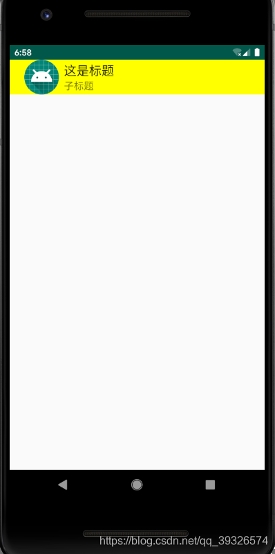
toolbar.setTitle("这是标题");
toolbar.setSubtitle("子标题");
toolbar.setBackgroundColor(Color.YELLOW);
toolbar.setLogo(R.mipmap.ic_launcher);
setSupportActionBar(toolbar);
}
}
可以对Toolbar设置Logo、标题、子标题等等,也可在布局文件中设置,hongyang大神有篇博客写的挺好的《 Android 5.x Theme 与 ToolBar 实战 》可以去参考一下。
在布局中设置
<androidx.appcompat.widget.Toolbar
      android:id="@+id/tool_bar"
      app:title="标题"
      app:subtitle="子标题"
      app:logo="@mipmap/ic_launcher"
      android:background="#ffff00"
      android:layout_width="match_parent"
      android:layout_height="?actionBarSize">
  </androidx.appcompat.widget.Toolbar>
看效果
2.AppBarLayout
AppBarLayout继承自LinearLayout,布局方向为垂直方向。所以你可以把它当成垂直布局的LinearLayout来使用。AppBarLayout是在LinearLayou上加了一些材料设计的概念,它可以让你定制当某个可滚动View的滚动手势发生变化时,其内部的子View实现何种动作。
请注意:上面提到的某个可滚动View,可以理解为某个ScrollView。怎么理解上面的话呢?就是说,当某个ScrollView发生滚动时,你可以定制你的“顶部栏”应该执行哪些动作(如跟着一起滚动、保持不动等等)。那某个可移动的View到底是哪个可移动的View呢?这是由你自己指定的!如何指定,我们后面说。
2.1 AppBarLayout子View的动作
内部的子View通过在布局中加app:layout_scrollFlags设置执行的动作,那么app:layout_scrollFlags可以设置哪些动作呢?分别如下:
(1) scroll:值设为scroll的View会跟随滚动事件一起发生移动。
(2)enterAlways:值设为enterAlways的View,当ScrollView往下滚动时,该View会直接往下滚动。而不用考虑ScrollView是否在滚动。
(3) exitUntilCollapsed:值设为exitUntilCollapsed的View,当这个View要往上逐渐“消逝”时,会一直往上滑动,直到剩下的的高度达到它的最小高度后,再响应ScrollView的内部滑动事件。
(4) enterAlwaysCollapsed:是enterAlways的附加选项,一般跟enterAlways一起使用,它是指,View在往下“出现”的时候,首先是enterAlways效果,当View的高度达到最小高度时,View就暂时不去往下滚动,直到ScrollView滑动到顶部不再滑动时,View再继续往下滑动,直到滑到View的顶部结束。
2.2将AppBarLayout与NestedScrollView关联起来
前面说了一直反复说“当ScrollView发生滚动时”,那么怎么将AppBarLayout与ScrollView关联起来呢?我们注意到,AppBarLayout与ScrollView之间动作“相互依赖”,这不就是我们上一篇CoordinatorLayout的使用如此简单所学的内容吗?把ScrollView和AppBarLayout作为CoordinateLayout的子View,然后编写一个Behavior,在这个Behavior里面判断当前的操作是应该让ScrollView时刻保持在AppBarLayout之下(即只要改变AppBarLayout的位置就可以一起滑动),还是应该让ScrollView内部滚动而不让AppBarLayout位置发生变化等等这些需求,都是可以在Behavior里面处理的。这里使用NestedScrollView。
- NestedScrollView简介
NestedScrollView即 支持嵌套滑动的ScrollView。因此,我们可以简单的把NestedScrollView类比为ScrollView,其作用就是作为控件父布局,从而具备(嵌套)滑动功能。NestedScrollView与ScrollView的区别就在于NestedScrollView支持 嵌套滑动,无论是作为父控件还是子控件,嵌套滑动都支持,且默认开启。更多介绍:传送门
3.CollapsingToolbarLayout
CollapsingToolbarLayout是用来对Toolbar进行再次包装的ViewGroup,主要是用于实现折叠(其实就是看起来像伸缩~)的App Bar效果。它需要放在AppBarLayout布局里面,并且作为AppBarLayout的直接子View。CollapsingToolbarLayout主要包括几个功能:
(1) 折叠Title(Collapsing title):当布局内容全部显示出来时,title是最大的,但是随着View逐步移出屏幕顶部,title变得越来越小。你可以通过调用setTitle函数来设置title。
(2)内容纱布(Content scrim):根据滚动的位置是否到达一个阀值,来决定是否对View“盖上纱布”。可以通过setContentScrim(Drawable)来设置纱布的图片.
(3)状态栏纱布(Status bar scrim):根据滚动位置是否到达一个阀值决定是否对状态栏“盖上纱布”,你可以通过setStatusBarScrim(Drawable)来设置纱布图片,但是只能在LOLLIPOP设备上面有作用。
(4)视差滚动子View(Parallax scrolling children):子View可以选择在当前的布局当时是否以“视差”的方式来跟随滚动。(PS:其实就是让这个View的滚动的速度比其他正常滚动的View速度稍微慢一点)。将布局参数app:layout_collapseMode设为parallax
(5)将子View位置固定(Pinned position children):子View可以选择是否在全局空间上固定位置,这对于Toolbar来说非常有用,因为当布局在移动时,可以将Toolbar固定位置而不受移动的影响。 将app:layout_collapseMode设为pin。
上代码:
activity_main.xml
<?xml version="1.0" encoding="utf-8"?>
<androidx.coordinatorlayout.widget.CoordinatorLayout
    xmlns:android="http://schemas.android.com/apk/res/android"
    xmlns:app="http://schemas.android.com/apk/res-auto"
    xmlns:tools="http://schemas.android.com/tools"
    android:orientation="vertical"
    android:layout_width="match_parent"
    android:layout_height="match_parent"
    tools:context=".MainActivity"
    >
<com.google.android.material.appbar.AppBarLayout
    android:layout_width="match_parent"
    android:layout_height="200dp">
    <com.google.android.material.appbar.CollapsingToolbarLayout
        android:layout_width="match_parent"
        android:layout_height="match_parent"
        app:contentScrim="@color/colorPrimary"
        app:expandedTitleGravity="bottom|center"
        app:collapsedTitleGravity="center"
        app:layout_scrollFlags="scroll|exitUntilCollapsed">
   <ImageView
       android:src="@mipmap/ic_launcher"
       android:layout_width="match_parent"
       android:layout_height="match_parent" />
  <androidx.appcompat.widget.Toolbar
      android:id="@+id/tool_bar"
      android:layout_width="match_parent"
      android:layout_height="?actionBarSize"
      app:layout_scrollFlags="scroll">
  </androidx.appcompat.widget.Toolbar>
    </com.google.android.material.appbar.CollapsingToolbarLayout>
</com.google.android.material.appbar.AppBarLayout>
  <androidx.core.widget.NestedScrollView
      android:layout_width="match_parent"
      android:layout_height="wrap_content"
      app:layout_behavior="@string/appbar_scrolling_view_behavior">
   <LinearLayout
       android:layout_width="match_parent"
       android:layout_height="wrap_content">
     <TextView
         android:layout_width="match_parent"
         android:layout_height="wrap_content"
         android:text="@string/context"/>
   </LinearLayout>
  </androidx.core.widget.NestedScrollView>
</androidx.coordinatorlayout.widget.CoordinatorLayout>
- CollapsingToolbarLayout折叠后标题居中
app:collapsedTitleGravity="center"
- CollapsingToolbarLayout展开后标题居中
app:expandedTitleGravity="center";
MainActivity.java
public class MainActivity extends AppCompatActivity {

    @Override
    protected void onCreate(Bundle savedInstanceState) {
        super.onCreate(savedInstanceState);
        setContentView(R.layout.activity_main);
        Toolbar toolbar=findViewById(R.id.tool_bar);
        toolbar.setTitle("这是标题");
        toolbar.setSubtitle("子标题");
        setSupportActionBar(toolbar);
    }
}
上图(动态的传不了)


 扫一扫
扫一扫


 3037
3037

 被折叠的 条评论
为什么被折叠?
被折叠的 条评论
为什么被折叠?
 到【灌水乐园】发言


