


 当浏览器原生的单选框和设计风格不匹配时,可以使用CSS来自定义样式。方法是隐藏原生的单选框,然后通过标签和伪类创建新的视觉效果。文章提供了一个示例,展示如何使用HTML和CSS实现不同状态(如选中、禁用等)的自定义单选框。
还记得第一次在大项目中负责后台管理模块时,我们设计给出了个设计规范,其中就有自定义的单选框、复选框,当时一看到就头大,因为实在不知道如何下手,毕竟浏览器的单选框是浏览器自己的组件,样式是不归程序员管理的。
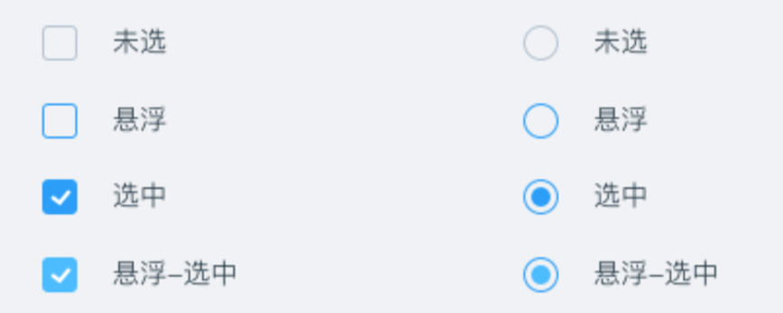
浏览器现在明白了,原生的单选框和设计风格不搭时,可以自定义,最好的实现方法就是借助原生的单选框再配合其他伪类。说白了就是把原生的单选框给隐藏了,然后通过伪类重新实现一个。
HTML 代码如下:
                    <div className={"cs-radio-test"}>
                        {/*原生单选项,写在前面*/}
                        <input type={"radio"} id={"radio"}/>
                        {/*label 元素模拟单选项*/}
                        <label htmlFor={"radio"} className={"cs-radio"}></label>
                        {/*单选文案*/}
                        <label htmlFor={"radio"}>单选项</label>
                    </div>
                    <div className={"cs-radio-test"}>
                        {/*原生单选项,写在前面*/}
                        <input type={"radio"} id={"radio1"} checked/>
                        {/*label 元素模拟单选项*/}
                        <label htmlFor={"radio1"} className={"cs-radio"}></label>
                        {/*单选文案*/}
                        <label htmlFor={"radio1"}>单选项 checked</label>
                    </div>
                    <div className={"cs-radio-test"}>
                        {/*原生单选项,写在前面*/}
                        <input type={"radio"} id={"radio2"} disabled/>
                        {/*label 元素模拟单选项*/}
                        <label htmlFor={"radio2"} className={"cs-radio"}></label>
                        {/*单选文案*/}
                        <label htmlFor={"radio2"}>单选项 disabled</label>
                    </div>
                    <div className={"cs-radio-test"}>
                        {/*原生单选项,写在前面*/}
                        <input type={"radio"} id={"radio3"} disabled checked/>
                        {/*label 元素模拟单选项*/}
                        <label htmlFor={"radio3"} className={"cs-radio"}></label>
                        {/*单选文案*/}
                        <label htmlFor={"radio3"}>单选项 checked + disabled</label>
                    </div>
CSS 样式如下:
//设置单选框透明度为 0 并覆盖其他元素
[type="radio"] {
  position: absolute;
  width: 20px;
  height: 20px;
  opacity: 0;
  cursor: pointer;
}

//自定义单选框演示
.cs-radio {
  //width: 1rem;
  //height: 1rem;
  display: inline-block;
  height: 20px;
  width: 20px;
  border:1px solid gray;
  border-radius: 50%;
  background-color: # fff;
  box-sizing:border-box;
  //vertical-align: -.5ex;
  user-select: none;
  transition: border-color .2s;
  overflow: hidden;
}

//选中和聚焦状态下的单选框样式
:focus + .cs-radio,
:checked + .cs-radio {
  border-color: green;
}

:checked + .cs-radio::before {
  content: "";
  display: block;
  width: 10px;
  height: 10px;
  margin: 4px auto 0;
  border-radius: 50%;
  background-color: green;
}

//禁用状态下的单选框样式
:disabled + .cs-radio {
  background-color: # f5f5f5;
  opacity: .4;
}
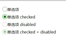
自定义前的效果:

自定义后的效果:
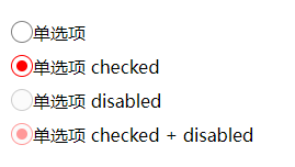
可以看到样式和颜色想怎么改就怎么改。


 扫一扫
扫一扫


 1840
1840

 被折叠的 条评论
为什么被折叠?
被折叠的 条评论
为什么被折叠?
 到【灌水乐园】发言


