


 手机市场丰富使前端开发适配问题凸显,简单手段难以解决复杂结构或有特殊视觉要求的页面适配。文中介绍了解决方案,包括安装步骤、在index.html页面head标签插入代码、在webpack配置文件添加配置以及定义组件等内容。
0.前言
手机市场日渐丰富的同时,给我们前端开发人员带来的网页内容自适应屏幕尺寸进行显示的问题也日渐凸显出来。原本可能通过百分比/媒体查询等简单手段就可以常见的适配问题,但是对于页面有复杂结构或者视觉上有特殊要求的,就需要通过其他手段来解决了。
1.安装
npm install --save-dev less less-loader
npm install --save-dev style-loader css-loader
2.先在index.html页面head标签内插入这段代码
<script>
    (function (doc, win) {
      var docEl = doc.documentElement,
        resizeEvt = 'orientationchange' in window ? 'orientationchange' : 'resize',
        recalc = function () {
          var clientWidth = docEl.clientWidth;
          if (!clientWidth) return;
          if (clientWidth >= 640) {
            docEl.style.fontSize = '100px';
          } else {
            docEl.style.fontSize = 100 * (clientWidth / 640) + 'px';
          }
        };

      if (!doc.addEventListener) return;
      win.addEventListener(resizeEvt, recalc, false);
      doc.addEventListener('DOMContentLoaded', recalc, false);
    })(document, window);
  </script>
3.在添加 build/webpack.base.conf.js 里面的module.exports 里的 module 里添加下面这段配置
 {
        test: /\.less$/,
        use: [
          "style-loader",
          "css-loader",
          "less-loader"
        ]
      }
4.定义组件
<template>
    <div class="box"> <p>header</p> </div>
</template>

<script>
export default {
  name: "headers",
  data() {
    return {};
  }
};
</script>

<style scoped lang="less">
.box {
  height: 300/50rem;
  width: 200/50rem;
  background-color: red;
  font-size: 16/50 rem;
}
</style>
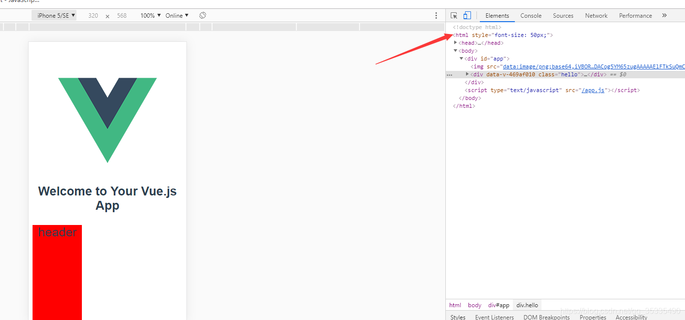
最后效果


 扫一扫
扫一扫


 1409
1409

 被折叠的 条评论
为什么被折叠?
被折叠的 条评论
为什么被折叠?
 到【灌水乐园】发言


