


一、布局
1. 盒子模型的宽度如何计算?
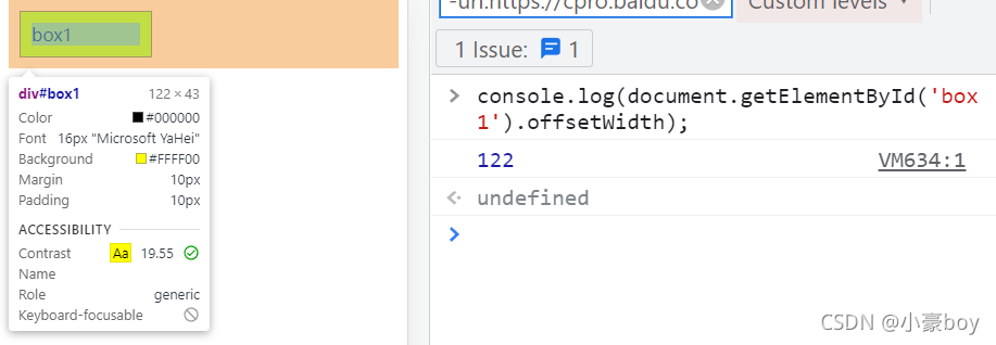
<!DOCTYPE html>
<html>

<head>
    <meta charset="UTF-8">
    <meta name="viewport" content="width=device-width, initial-scale=1.0">
    <title>盒模型</title>
    <style>
        #box1 {
            width: 100px;
            padding: 10px;
            border: 1px solid #000;
            margin: 10px;
            background-color: yellow;
        }
    </style>
</head>

<body>
    <div id="box1">box1</div>
</body>

</html>
- offsetWidth = ( 内容宽度 + 内边距 + 边框 ),无外边距。
- 这里的offsetWidth是 122px。
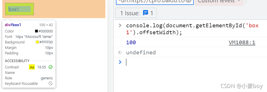
- 补充:如果让 offsetWidth 等于 100px ,该如何做?
- 添加: box-sizing: border-box;

2. margin 纵向重叠的问题
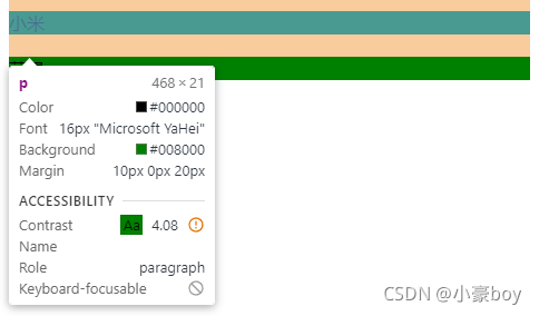
<!DOCTYPE html>
<html>
    <head>
        <meta charset="UTF-8">
        <meta name="viewport" content="width=device-width, initial-scale=1.0">
        <title>margin 纵向重叠</title>
        <!-- 小米和苹果之间的距离是多少? -->
        <style>
            p {
                background-color: green;
                margin-top: 10px;
                margin-bottom: 20px;
            }
        </style>
    </head>
    <body>
        <p>小米</p>
        <p></p>
        <p></p>
        <p></p>
        <p>苹果</p>
    </body>
</html>
总结:
- 相邻元素的 margin-top 和 margin-bottom 会发生重叠,取两者的最大值作为它们之间的距离,故这里小米与苹果的距离为 20 px。
- 空白内容的 <p></p> 也会重叠。
3. margin 负值的问题
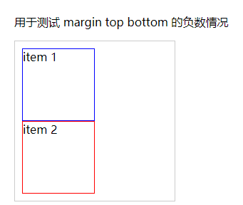
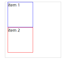
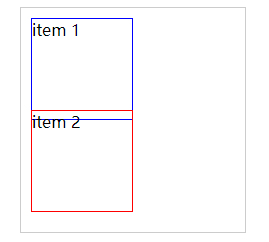
3.1 测试 margin top bottom 的负数情况
- 没有添加margin时:
- 若给 item 1 添加 margin-top: -10px;
- 若给 item 1 添加 margin-bottom: -10px;
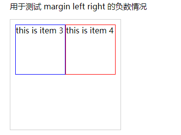
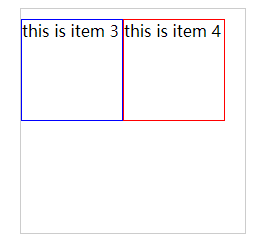
3.2 测试 margin left right 的负数情况
- 没有添加margin时:
- 若给 item 1 添加 margin-left: -10px;
- 若给 item 1 添加 margin-right: -10px;
总结:
- margin-top 和 margin-left 负值,元素向上、向左移动。
- margin-right 设置负值不会产生位移,只会减小元素供CSS读取的宽度。
- margin-bottom 设置负值不会产生位移,只会减小元素供CSS读取的高度。
4. BFC 理解和应用
4.1 什么是 BFC?如何应用?
- Block format context ,块级格式化上下文。
- 一块独立渲染区域,内部元素的渲染不会影响边界以外的元素。
4.2 形成 BFC 的常见条件
- float 不是 none。
- position 是 absolute 或 fixed。
- overflow 不是 visible。
- display 是 flex inline-block 等。
4.3 BFC 的常见应用
- 清除浮动
详细解释:BFC的形成条件和特性分析 - 简书,BFC 形成条件 - 孟繁贵 - 博客园
5. float 布局的问题,以及 clearfix
5.1 圣杯布局和双飞翼布局的目的:
- 三栏布局,中间一栏最先加载和渲染(内容最重要)
- 两侧内容固定,中间内容随着宽度自适应
- 一般用于 PC 网页
5.2 如何实现圣杯布局和双飞翼布局
圣杯布局:
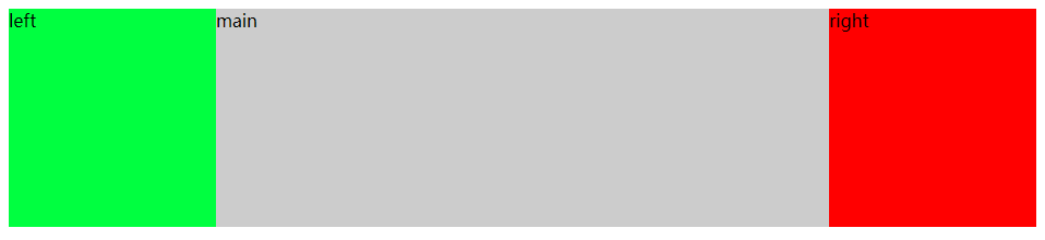
<!DOCTYPE html>
<html>

<head>
    <meta charset="UTF-8">
    <meta name="viewport" content="width=device-width, initial-sacle=1.0">
    <title>圣杯布局</title>
    <style>
        body {
            min-width: 550px;
        }

        #header {
            text-align: center;
            background-color: #f1f1f1;
        }

        #container {
            padding-left: 200px;
            padding-right: 150px;
        }

        #container .column {
            float: left;
        }

        #center {
            width: 100%;
            background-color: #ccc;
        }

        #left {
            position: relative;
            width: 200px;
            background-color: aqua;
            /* 相对父容器宽度的 100% */
            margin-left: -100%;
            right: 200px;
        }

        #right {
            width: 150px;
            background-color: blueviolet;
            margin-right: -150px;
        }

        #footer {
            text-align: center;
            background-color: #f1f1f1;
        }

        /* 清除浮动 */
        .clearfix:after {
            content: '';
            display: table;
            clear: both;
        }
    </style>
</head>

<body>
    <div id="header">header</div>
    <div id="container" class="clearfix">
        <div id="center" class="column">center</div>
        <div id="left" class="column">left</div>
        <div id="right" class="column">right</div>
    </div>
    <div id="footer">footer</div>
</body>

</html>
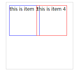
双飞翼布局:
<!DOCTYPE html>
<html>

<head>
    <meta charset="UTF-8">
    <meta name="viewport" content="width=device-width, initial-scale=1.0">
    <title>双飞翼布局</title>
    <style>
        body {
            min-width: 550px;
        }

        .col {
            float: left;
        }

        #main {
            width: 100%;
            height: 200px;
            background-color: #ccc;
        }
        #main-wrap {
            margin: 0 190px;
        }

        #left {
            width: 190px;
            height: 200px;
            background-color: rgb(0, 255, 64);
            margin-left: -100%;
        }

        #right {
            width: 190px;
            height: 200px;
            background-color: #f00;
            margin-left: -190px;
        }
    </style>
</head>

<body>
    <div id="main" class="col">
        <div id="main-wrap">
            main
        </div>
    </div>
    <div id="left" class="col">left</div>
    <div id="right" class="col">right</div>
</body>

</html>
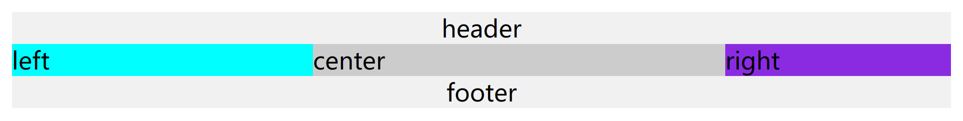
5.3 圣杯布局和双飞翼布局的技术总结
- 使用 float 布局。
- 两侧使用 margin 负值,以便和中间内容横向重叠。
- 防止中间内容被两侧覆盖,一个用 padding 一个用 margin。
5.4 手写 clearfix
/* 手写 clearfix */
.clearfix:after {
    content: '';
    display: table;
    clear: both;
}
.clearfix {
    /* 兼容 IE 低版本 */
    *zoom: 1;
}
- :after/::after的异同:
:after/::after和:before/::before的异同-优快云博客
- 关于使用 display:block与display:table 的区别:
6. flex 布局的问题
6.1 常用语法回顾
- 容器属性:flex-direction(决定主轴的方向)、justify-content(主轴上的对齐)、flex-wrap(是否换行)、align-items(交叉轴上如何对齐)。
- 项目属性:align-self(该项目在交叉轴的对齐方式)。
- 详细介绍地址:flex布局--入门_小豪boy的博客-优快云博客
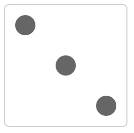
6.2 flex 实现一个三点的色子
<!DOCTYPE html>
<html>

<head>
    <meta charset="UTF-8">
    <meta name="viewport" content="width=device-width, initial-scale=1.0">
    <title>flex 画骰子</title>
    <style>
        .box {
            width: 200px;
            height: 200px;
            border: 2px solid #ccc;
            border-radius: 10px;
            padding: 20px;
            /* flex 布局 */
            display: flex;
            /* 两端对齐 */
            justify-content: space-between;
        }
        .item {
            /* 点的样式 */
            display: block;
            width: 40px;
            height: 40px;
            border-radius: 50%;
            background-color: #666;
        }
        .item:nth-child(2) {
            /* 第二项居中对齐 */
            align-self: center;
        }
        .item:nth-child(3) {
            /* 第三项尾对齐 */
            align-self: flex-end;
        }
    </style>
</head>

<body>
    <div class="box">
        <span class="item"></span>
        <span class="item"></span>
        <span class="item"></span>
    </div>
</body>

</html>
二、定位
1. absolute 和 relative 分别依据什么定位?
- relative 依据自身定位。
- absolute 依据最近一层的定位元素定位。
- 定位元素:
- absolute relative fixed
- body
2. 居中对齐有哪些实现方式?
2.1 水平居中
文本水平居中:
- 文本内容居中:text-align: center;
div水平居中:
- 有固定宽度:margin: 0 auto;
- absolute 定位,知道元素宽度:left: 50% ;margin-left:负宽度的一半;
- absolute 定位,元素宽度未知:left: 50%;transform:translateX(-50%);
- absolute 定位:left: 0; right: 0; margin: 0 auto;
- flex布局:justify-content: center;
2.2 垂直居中
文本垂直居中:
- 设置行高等于所在区域的高度:height: 200px; line-height: 200px;
- vertical-align实现文本的垂直居中:display:table-cell; vertical-align:middle;
div垂直居中:
- absolute 定位,知道元素高度:top: 50%;margin-top:负高度的一半;
- absolute 定位,元素高度未知:top: 50%;transform: translateY(-50%);
- absolute 定位:top: 0; bottom: 0; margin: auto 0;
- flex布局:align-items:center;
2.3 水平垂直居中
文本水平垂直居中:
- text-align: center;height: 200px; line-height: 200px;
- text-align: center;display:table-cell; vertical-align:middle;
div水平垂直居中:
- absolute 定位,知道元素宽高:left: 50% ;margin-left:负宽度的一半;top: 50%;margin-top:负高度的一半;
- absolute 定位,元素宽高未知:left: 50%; top: 50%;transform: translate(-50%,-50%);
- absolute 定位:left: 0; right: 0; top: 0; bottom: 0; margin: auto;
- flex布局:justify-content: center; align-items:center;
三、图文样式
1. line-height 如何继承?
<!DOCTYPE html>
<html>

<head>
    <meta charset="UTF-8">
    <meta name="viewport" content="width=device-width, initial-scale=1.0">
    <title>line-height 如何继承</title>
    <!-- 如下代码,p 标签的行高将会是多少? -->
    <style>
        body {
            font-size: 20px;
            line-height: 200%;
        }

        p {
            font-size: 16px;
        }
    </style>
</head>

<body>
    <p>666</p>
</body>

</html>
- 写具体数值,如 30px ,则继承该值(比较好理解)。
- 写比例,如 2 ,则继承该比例(如这里p标签的font-size:16px,所以line-height为16*2=32px)
- 写百分比,如 200% ,则继承计算出来的值,即 20*200%=40px(考点)
四、响应式
1. rem 是什么?
- rem 是一个长度单位。
- em ,相对长度单位,相对于父元素,不常用。
- px ,绝对长度单位,最常用。
- rem ,相对长度单位,相对于根元素,常用于响应式布局。
2. 响应式布局的常见方案?
- media-query,根据不同的屏幕宽度设置根元素 font-size。
- rem,基于根元素的相对单位。
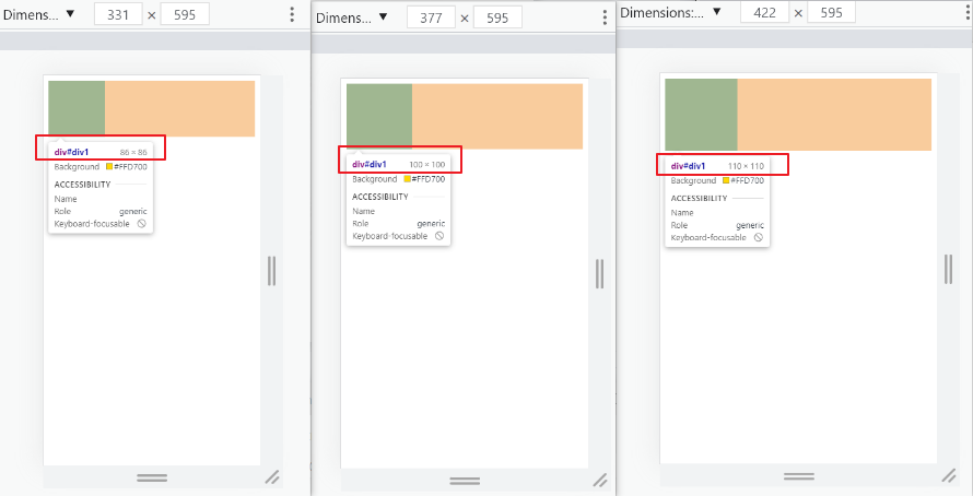
<!DOCTYPE html>
<html>

<head>
    <meta charset="UTF-8">
    <meta name="viewport" content="width=device-width, initial-scale=1.0">
    <title>响应式布局</title>
    <style>
        @media only screen and (max-width: 374px) {

            /* iphone5 或者更小的尺寸,以 iphone5 的宽度(320px)比例设置 font-size */
            html {
                font-size: 86px;
            }
        }

        @media only screen and (min-width: 375px) and (max-width: 413px) {

            /* iphone6/7/8 和 iphone x */
            html {
                font-size: 100px;
            }
        }

        @media only screen and (min-width: 414px) {

            /* iphone6p 或者更大的尺寸,以 iphone6p 的宽度(414px)比例设置 font-size */
            html {
                font-size: 110px;
            }
        }

        body {
            font-size: 0.16rem;
        }

        #div1 {
            width: 1rem;
            height: 1rem;
            background-color: gold;
        }
    </style>
</head>

<body>
    <div id="div1"></div>
</body>

</html>
- rem的弊端: “阶梯” 性。
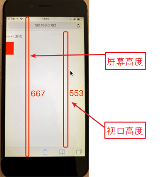
网页视口尺寸:
- window.screen.height // 屏幕高度
- window.innerHeight // 网页视口高度
- document.body.clientHeight // body 高度
- vw 网页视口宽度的1/100。
- vh 网页视口高度的1/100。
- vmax 取两者(vw/vh)最大值;vmin 取两者最小值。


 扫一扫
扫一扫


 874
874

 被折叠的 条评论
为什么被折叠?
被折叠的 条评论
为什么被折叠?
 到【灌水乐园】发言


