


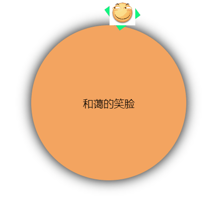
效果如图
<!DOCTYPE html>
<html lang="en">

<head>
  <meta charset="UTF-8">
  <meta name="viewport" content="width=device-width, initial-scale=1.0">
  <meta http-equiv="X-UA-Compatible" content="ie=edge">
  <title>公转不自转</title>
  <style>
    /* 外层圆 */
    .out {
      margin-top: 200px;
      margin-left: 200px;
      position: relative;
      height: 300px;
      width: 300px;
      border-radius: 150px;
      background-color: sandybrown;
      box-shadow: 0 0 23px;
    }

    /* 笑脸的容纳框 */
    .cover {
      display: inline-block;
      width: 50px;
      height: 50px;
      position: absolute;
      /* 定义基点 */
      transform-origin: 150px 150px;
      animation: smile linear 5s infinite;
      background-color: springgreen;
    }

    /* 笑脸表情包*/
    img {
      width: 50px;
      height: 50px;
      /*方法1 不自转只需要reverse反向线性就可以了*/
      animation: smile reverse linear 5s infinite;
    }

    @keyframes smile {
      to {
        transform: rotateZ(360deg);
      }
    }

    /* 方法2 */
    /* 默认情况下笑脸会跟随容纳框再5s内旋转360deg,所以只要再变换曲线相同的情况下再让它倒着转360deg就好啦 */
    /* @keyframes no-rotate {
      to {
        transform: rotateZ(-360deg);
      }
    } */

    /* 文本的绝对居中 */
    .out span {
      display: block;
      position: absolute;
      top: 50%;
      left: 50%;
      transform: translate(-50%, -50%);
      font-size: 20px;
    }
  </style>
</head>

<body>
  <div class="out">
    <div class="cover">
      <img
        src="https://ss0.bdstatic.com/94oJfD_bAAcT8t7mm9GUKT-xh_/timg?image&quality=100&size=b4000_4000&sec=1577100031&di=7445f215ef1f860d45fd93be22b52f57&src=http://git.oschina.net/uploads/group/110103951448978.jpg"
        alt="">
    </div>
    <span>和蔼的笑脸</span>
  </div>
</body>

</html>


 扫一扫
扫一扫


 被折叠的 条评论
为什么被折叠?
被折叠的 条评论
为什么被折叠?
 到【灌水乐园】发言


