


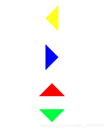
在以前的工作中我们如果想用三角形这个图标只能找UI拿图标,可是如果很多地方都有用到这个图标只会增加http的请求,会降低性能,今天我们就来学习下如何画三角形,效果图如下
<!DOCTYPE html>
<html>
	<head>
		<meta charset="UTF-8">
		<title>triangle三角形的绘制</title>
	</head>
	<body>
		<div class="right"></div>
		<div class="left"></div>
		<div class="top"></div>
		<div class="bottom"></div>
		<style>
			.right{
				width:0px;
				height:0px;
				border-top:50px solid transparent;
				border-right:50px solid #ffff00;
				border-bottom:50px solid transparent;
				border-left:0px solid #0000FF;
				margin: 50px auto;
			}
			.left{
				width:0px;
				height:0px;
				border-top:50px solid transparent;
				border-right:0px solid #ffff00;
				border-bottom:50px solid transparent;
				border-left:50px solid #0000FF;
				margin: 50px auto;
			}
			.top{
				width:0px;
				height:0px;
				border-top:0px solid transparent;
				border-right:50px solid transparent;
				border-bottom:50px solid #f00;
				border-left:50px solid transparent;
				margin: 50px auto;
			}
			.bottom{
				width:0px;
				height:0px;
				border-top:50px solid #0f0;
				border-right:50px solid transparent;
				border-bottom:0px solid transparent;
				border-left:50px solid transparent;
				margin: 50px auto;
			}
		</style>
	</body>
</html>
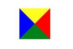
.box{
				width:0px;
				height:0px;
				border-top:50px solid #ffff00;
				border-right:50px solid red;
				border-bottom:50px solid green;
				border-left:50px solid blue;
				margin: 50px auto;
			}
其实做三角形的原理是使用border边框这个属性,如上图我们是把width跟height都设置为0,然后设置border的四个值为50,出现上面的图,如果我们想要向下的三角图标,把向上的宽度设置为0,左右两个的宽度颜色设置为透明就可以了
width:0px;
				height:0px;
				border-top:50px solid #0f0;
				border-right:50px solid transparent;
				border-bottom:0px solid #0f0;
				border-left:50px solid transparent;
				margin: 50px auto;


 扫一扫
扫一扫


 1396
1396

 被折叠的 条评论
为什么被折叠?
被折叠的 条评论
为什么被折叠?
 到【灌水乐园】发言


