


 本文介绍如何使用CSS3自定义Checkbox和Radio按钮的样式,通过隐藏原生元素并利用伪元素和伪类实现丰富的视觉效果。示例包括自定义的滑动条、文字显示及圆形选择状态。
实现思路
原理很简单,先把页面上<input type="checkbox">的display设置为none,从而把它隐藏掉,然后利用CSS3代码来绘制与checkbox(radio)相连的label元素,用label来模拟checkbox(radio)。
另外,我们可以利用伪元素::before和::after给label添加样式,利用CSS3的伪类选择器:checked,:hover,:focus,:disabled设置不用状态的样式。
示例
1.自定义checkbox(样式1)
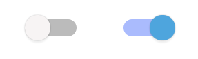
HTML代码如下:
<input type="checkbox" id="chk">
<label for="chk"></label>
CSS代码如下:
#chk {
	display: none;  /* 将原生的checkbox隐藏 */
}

/* label 模拟 “划动条” */
#chk + label {
	position: relative;
	display: inline-block;
	width: 60px;
	height: 20px;
	border-radius: 10px;
	background-color: #bbb;
}

/* “label::before伪元素 模拟 “划块” */
#chk + label:before {
	content: '';
	cursor: pointer;
	position: absolute;
	top: -5px;
	left: 0;
	z-index: 99;
	width: 30px;
	height: 30px;
	border-radius: 50%;
	background: #F7F4F4;
	box-shadow: 0 3px 1px rgba(0,0,0,0.05), 0 0px 1px rgba(0,0,0,0.3);
	-webkit-transition: all 0.1s ease-in;
	transition: all 0.1s ease-in;
}

/* checkbox选中状态时,“划动条”的样式 */
#chk:checked + label {
	background: #aabbfd;
}

/* checkbox选中状态时,“划块”的样式 */
#chk:checked + label:before {
	content: '';
	position: absolute;
	left: 30px;
	background-color: #4ea5dd;
}
2.自定义checkbox(样式2)
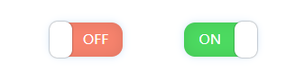
HTML代码如下:
<input type="checkbox" id="chk">
<label for="chk"></label>
CSS代码如下:
#chk {
	display: none;  /* 将原生的checkbox隐藏 */
}

/* label 模拟 “划动条” */
#chk + label {
	display: inline-block;
	position: relative;
	width: 65px;
	height: 30px;
	border-radius: 10px;
	background-color: #F7836D;
	box-shadow: inset 0 0 20px rgba(0, 0, 0, 0.1), 0 0 10px rgba(146, 196, 245, 0.4);
}

/* “label::before伪元素 模拟 “划块” */
#chk + label:before {
	content: '';
	cursor: pointer;
	position: absolute;
	top: -1px;
	left: 0;
	z-index: 99;
	width: 20px;
	height: 32px;
	border-radius: 7px;
	background: #fff;
	box-shadow: 0 0 1px rgba(0,0,0,0.6);
}

/* “label::after伪元素 模拟 “OFF/ON文字” */
#chk + label:after {
	content: 'OFF';
	position: absolute;
	top: 0;
	left: 30px;
	width: 50%;
	text-align: left;
	font-size: 12px;
	line-height: 30px;
	color: #fff;
}

/* checkbox选中状态时,“划动条”的样式 */
#chk:checked + label {
	background-color: #4cda60;
}

/* checkbox选中状态时,“划块”的样式 */
#chk:checked + label:before {
	content: '';
	position: absolute;
	left: 45px;
}

/* checkbox选中状态时,“OFF/ON文字”的样式 */
#chk:checked + label:after {
	content: 'ON';
	left: 0;
	text-align: right;
}

/* 点击时,缓动动画过渡 */
#chk + label:before,#chk + label:after,#chk + label {
	-webkit-transition: all 0.1s ease-in;
	transition: all 0.1s ease-in;
}
2.自定义radio
HTML代码如下:
<input type="radio" name="rd" class="rd" id="rd1">
<label for="rd1"></label>
<span style="margin-right: 10px;"></span>
<input type="radio" name="rd" class="rd" id="rd2" checked>
<label for="rd2"></label>
<span style="margin-right: 10px;"></span>
<input type="radio" name="rd" class="rd" id="rd3">
<label for="rd3"></label>
CSS代码如下:
.rd {
	display: none;  /* 将原生的radio隐藏 */
}

/* label 模拟 “底部框” */
.rd + label {
	display: inline-block;
	position: relative;
	cursor: pointer;
	width: 24px;
	height: 24px;
	border-radius: 50%;
	background-color: #cecece;
	box-shadow: 0 1px 15px rgba(0, 0, 0, 0.1) inset, 0 1px 4px rgba(0, 0, 0, 0.1) inset, 1px -1px 2px rgba(0, 0, 0, 0.1);
}

/* “label::before伪元素 模拟 “选择小圆块” */
.rd + label:before {
	content: '';
	position: absolute;
	top: 12px;
	left: 12px;
	z-index: 500;
	width: 0;
	height: 0;
	border-radius: 50%;
	background: #f1f1f1;
	-webkit-transition: all 0.15s ease-in;
	transition: all 0.15s ease-in;
}

/* radio选中状态时,“底部框”的样式 */
.rd:checked + label {
	background: #059acb;
}

/* radio选中状态时,“选择小圆块”的样式 */
.rd:checked + label:before {
	content: '';
	position: absolute;
	top: 4px;
	left: 4px;
	width: 16px;
	height: 16px;
}
---------------------
原文:https://blog.youkuaiyun.com/weixin_42140586/article/details/80312570


 扫一扫
扫一扫


 117
117

 被折叠的 条评论
为什么被折叠?
被折叠的 条评论
为什么被折叠?
 到【灌水乐园】发言


