效果:
代码:
<!DOCTYPE html>
<html lang="en">
<head>
<meta charset="utf-8">
<title>hoverSlideout Demo</title>
<style type="text/css">
.container {
width: 400px;
height: 100px;
border:1px solid red;
background-color: #ef5621;
overflow:hidden;
position:relative;
}
.back{
position:absolute;
width:100%;
height:100%;
background-color: #ef5621;
transition: 0.5s all linear;
z-index:3;
}
.bar {
position:absolute;
border-radius:50%;
transition: 0.5s all linear;
background-color: #fff;
width: 0;
height:0;
left:50%;
top:50%;
z-index:3;
}
input{
position:absolute;
transition: 0.5s all linear;
width:100%;
height:100%;
font-size:30px;
outline:none;
border:0;
z-index:1;
opacity:0;
}
.container:hover .back{
opacity:0;
}
.container:hover .bar {
width: 200%;
height: 200%;
left:-50%;
top:-50%;
opacity:0;
}
.container:hover input{
z-index:3;
opacity:1;
}
</style>
</head>
<body>
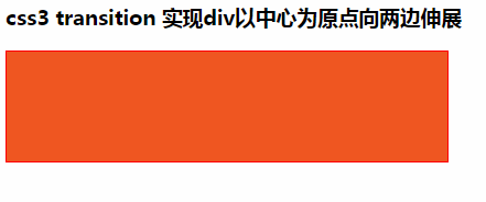
<h3>css3 transition 实现div以中心为原点向两边伸展</h3>
<div class="container">
<div class="back"></div>
<div class="bar"></div>
<input/>
</div>
</body>
</html>


 这个示例展示了如何用CSS3的transition属性创建一个以中心为原点向两边伸展的效果。当鼠标悬停在含有输入框的红色容器上时,背景会淡出,中央的白色圆点扩大并移出,同时输入框变得可见。


 扫一扫
扫一扫


 962
962

 被折叠的 条评论
为什么被折叠?
被折叠的 条评论
为什么被折叠?
 到【灌水乐园】发言


