


 博客提及项目结构中的 HTML 部分,给出了图片下载地址为 https://download.youkuaiyun.com/download/weixin_41937552/13786683 ,还提到有效果图。
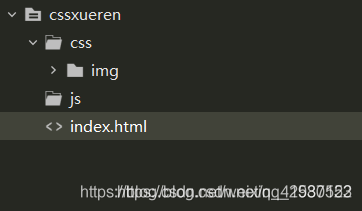
项目结构:
html:
<!DOCTYPE html PUBLIC "-//W3C//DTD XHTML 1.0 Transitional//EN"  "http://www.w3.org/TR/xhtml1/DTD/xhtml1-transitional.dtd">
<html xmlns="http://www.w3.org/1999/xhtml">
<head>
<meta http-equiv="Content-Type" content="text/html; charset=utf-8" />
<title>CSS3圣诞树雪人下雪动画效果</title>

<style type="text/css">
body{margin:0;padding:0;list-style-type:none;}
.header{
margin: 0 0 30px;
background: url(css/img/header-bg.png);
background: url(css/img/snow-bg.png) repeat-y center, url(css/img/header-bg.png);
-webkit-animation: animate-snow 9s linear infinite;
-moz-animation: animate-snow 9s linear infinite;
-ms-animation: animate-snow 9s linear infinite;
animation: animate-snow 9s linear infinite;
}

@-webkit-keyframes animate-snow
{
0% { background-position: center 0, 0 0;}
100% { background-position: center 885px, 0 0;}
}

@-moz-keyframes animate-snow
{
0% { background-position: center 0, 0 0;}
100% { background-position: center 885px, 0 0;}
}

@-ms-keyframes animate-snow
{
0% { background-position: center 0, 0 0;}
100% { background-position: center 885px, 0 0;}
}

@keyframes animate-snow
{
0% { background-position: center 0, 0 0;}
100% { background-position: center 885px, 0 0;}
}

.wrapper{ width: 960px; height: 315px; margin: auto; overflow: hidden; position: relative; background-image: url(css/img/wrapper-bg.png); background-repeat: no-repeat; background-position: bottom;    }

@-moz-keyframes animate-drop {

0% {opacity:0;-moz-transform: translate(0, -315px);}
100% {opacity:1;-moz-transform: translate(0, 0);}
}

@-webkit-keyframes animate-drop {

0% {opacity:0;-webkit-transform: translate(0, -315px);}
100% {opacity:1;-webkit-transform: translate(0, 0);}
}

@-ms-keyframes animate-drop {

0% {opacity:0;-ms-transform: translate(0, -315px);}
100% {opacity:1;-ms-transform: translate(0, 0);}
}

@keyframes animate-drop {

0% {opacity:0;transform: translate(0, -315px);}
100% {opacity:1;transform: translate(0, 0);}
}

.christmas-tree, .snowman {
position: absolute;
-moz-animation: animate-drop 1s linear;
-webkit-animation: animate-drop 1s linear;
-ms-animation: animate-drop 1s linear;
animation: animate-drop 1s linear;
}

.christmas-tree {
width: 112px;
height: 137px;
background: url(css/img/christmas-tree.png);
}

.snowman {
width: 115px;
height: 103px;
top: 195px;
left: 415px;
background: url(css/img/snowman.png);
-moz-animation-duration: .6s;
-webkit-animation-duration: .6s;
-ms-animation-duration: .6s;
animation-duration: .6s;
}

.tree1 {
top: 165px;
left: 35px;
-moz-animation-duration: .6s;
-webkit-animation-duration: .6s;
-ms-animation-duration: .6s;
animation-duration: .6s;
}

.tree2 {
left: 185px;
top: 175px;
-moz-animation-duration: .9s;
-webkit-animation-duration: .9s;
-ms-animation-duration: .9s;
animation-duration: .9s;
}

.tree3 {
left: 340px;
top: 125px;
-moz-animation-duration: .7s;
-webkit-animation-duration: .7s;
-ms-animation-duration: .7s;
animation-duration: .7s;
}

.tree4 {
left: 555px;
top: 155px;
-moz-animation-duration: .8s;
-webkit-animation-duration: .8s;
-ms-animation-duration: .8s;
animation-duration: .8s;
}

.tree5 {
left: 710px;
top: 170px;
-moz-animation-duration: .7s;
-webkit-animation-duration: .7s;
-ms-animation-duration: .7s;
animation-duration: .7s;
}

.tree6 {
left: 855px;
top: 125px;
-moz-animation-duration: .6s;
-webkit-animation-duration: .6s;
-ms-animation-duration: .6s;
animation-duration: .6s;
}
</style>

</head>

<body>

<div class="header">
<div class="wrapper">
	<div class="christmas-tree tree1"></div>
	<div class="christmas-tree tree2"></div>
	<div class="christmas-tree tree3"></div>
  <div class="snowman"></div>
	<div class="christmas-tree tree4"></div>
	<div class="christmas-tree tree5"></div>
	<div class="christmas-tree tree6"></div>
</div>
</div>
<div style="text-align:center;">
<p>来源:<a href="sunmenglei.blog.youkuaiyun.com" target="_blank">优快云博客</a></p>
</div>
<script src="http://down.admin5.comjs/tongji.js"></script>
<script src="http://down.admin5.comjs/youxia.js" type="text/javascript"></script>
</body>
</html>
图片下载地址:https://download.youkuaiyun.com/download/weixin_41937552/13786683
效果图:


 扫一扫
扫一扫


 1265
1265

 被折叠的 条评论
为什么被折叠?
被折叠的 条评论
为什么被折叠?
 到【灌水乐园】发言


