


 本文介绍了如何使用Vue动态创建导航菜单,根据后台传递的数据数量,展示不同数量的导航项。通过手绘思路图和代码示例,详细解析了HTML结构、JavaScript逻辑以及CSS样式,特别是动态设置class类名来实现特定导航项的样式调整。适用于理解和实现Vue动态导航的开发者。
我们要实现一个导航,可以根据后台传过来的数据进行改变的一个导航.
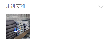
比如后台传一个导航数据时显示:
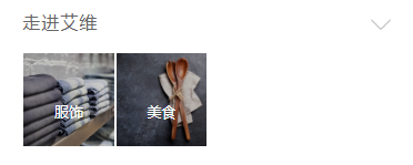
传二个导航数据时显示:
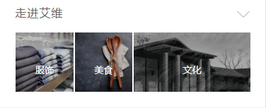
传三个导航数据时显示:
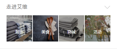
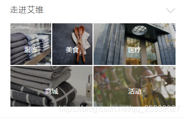
传四个导航数据时显示:
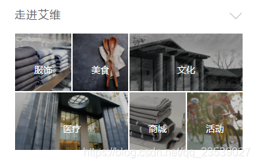
传五个导航数据时显示:
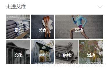
传六个导航数据时显示:
传七个导航数据时显示:
传8个导航数据时显示:
首先第一步是要解决这个正方形的问题,链接放上:https://mp.youkuaiyun.com/postedit/86541023
先来写第前面几个吧,
具体的就是先搞思路了:
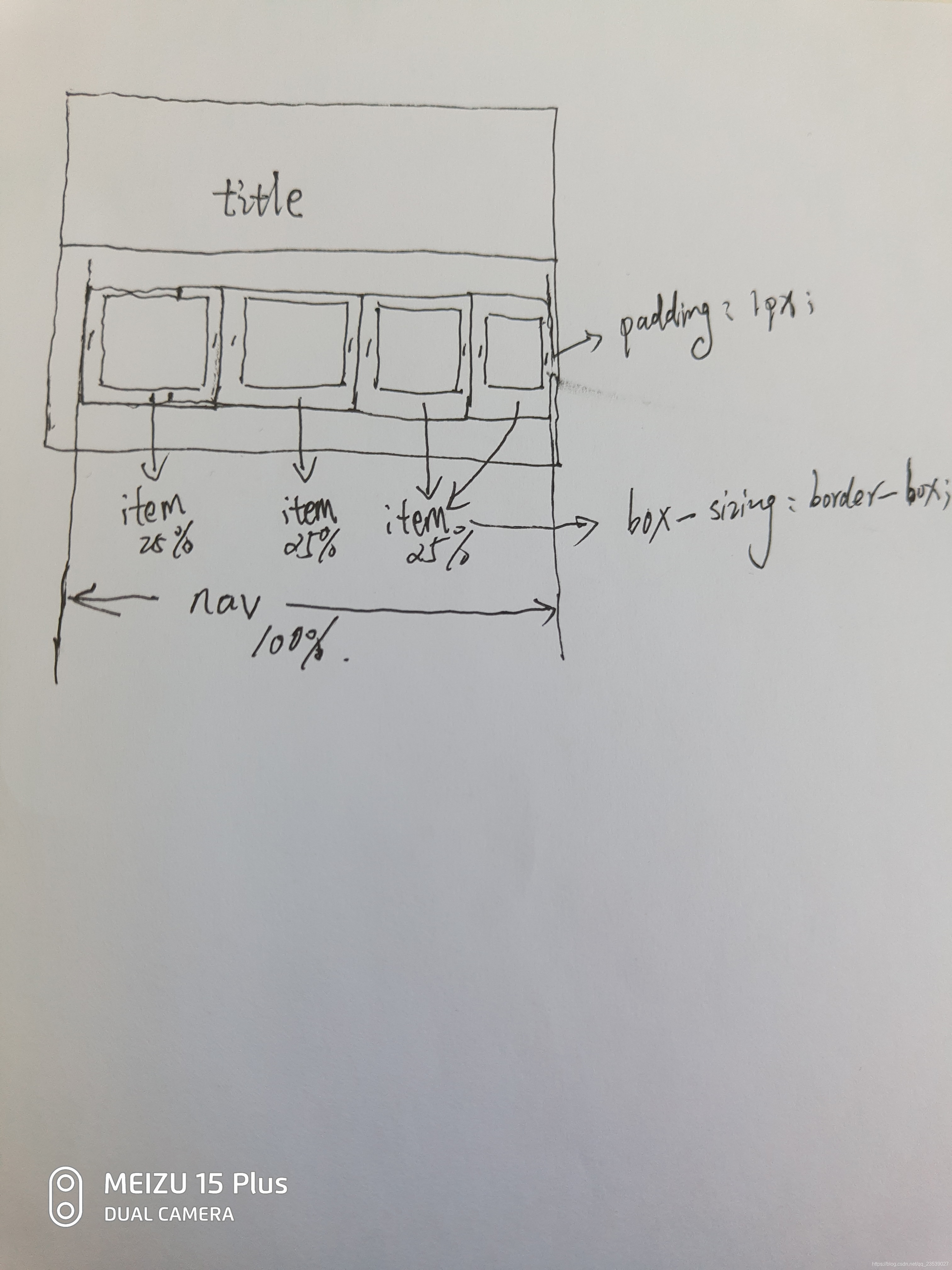
小弟不才,手绘了一张思路图.中心的div设为nav,平分为4份item,每份item就是25%.
下面就是部分的html结构代码:
<template>
        <div class="nav">
            <div class="introdution-title" >
                <p>走进艾维</p>
                <img src="static/img/down.png" alt="图片">
            </div>

            <div class="nav-item" v-if="navLength==1">
                 <ul >
                    <li v-for='item in IndexNav'  @click="see(item.link)">
                        <div class="dummy"></div>
	                    <img :src="item.thumb" alt="">
	                    <p></p>
	                    <span>{{item.nav_name}}</span>
                    </li>
                </ul>
            </div>
        </div>
</template>
我们是遍历IndexNav后,渲染到li上.
然后是scirpt部分:
<script>
	export default {
		name:'',
		data() {
			return {
				navLength:'1',
				IndexNav:[ {id: 43,link: "trade",nav_name: "服饰",thumb: "http://www.iwelife.com.cn/public/attachment/images/20181128/bf90229b4b993a67da9a26185eaa5453.png"} ],
			}
		},
	}
</script>
注意:这里的navLength 是和IndexNav.length是一致,这里是方便大家伙快速浏览,实际应用上是接口获取res.data.data,再令navLength = res.data.data.length.
最后是css部分代码:
<style lang="less" scoped>
.nav{
        width: 100%;
        height: auto;
        margin: 0 auto;
        background-color: #fff;
        border-top:6px solid #E5E5E5;
        border-bottom:6px solid #f3f3f3;
        .nav-item {
	width: 89.5%;
	margin: 0 auto;
	padding-left: 3px;
                padding-top: 4px;
	padding-bottom: 20px;
	ul{
	    width: 100%;
	    margin:0 auto;
	    display: flex;
	    flex-direction: row;
	    flex-wrap: wrap;
	    li {
                        box-sizing: border-box;
	        width: calc(~"25% - 2px");
	        margin: 1px;
	        text-align: center;
	        color: #fff;
	        position: relative;
                        overflow: hidden;
                    img{
                        position: absolute;
                        top :0;
                        left: 0;
                        right: 0;
                        bottom:0;
                        z-index: 10;
                        width: 100%;
                        height: 100%;
                        object-fit: cover;
                    }
                    p{
                        position:absolute;
                        top :0;
                        left:0;
                        right:0;
                        bottom: 0;
                        text-align: center;
                        z-index: 11;
                        font-size: 14px;
                        letter-spacing: 1px;
                        color: #fff;
                        background-color: rgba(0,0,0,.2);
                    }
                    span{
                        position:absolute;
                        left:0;
                        right:0;
                        bottom: 0;
                        text-align: center;
                        z-index: 12;
                        height: 60px;
                        line-height: 60px ;
                        font-size: 13px;
                        color: #fff;
                    }

	            }


	        }
         }
     }
    .introdution-title{
        width: 89.5% ;
        margin: 0 auto;
        text-align: left;
        font-size: 16px;
        /*font-weight: bold;*/
        height: 46px;
        line-height:46px;
        letter-spacing: 1px;
        padding-left: 3px;
        /*border-bottom: 1px solid #E1E1E1;*/
        display: flex;
        flex-direction: row;
        justify-content: space-between;
        align-items: center;
        img{
            width: 20px;
            height: 20px;
            padding-right: 3px;
        }
        p{
            font-size: 16px;
            color: #666;
        }
    }
	.dummy{margin-top: 100%;}
	.dummy2{margin-top: calc(~"50% - 2px");}
</style>
复制粘贴后对不齐,吗的(以后再整齐一下). 只要了解了正方形的写法,和导航的渲染思路就能轻易的写出来.
还有就是要注意在less下的calc()的写法:width: calc(~"25% - 2px").
第二个,第三个以此类推...........实际在应用中一般都是设置7个(这样好看些)
下面是所有的代码,根据传过来不同的IndexNav和navLength,我都可以做一次判断后渲染出来,主要是注意那个动态设置class类名那里,我是根据传过来的下标index进行的动态判断,我们的结构是第三个要拉长一些,那么则判断下标为2的元素加上一个active和dummy2,如此,一个动态的导航就出来了.
<template>
        <div class="nav">
            <div class="introdution-title" >
                <p>走进艾维</p>
                <img src="static/img/down.png" alt="图片">
            </div>

            <div class="nav-item" v-if="navLength==1">
                 <ul >
                    <li v-for='item in IndexNav'  @click="see(item.link)">
                        <div class="dummy"></div>
	                    <img :src="item.thumb" alt="">
	                    <p></p>
	                    <span>{{item.nav_name}}</span>
                    </li>
                </ul>
            </div>

            <div class="nav-item" v-if="navLength==2">
                 <ul >
                  <li v-for='item in IndexNav'  @click="see(item.link)">
	                  	<div class="dummy"></div>
	                    <img :src="item.thumb" alt="">
	                    <p></p>
	                    <span>{{item.nav_name}}</span>
                  </li>
                </ul>
            </div>

            <div class="nav-item" v-if="navLength==3">
                <ul >
                    <li v-for='(item,index) in IndexNav' :class="{active:index == '2'}" @click="see(item.link)">
	                  	<div class="dummy" :class="{dummy2:index == '2'}"></div>
	                    <img :src="item.thumb" alt="">
	                    <p></p>
	                    <span>{{item.nav_name}}</span>
                    </li>
                </ul>
            </div>

            <div class="nav-item" v-if="navLength==4">
                <ul>
                  <li  v-for='item in IndexNav' @click="see(item.link)">
	                  	<div class="dummy"></div>
	                    <img :src="item.thumb" alt="">
	                    <p></p>
	                    <span>{{item.nav_name}}</span>
                  </li>
                </ul>
            </div>

            <div class="nav-item" v-if="navLength==5" >
                <ul >
                  <li v-for='(item,index) in IndexNav'  :class="{active:index == '2' || index == '3' || index == '4'}" @click="see(item.link)">
	                  	<div class="dummy" :class="{dummy2:index == '2' || index == '3' || index == '4'}"></div>
	                    <img :src="item.thumb" alt="">
	                    <p></p>
	                    <span>{{item.nav_name}}</span>
                  </li>
                </ul>
            </div>

             <div class="nav-item" v-if="navLength==6">
                <ul >
                  <li v-for='(item,index) in IndexNav'  :class="{active:index == '2' || index == '3'}"  @click="see(item.link)">
	                  	<div class="dummy" :class="{dummy2:index == '2' || index == '3' }"></div>
	                    <img :src="item.thumb" alt="">
	                    <p></p>
	                    <span>{{item.nav_name}}</span>
                  </li>
                </ul>
            </div>

            <div class="nav-item" v-if="navLength==7">
                <ul >
                    <li v-for='(item,index) in IndexNav'  :class="{active: index == '2'}" @click="see(item.link)">
	                  	<div class="dummy" :class="{dummy2: index == '2' }"></div>
	                    <img :src="item.thumb" alt="">
	                    <p></p>
	                    <span>{{item.nav_name}}</span>
                    </li>
                </ul>
            </div>

            <div class="nav-item" v-if="navLength==8" >
                <ul >
                    <li v-for='(item,index) in IndexNav' @click="see(item.link)">
	                  	<div class="dummy"></div>
	                    <img :src="item.thumb" alt="">
	                    <p></p>
	                    <span>{{item.nav_name}}</span>
                    </li>
                </ul>
            </div>

	    </div>
</template>
<script>
export default {
name:'',
data() {
return {
showNum: false,
navLength:'7',
IndexNav:[
{id: 43,link: "trade",nav_name: "服饰",thumb: "http://www.iwelife.com.cn/public/attachment/images/20181128/bf90229b4b993a67da9a26185eaa5453.png"},
{id: 42,link: "catering",nav_name: "美食",thumb: "http://www.iwelife.com.cn/public/attachment/images/20181128/2e6f9d63260e64b79d0549944c4414b3.png"},
{id: 44,link: "sports",nav_name: "运动",thumb: "http://www.iwelife.com.cn/public/attachment/images/20181128/0bec9f9cef8811dd7f0267daba7e16c5.png"},
{id: 45,link: "culture",nav_name: "文化",thumb: "http://www.iwelife.com.cn/public/attachment/images/20181107/832600adaf497482a530034b92497b61.png" },
{id: 46,link: "medical",nav_name: "医疗",thumb: "http://www.iwelife.com.cn/public/attachment/images/20181107/d8c7dbbe4878b526f6f594956b5e428e.png",},
{id: 47,link: "shop",nav_name: "商城",thumb: "http://www.iwelife.com.cn/public/attachment/images/20181107/a5b1ca26f528f8b81641a511d2dbb965.png"},
{id: 48,link: "events",nav_name: "活动",thumb: "http://www.iwelife.com.cn/public/attachment/images/20181107/835e5260eef19f4407c7a90c16caabfe.png"},
],
}
},
}
}
</script><style lang="less" scoped>
.nav{
width: 100%;
height: auto;
margin: 0 auto;
background-color: #fff;
border-top:6px solid #E5E5E5;
border-bottom:6px solid #f3f3f3;
.nav-item {
width: 89.5%;
margin: 0 auto;
padding-left: 3px;
padding-top: 4px;
padding-bottom: 20px;
ul{
width: 100%;
margin:0 auto;
display: flex;
flex-direction: row;
flex-wrap: wrap;
li {
box-sizing: border-box;
width: calc(~"25% - 2px");
margin: 1px;
text-align: center;
color: #fff;
position: relative;
overflow: hidden;
img{
position: absolute;
top :0;
left: 0;
right: 0;
bottom:0;
z-index: 10;
width: 100%;
height: 100%;
object-fit: cover;
}
p{
position:absolute;
top :0;
left:0;
right:0;
bottom: 0;
text-align: center;
z-index: 11;
font-size: 14px;
letter-spacing: 1px;
color: #fff;
background-color: rgba(0,0,0,.2);
}
span{
position:absolute;
left:0;
right:0;
bottom: 0;
text-align: center;
z-index: 12;
height: 60px;
line-height: 60px ;
font-size: 13px;
color: #fff;
}
}
li.active {
width: calc(~"50% - 2px");
margin: 1px;
text-align: center;
color: #fff;
position: relative;
overflow: hidden;
}
}
}
}
.introdution-title{
width: 89.5% ;
margin: 0 auto;
text-align: left;
font-size: 16px;
/*font-weight: bold;*/
height: 46px;
line-height:46px;
letter-spacing: 1px;
padding-left: 3px;
/*border-bottom: 1px solid #E1E1E1;*/
display: flex;
flex-direction: row;
justify-content: space-between;
align-items: center;
img{
width: 20px;
height: 20px;
padding-right: 3px;
}
p{
font-size: 16px;
color: #666;
}
}
.dummy{margin-top: 100%;}
.dummy2{margin-top: calc(~"50% - 2px");}
</style>当然,如果你遇到有上面不懂的地方可以留言...有的地方不一定讲到位,欢迎一起探讨.......


 扫一扫
扫一扫


 1305
1305

 被折叠的 条评论
为什么被折叠?
被折叠的 条评论
为什么被折叠?
 到【灌水乐园】发言


