


Ant Design Vue-------Select 选择器
今天就讲讲Ant Design Vue下的控件----select 下拉框
结合项目中的需求,讲一下该控件如何配置,需求:
(1)设置控件的宽度和高度
(2)绑定数据源
(3)选中后获取名称
(4)默认提示项
模板中的代码如下:
<a-form layout="inline">
        <a-form-item label="区块"> <a-select placeholder="请选择区块" v-model:value="selectedBlockId" :options="BlockList" style="width: 220px" @change="handleSelectBlockChanged" /></a-form-item>
      </a-form>
1. 宽度和高度设置:
(1)宽度设置:style属性;
(2)高度设置: size=large,高度为40px; size=small,高度为24px,默认高度为32px
2.options绑定数据源,数据源中,key值为value, label,一般用map函数。
const selectedBlockId = ref('');
const BlockList = ref([] as any[]);
function queryBlockList(id) {
    let queryBlockJson = {};//往后端传值
    Query(queryBlockJson).then((res) => {//Query:API
          BlockList.value = res.map((item) => {
            return { value: item.interestId, label: item.blockName };
          });
}
3. 选中后,获取选中项的相关信息,利用change事件:
//根据选定的信息得到名称
  function handleSelectBlockChanged(val: string) {
    let item = BlockList.value.find((item) => item.value == val);
    console.log('item', item.label);
//item.label:名称;如果item中还需要别的信息,在数据源里加属性,在这里获取item,然后调用。
  }
4.默认提示项展示:
第一种办法:先设置placeholder的内容,然后将selectedBlockId 默认值设为undefined或者null,页面上placeholder的内容才会出来。
const selectedBlockId = ref(undefined);
or
const selectedBlockId = ref(null);
第二种办法(vue官网上学习到的):
<div>Selected: {{ selected }}</div>

<select v-model="selected">
  <option disabled value="">Please select one</option>
  <option>A</option>
  <option>B</option>
  <option>C</option>
</select>
效果如图: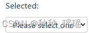 即:提供一个空值的禁用选项。如果
 v-model 表达式的初始值不匹配任何一个选择项,<select> 元素会渲染成一个“未选择”的状态。如果数据来自api,在map后面加一行代码:
data.unshift({ value: '-1', label: '全部' });
下拉框中会一直存在“全部”这个选项,可在change事件中组织代码了。
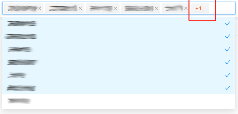
5. 下拉框多选
配置需要两个属性:
(1)mode="multiple"
(2):max-tag-count="maxTagCount"//可设置maxTagCount为最大数字,比如3
(3)调整展示样式:
<template #maxTagPlaceholder="omittedValues">
<span style="color: red">+{{ omittedValues.length }}...</span>
</template>
最终效果如下:


 扫一扫
扫一扫


 2万+
2万+

 被折叠的 条评论
为什么被折叠?
被折叠的 条评论
为什么被折叠?
 到【灌水乐园】发言


