 使用Flex布局实现圆圈居中排列


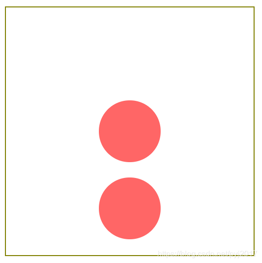
 本文档展示了一种使用Flex布局在400px的盒子内居中放置两个100px圆的方法。上圆水平居中,下圆则在上圆水平居中并保持与上圆垂直居中,同时与下边框距离相等。通过CSS样式实现该布局,主要涉及到justify-content和align-items属性的使用。
使用flex布局实现下面图中效果:
外框高都为400px,边框为2px;圆的宽高为100px;中圆是水平居中;下圆是水平居中以及相对于中圆垂直居中(下圆到中圆的距离和下圆到下边框的距离相等)。效果如图:
我的实现方法是笨办法,大佬们多指点
<div class="box">
        <div class="item">
            <div class="child">
            </div>
        </div>
    </div>
.box{
    width: 400px;
    height: 400px;
    border: olive solid 2px;
    display: flex;
    justify-content: center;
    align-items: center;
}
.item{
    width: 100px;
    height: 100px;
    background-color: rgba(255, 0, 0, 0.6);
    border-radius: 100%;
}
.child{
    width: 100px;
    height: 100px;
    background-color: rgba(255, 0, 0, 0.6);
    border-radius: 100%;
    margin-top: 125px;
}


 扫一扫
扫一扫


 1412
1412

 被折叠的 条评论
为什么被折叠?
被折叠的 条评论
为什么被折叠?
 到【灌水乐园】发言


