


正常情况下,宽度自适应,文字较少,没什么问题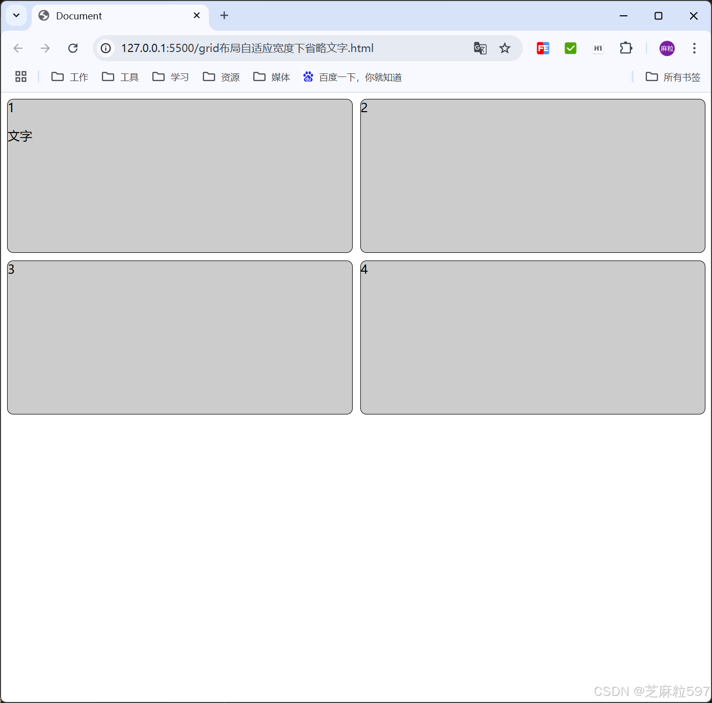
文字过长时,盒子宽度被撑开,导致每一项的宽度不一致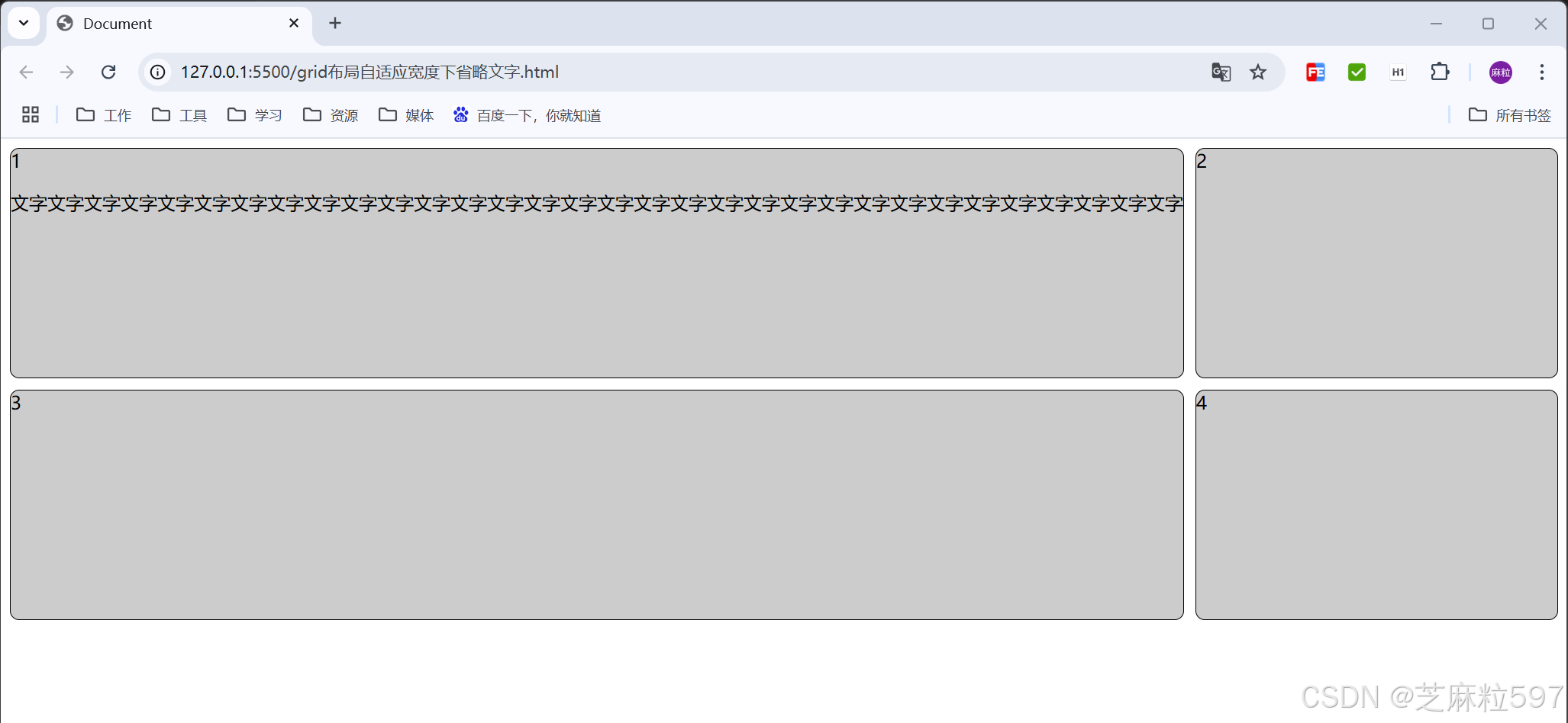
这里文本用单行省略的方式不起作用
.item p{
        /* 单行文本省略 */
        overflow: hidden;
        text-overflow: ellipsis;
        white-space: nowrap;
    }
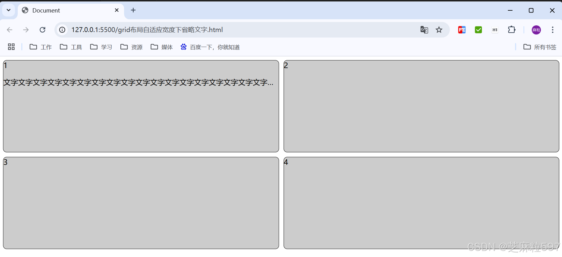
解决:使用多行省略的方式,行数1行
demo如下:
<!DOCTYPE html>
<html lang="en">
<head>
    <meta charset="UTF-8">
    <meta name="viewport" content="width=device-width, initial-scale=1.0">
    <title>Document</title>
    <style>
        .container{
            width: 100%;
            display: grid;
            grid-template-columns: repeat(2,1fr);
            column-gap: 10px;
        }
        .item{
            height: 200px;
            margin-bottom: 10px;
            background-color: #ccc;
            border: 1px solid #000;
            border-radius: 8px;
        }
        .item p{
            /* 单行文本省略 */
            /* overflow: hidden;
            text-overflow: ellipsis;
            white-space: nowrap; */
            /* 多行文本省略 */
            display: -webkit-box;
            overflow: hidden;
            -webkit-line-clamp: 1;
            -webkit-box-orient: vertical;
        }
    </style>
</head>
<body>
    <div class="container">
        <div class="item">1
            <p>文字文字文字文字文字文字文字文字文字文字文字文字文字文字文字文字文字文字文字文字文字文字文字文字文字文字文字文字文字文字文字文字</p>
        </div>
        <div class="item">2

        </div>
        <div class="item">3

        </div>
        <div class="item">4

        </div>
    </div>
</body>
</html>


 扫一扫
扫一扫


 1335
1335

 被折叠的 条评论
为什么被折叠?
被折叠的 条评论
为什么被折叠?
 到【灌水乐园】发言


