


body中
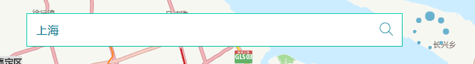
 <!-- input包含input、search图标、input上下左右边框、loading四部分 -->
    <div class="middle">
        <div class="btn btn-primary btn-ghost btn-border-stroke ">
            <div class="type-ahead" id="input-border">
                <input type="text" value="" class="search type-ahead__input" id="inputTxt" placeholder="输入关键词..." />
                <!-- search的图标 -->
                <span>
                    <svg id="findBtn" class="icon" width="24" height="24" xmlns="http://www.w3.org/2000/svg"
                        fill-rule="evenodd" clip-rule="evenodd">
                        <path
                            d="M15.853 16.56c-1.683 1.517-3.911 2.44-6.353 2.44-5.243 0-9.5-4.257-9.5-9.5s4.257-9.5 9.5-9.5 9.5 4.257 9.5 9.5c0 2.442-.923 4.67-2.44 6.353l7.44 7.44-.707.707-7.44-7.44zm-6.353-15.56c4.691 0 8.5 3.809 8.5 8.5s-3.809 8.5-8.5 8.5-8.5-3.809-8.5-8.5 3.809-8.5 8.5-8.5z">
                        </path>
                    </svg>
                </span>
            </div>
            <!-- input的上、下、左、右边框 -->
            <div class="btn-borders">
                <div class="border-top"></div>
                <div class="border-right"></div>
                <div class="border-bottom"></div>
                <div class="border-left"></div>
            </div>
        </div>

        <!-- loading -->
        <div id="loading3">
        <div class="demo3"></div>
        <div class="demo3"></div>
        <div class="demo3"></div>
        <div class="demo3"></div>
        <div class="demo3"></div>
        <div class="demo3"></div>
        <div class="demo3"></div>
        <div class="demo3"></div>
    </div>
    </div>
css中
/* input效果 */
.middle {
  width:444px;
  height:48px;
  position: absolute;
  top: 10%;
  right:50%;
  transform:translateX(50%);
  z-index:2;
}
.search {
  display: block;
  height: 22px;
  transition: all 1s;

}
.type-ahead {
width:99.6%;
z-index: 2;
position:absolute;
left:1px;
top:1px;
-webkit-perspective: 500px;
        perspective: 500px;
}
.type-ahead__input {
padding: 12px 34px 12px 12px;
border: none;
border-radius: 0;
font-size: 16px;
letter-spacing: .4px;
caret-color: #007991;
color: #007991;
outline: none;
width: calc(100% - 46px);
box-shadow: 4px 8px 12px 0 rgba(0, 0, 0, 0.1);
}
.type-ahead__input::-webkit-input-placeholder {
opacity: .5;
-webkit-transition: opacity .2s linear;
transition: opacity .2s linear;
color: #6E6E6E;
}
.type-ahead__input::-moz-placeholder {
opacity: .5;
-moz-transition: opacity .2s linear;
transition: opacity .2s linear;
color: #6E6E6E;
}
.type-ahead__input:-ms-input-placeholder {
opacity: .5;
-ms-transition: opacity .2s linear;
transition: opacity .2s linear;
color: #6E6E6E;
}
.type-ahead__input::-ms-input-placeholder {
opacity: .5;
-ms-transition: opacity .2s linear;
transition: opacity .2s linear;
color: #6E6E6E;
}
.type-ahead__input::placeholder {
opacity: .5;
-webkit-transition: opacity .2s linear;
transition: opacity .2s linear;
color: #6E6E6E;
}
.type-ahead__input:focus::-webkit-input-placeholder {
opacity: .7;
}
.type-ahead__input:focus::-moz-placeholder {
opacity: .7;
}
.type-ahead__input:focus:-ms-input-placeholder {
opacity: .7;
}
.type-ahead__input:focus::-ms-input-placeholder {
opacity: .7;
}
.type-ahead__input:focus::placeholder {
opacity: .7;
}
.type-ahead .icon {
position: absolute;
right:10px;
/* margin-left:410px; */
margin-top:-36px;
fill: #6E6E6E;
-webkit-transform: scale(0.8);
        transform: scale(0.8);
fill: #007991;
}
/* input上、下、左、右边框效果 */
.btn {
  --hue: 190;
  --ease-in-duration: 0.25s;
  --ease-in-exponential: cubic-bezier(0.95, 0.05, 0.795, 0.035);
  --ease-out-duration: 0.65s;
  --ease-out-delay: var(--ease-in-duration);
  --ease-out-exponential: cubic-bezier(0.19, 1, 0.22, 1);
  position: absolute;
  right:50%;
  z-index:4;
  width:100%;
  /* width:348px; */
  height:16px;
  padding: 1rem 3rem;
  font-size: 1rem;
  line-height: 1.5;
  color: white;
  text-decoration: none;
  background-color: hsl(var(--hue), 100%, 41%);
  border:none;
  outline: transparent;
  overflow: hidden;
  cursor: pointer;
  user-select: none;
  white-space: nowrap;
  transition: 0.25s;
  transform: translateX(50%);
}
.btn:hover {
  background: hsl(var(--hue), 100%, 31%);
}
.btn-primary {
  --hue: 171;
}
.btn-ghost {
  color: hsl(var(--hue), 100%, 41%);
  background-color: transparent;
  border-color: hsl(var(--hue), 100%, 41%);
}
.btn-ghost:hover {
  color: white;
}
.btn-border-stroke {
  border-color: hsla(var(--hue), 100%, 41%, 0.35);
}

.btn-borders {
  position: absolute;
  top: 0;
  left: 0;
  width: 100%;
  height: 100%;
}
.btn-borders .border-top {
  position: absolute;
  top: 0;
  width: 100%;
  height: 1px;
  background: hsl(var(--hue), 100%, 41%);
  transform: scaleX(0);
  transform-origin: left;
}
.btn-borders .border-right {
  position: absolute;
  right: 0;
  width: 1px;
  height: 100%;
  background: hsl(var(--hue), 100%, 41%);
  transform: scaleY(0);
  transform-origin: bottom;
}
.btn-borders .border-bottom {
  position: absolute;
  bottom: 0;
  width: 100%;
  height: 1px;
  background: hsl(var(--hue), 100%, 41%);
  transform: scaleX(0);
  transform-origin: left;
}
.btn-borders .border-left {
  position: absolute;
  left: 0;
  width: 1px;
  height: 100%;
  background: hsl(var(--hue), 100%, 41%);
  transform: scaleY(0);
  transform-origin: bottom;
}
/* when unhover, ease-out left, bottom; ease-in right, top */
.btn-borders .border-left {
  transition: var(--ease-out-duration) var(--ease-out-delay) var(--ease-out-exponential);
}

.btn-borders .border-bottom {
  transition: var(--ease-out-duration) var(--ease-out-delay) var(--ease-out-exponential);
}
.btn-borders .border-right {
  transition: var(--ease-in-duration) var(--ease-in-exponential);
}

.btn-borders .border-top {
  transition: var(--ease-in-duration) var(--ease-in-exponential);
}

.btn-border-stroke:hover {
  color: hsl(var(--hue), 100%, 41%);
  background: transparent;
}

.btn-border-stroke:hover .border-top,
.btn-border-stroke:hover .border-bottom {
  transform: scaleX(1);
}

.btn-border-stroke:hover .border-left,
.btn-border-stroke:hover .border-right {
  transform: scaleY(1);
}

/* when hover, ease-in left, bottom; ease-out right, top */

.btn-border-stroke:hover .border-left {
  transition: var(--ease-in-duration) var(--ease-in-exponential);
}

.btn-border-stroke:hover .border-bottom {
  transition: var(--ease-in-duration) var(--ease-in-exponential);
}

.btn-border-stroke:hover .border-right {
  transition: var(--ease-out-duration) var(--ease-out-delay) var(--ease-out-exponential);
}

.btn-border-stroke:hover .border-top {
  transition: var(--ease-out-duration) var(--ease-out-delay) var(--ease-out-exponential);
}


/* 加载效果 */
#loading3 {
  display: none;
  position: absolute;
	width:50px;
  height:50px;
  right:-25%;
}
.demo3 {
	width:0.3em;
	height:0.3em;
	border-radius:2px;
	background:#68b2ce;
	position:absolute;
	animation:demo3 linear 0.8s infinite;
	-webkit-animation:demo3 linear 0.8s infinite;
}
.demo3:nth-child(1) {
	left:24px;
	top:2px;
	animation-delay:0s;
}
.demo3:nth-child(2) {
	left:40px;
	top:8px;
	animation-delay:0.1s;
}
.demo3:nth-child(3) {
	left:47px;
	top:24px;
	animation-delay:0.1s;
}
.demo3:nth-child(4) {
	left:40px;
	top:40px;
	animation-delay:0.2s;
}
.demo3:nth-child(5) {
	left:24px;
	top:47px;
	animation-delay:0.4s;
}
.demo3:nth-child(6) {
	left:8px;
	top:40px;
	animation-delay:0.5s;
}
.demo3:nth-child(7) {
	left:2px;
	top:24px;
	animation-delay:0.6s;
}
.demo3:nth-child(8) {
	left:8px;
	top:8px;
	animation-delay:0.7s;
}
@keyframes demo3 {
	0%,40%,100% {
	transform:scale(1);
}
20% {
	transform:scale(3);
}
}@-webkit-keyframes demo3 {
	0%,40%,100% {
	transform:scale(1);
}
20% {
	transform:scale(3);
}
}
input效果:


 扫一扫
扫一扫


 307
307

 被折叠的 条评论
为什么被折叠?
被折叠的 条评论
为什么被折叠?
 到【灌水乐园】发言


