


 本文探讨了CSS3中浮动元素(float)与标准流父盒子的交互,通过实例展示了当浮动元素不设置浮动时,如何影响其在页面布局中的位置。内容包括如何调整div元素的浮动属性,以实现不同的排列效果。
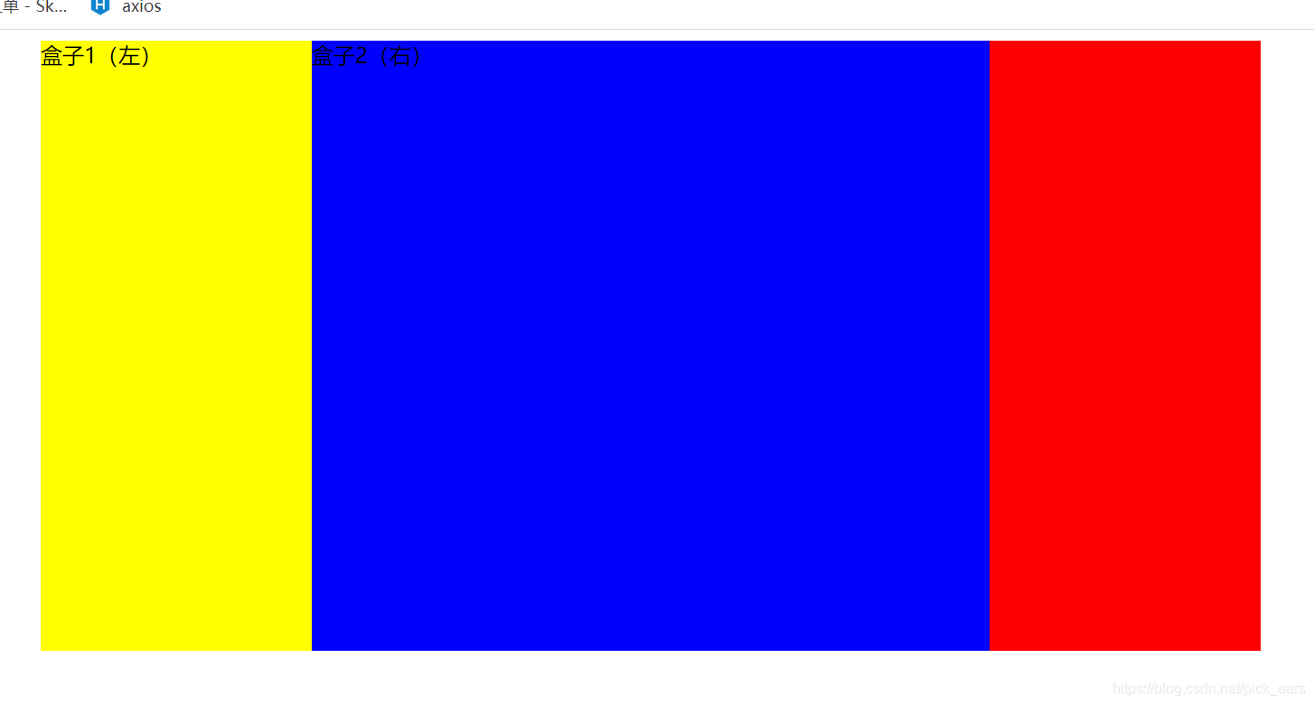
效果:

代码:
<!DOCTYPE html>
<html>
	<head>
		<meta charset="UTF-8">
		<title></title>
		<style>
			.box{
				width:900px;
				height:450px;
				background-color:red;
				/*若父盒子居中*/
				margin: 0 auto;
			}
			.box1{
				float: left;
				width: 200px;
				height: 450px;
				background-color: yellow;
			}
			.box2{
				float: left;
				width: 700px;
				height: 450px;
				background-color: blue;
			}
		</style>

	</head>
	<body>
		<div class="box">
			<div class="box1">
				盒子1(左)
			</div>
			<div class="box2">
				盒子2(右)
			</div>
		</div>

	</body>
</html>
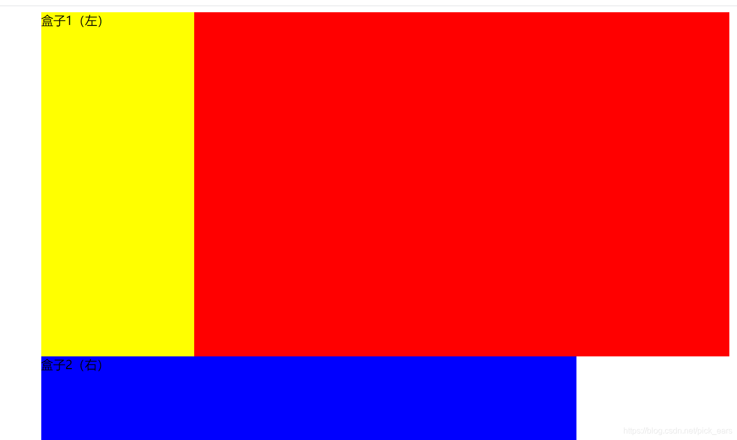
若第二个盒子没有加浮动,会挨着最左侧开始
			.box2{
				/*float: left;*/
				width: 700px;
				height: 450px;
				background-color: blue;
			}
若两个都没有加浮动
			.box1{
				/*float: left;*/
				width: 200px;
				height: 450px;
				background-color: yellow;
			}
			.box2{
				/*float: left;*/
				width: 700px;
				height: 450px;
				background-color: blue;
			}


 扫一扫
扫一扫


 287
287

 被折叠的 条评论
为什么被折叠?
被折叠的 条评论
为什么被折叠?
 到【灌水乐园】发言


