


1、桑基图—echarts
桑基图是一种用于表示流动或关系的可视化图表,特别适合展示数据的流向和相对大小。
桑基图通过箭头的宽度表示流量的大小,通常用于展示各个节点之间的流动关系。节点表示数据的来源和去向,箭头表示流动的量。
1.1 数据结构
ECharts 桑基图需要两部分数据:data 和 links。
data:节点数据,包含节点名称。
links:连接数据,定义流动的来源、目标和流量值。
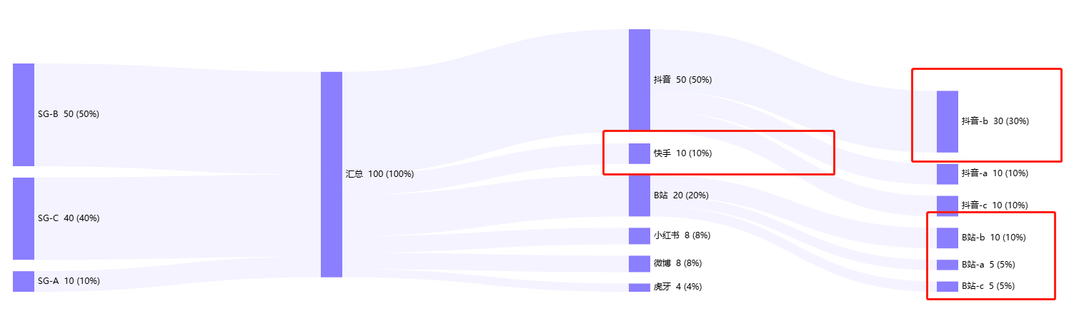
下方图是我们的目标结果:

<template>
  <div class="data-work">
    <div ref="chartRef" style="max-width: 1850px; height: 400px"></div>
  </div>
</template>
<script lang="ts" setup>
import { ref, nextTick, onMounted } from 'vue';
import * as echarts from 'echarts';

const chartRef = ref();
const chart = ref();
const options = ref({
  animation: true,
  animationThreshold: 2000,
  animationDuration: 1000,
  animationEasing: 'cubicOut',
  animationDelay: 0,
  animationDurationUpdate: 300,
  animationEasingUpdate: 'cubicOut',
  animationDelayUpdate: 0,
  hoverLayerThreshold: 3000,
  series: {
    type: 'sankey',
    layout: 'none',
    // focusNodeAdjacency: 'outEdges',
    // silent: true, //取消hover效果
    data: [],
    links: [],
    itemStyle: {
      borderColor: 'transparent', // 设置边框颜色为透明
      borderWidth: 0, // 或者直接设置宽度为0
      // color: '#409eff', // 你可以设置节点的填充颜色
    },
    left: '0',
    top: '24px',
    right: '300px',
    bottom: '8px',
    nodeWidth: 30,
    nodeGap: 16,
    nodeAlign: 'left', // 桑基图中节点的对齐方式,默认是双端对齐
    layoutIterations: 0,  // 如果希望图中节点的顺序是按照原始 data 中的顺序排列的,可设该值为 0。否则是按照大小排列
    orient: 'horizontal',
    draggable: true,
    levels: [
      {
        depth: 0,
        itemStyle: {
          color: '#8B7EFF', //图形的颜色
        },
        lineStyle: {
          show: true,
          width: 2,
          opacity: 0.1,
          curveness: 0.5,
          type: 'solid',
          color: 'source',
        },
      },
      {
        depth: 1,
        itemStyle: {
          color: '#8B7EFF',
        },
        lineStyle: {
          show: true,
          width: 1,
          opacity: 0.1,
          curveness: 0.5,
          type: 'solid',
          color: 'source',
        },
      },
      {
        depth: 2,
        itemStyle: {
          color: '#8B7EFF',
        },
        lineStyle: {
          show: true,
          width: 1,
          opacity: 0.1,
          curveness: 0.5,
          type: 'solid',
          color: 'source',
        },
      },
      {
        depth: 3,
        itemStyle: {
          color: '#8B7EFF',
        },
        lineStyle: {
          show: true,
          width: 1,
          opacity: 0.1,
          curveness: 0.5,
          type: 'solid',
          color: 'source',
        },
      },
    ],
    label: {
      show: true,
      position: 'right',
      margin: 8,
      fontSize: 12,
      formatter: (params: any) => {
        return `${params.name}  ${params.data.value} (${params.data.rate})`;
      },
    },
    lineStyle: {
      show: true,
      width: 1,
      opacity: 0.2,
      curveness: 0.5,
      type: 'solid',
      color: 'source',
    },
  },
  aria: {
    enabled: false,
  },
  color: ['#5470c6', '#91cc75', '#fac858', '#ee6666', '#73c0de', '#3ba272', '#fc8452', '#9a60b4', '#ea7ccc'],
  tooltip: {
    show: true,
    trigger: 'item',
    triggerOn: 'mousemove|click',
    axisPointer: {
      type: 'line',
    },
    showContent: true,
    alwaysShowContent: false,
    showDelay: 0,
    hideDelay: 100,
    enterable: false,
    confine: false,
    appendToBody: false,
    transitionDuration: 0.4,
    textStyle: {
      fontSize: 14,
      // color: '#fff',
    },
    borderWidth: 0,
    padding: 16,
    order: 'seriesAsc',
    backgroundColor: 'rgba(0,0,0,0.8)',
    formatter: (params) => {
      if (params.data.source) {  //自定义tooltip 模板字符串
        const html = `<div style="height:auto;">
            <div style="display:flex;align-items:center;justify-content:space-between;font-size:12px;line-height:1;">
              <span style="display:inline-block;width:8px;height:8px;background:#8b7efe;margin-right:5px;"></span>
              <span style="display:inline-block;margin-right:25px;">${params.data.source}—>${params.data.target}</span>
              <span>${(params.data.value, 1)}(${params.data.rate})</span>
            </div>
          </div>`;
        return html;
      }
      const html = `<div style="height:auto;">
            <div style="display:flex;align-items:center;justify-content:space-between;font-size:12px;line-height:1;">
              <span style="display:inline-block;width:8px;height:8px;background:#8b7efe;margin-right:5px;"></span>
              <span style="display:inline-block;margin-right:25px;">${params.name}</span>
              <span>${params.data.value}(${params.data.rate})</span>
            </div>
          </div>`;
      return html;
    },
  },
});


// 重新设置options
const setOption = (chartDataInfo) => {
  if (chart.value) {
    chart.value.dispose();
  }
  if (!chartRef.value) {
    return;
  }
  const { flow_data, node_data } = chartDataInfo;
  if (!flow_data?.length) {
    const optionEmpty = {
      title: {
        text: '暂无数据',
        left: 'center',
        top: 'center',
        textStyle: {
          fontSize: 20,
          color: '#999',
        },
      },
      tooltip: {
        show: false, // 隐藏 tooltip
      },
      series: [], // 不显示任何系列
    };
    chart.value = echarts.init(chartRef.value, 'white', { renderer: 'canvas' });
    chart.value.setOption(optionEmpty);
    return;
  }
  options.value.series.links = flow_data;
  options.value.series.data = node_data;
  nextTick(() => {
    chart.value = echarts.init(chartRef.value, 'white', { renderer: 'canvas' });
    chart.value.setOption(options.value);
  });
};
onMounted(() => {
  const chartDataInfo = {
   flow_data: [],
   node_data: [],
  };
  setOption(chartDataInfo);
});
</script>
数据结构示例:
links:
flow_data: [
      {
        source: 'SG-A', //边的源节点名称
        target: '汇总', //边的目标节点名称
        value: 10, //边的数值,决定边的宽度。
        rate: '10%', //这个是自定义要展示的字段
      },
      {
        source: 'SG-B',
        target: '汇总',
        value: 50,
        rate: '50%',
      },
      {
        source: 'SG-C',
        target: '汇总',
        value: 40,
        rate: '60%',
      },
      {
        source: '汇总',
        target: '抖音',
        value: 50,
        rate: '50%',
      },
      {
        source: '汇总',
        target: 'B站',
        value: 20,
        rate: '20%',
      },
      {
        source: '汇总',
        target: '小红书',
        value: 8,
        rate: '8%',
      },
      {
        source: '汇总',
        target: '快手',
        value: 10,
        rate: '10%',
      },
      {
        source: '汇总',
        target: '微博',
        value: 8,
        rate: '8%',
      },
      {
        source: '汇总',
        target: '虎牙',
        value: 4,
        rate: '4%',
      },
      {
        source: '抖音',
        target: '抖音-a',
        value: 10,
        rate: '10%',
      },
      {
        source: '抖音',
        target: '抖音-b',
        value: 30,
        rate: '30%',
      },
      {
        source: '抖音',
        target: '抖音-c',
        value: 10,
        rate: '10%',
      },
      {
        source: 'B站',
        target: 'B站-a',
        value: 5,
        rate: '5%',
      },
      {
        source: 'B站',
        target: 'B站-b',
        value: 10,
        rate: '10%',
      },
      {
        source: 'B站',
        target: 'B站-c',
        value: 5,
        rate: '5%',
      },
    ],
data:
    node_data: [
      {
        name: '汇总',
        rate: '100%',
        value: '100',
      },
      {
        name: 'SG-A',
        rate: '10%',
        value: '10',
      },
      {
        name: 'SG-B',
        rate: '50%',
        value: '50',
      },
      {
        name: 'SG-C',
        rate: '40%',
        value: '40',
      },
      {
        name: '抖音',
        rate: '50%',
        value: '50',
      },
      {
        name: 'B站',
        rate: '20%',
        value: '20',
      },
      {
        name: '小红书',
        rate: '8%',
        value: '8',
      },
      {
        name: '快手',
        rate: '10%',
        value: '10',
      },
      {
        name: '微博',
        rate: '8%',
        value: '8',
      },
      {
        name: '虎牙',
        rate: '4%',
        value: '4',
      },
      {
        name: '抖音-a',
        rate: '10%',
        value: '10',
      },
      {
        name: '抖音-b',
        rate: '30%',
        value: '30',
      },
      {
        name: '抖音-c',
        rate: '10%',
        value: '10',
      },
      {
        name: 'B站-a',
        rate: '5%',
        value: '5',
      },
      {
        name: 'B站-b',
        rate: '10%',
        value: '10',
      },
      {
        name: 'B站-c',
        rate: '5%',
        value: '5',
      },
    ],
1、请求数据后首次加载图表渲染失败:
原因:dom节点没加载出来
解决方案: nextTick()
2、图表从上到下排列顺序与数据返回顺序不一致
原因:默认按数据大小排列
解决方案:layoutIterations: 0
3、图表第4列没有数据时,默认第三列节点在第四列
解决方案:nodeAlign:left ,该属性是节点的对齐方式
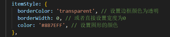
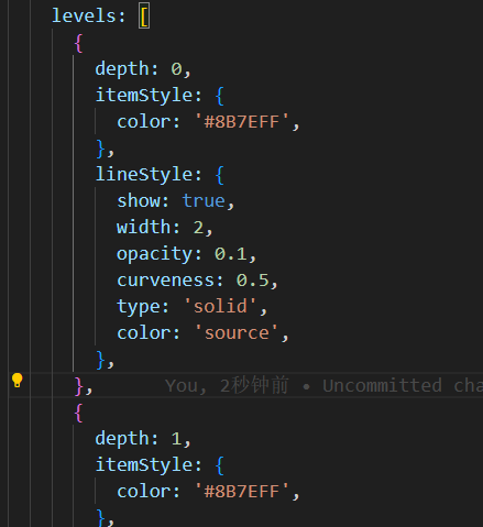
4、设置节点矩形的样式有两种方式:
统一设置:
单独设置每一列的:
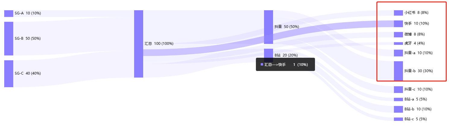
5、tooltip、文案展示等自定义样式可通过模板字符串实现,但是不支持图标、图片
6、注意:返回数据节点不能有重复,否则渲染失败;
2、柱状图–自定义tooltip样式以及字段展示—-G2
通常tooltip展示的都是key和value值,即横坐标与纵坐标对应的值,如果需要额外展示其他字段,则需要自定义写
数据结构:
在原有数据结构中,加入一个数组,如下proList数组,tooltip的数据展示则可以遍历该数组(如果多嵌套一层对象的话,tooltip那边拿不到值,比如{proObj:{name:‘其他1’}})拿不到proObj.name,只能直接拿到第一层)
data=[
{
    key:'label名称',
    value: 1000,
    proList:[
        {
            name:'其他1',
            value: 20
        },
        {
            name:'其他2',
            value: 30
        },
        {
            name:'其他3',
            value: 40
        },
        {
            name:'其他4',
            value: 50
        },
    ]
}
]
用模板字符串定义html,插入到图表中,下面码代码用来遍历数组
const itemTpl =
        '<li data-index={index}>' +
        '<span style="background-color:{color};width:8px;height:8px;border-radius:50%;display:inline-block;margin-right:8px;"></span>' +
        '{name}: <span class="g2-tooltip-value" style="display:inline-block;"><span class="g2-tooltip-num">{numValue}</span>{chineseValue}</span></li>';
 chart.value.tooltip({
        // 处理数据
        customItems: (items) => {
          console.log(items);
          items.forEach((v) => {
            const str = v.value.match(/[\u4e00-\u9fa5]+/g);
            v.chineseValue = str ? str[0] : ''; // 中文
            v.numValue = v.chineseValue ? v.value.replace(v.chineseValue, '') : v.value;
              let elementStr = '';
              v.data.proList.forEach((ele) => {
                elementStr += `<div style="padding:0 0 10px;">${
                  ele.name
                } <span class="g2-tooltip-value" style="display:inline-block;"><span class="g2-tooltip-num">${formatBigNumberToZhY(
                  ele.value,
                  2,
                )}</span></span></div>`;
              });
              v.elementStr = elementStr;
          });
          return items;
        },
        showCrosshairs: true, // 辅助线
        shared: true,
        containerTpl:
          '<div class="g2-tooltip">' +
          '<div class="g2-tooltip-title" style="margin:10px 0;"></div>' +
          '<ul class="g2-tooltip-list"></ul></div>',
        itemTpl,
      });
数据过多时,柱状图部分label缺失
原因:每条数据的柱状图展示间距不够
解决方案:categorySize的值设置大点
chart.value.option(‘scrollbar’, {
type: ‘horizontal’,
categorySize: 40,
});
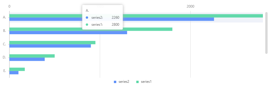
3、条形图—G2
数据:
const data = [
  { label: 'A.', type: 'series1', value: 2800 },
  { label: 'A.', type: 'series2', value: 2260 },
  { label: 'B.', type: 'series1', value: 1800 },
  { label: 'B.', type: 'series2', value: 1300 },
  { label: 'C.', type: 'series1', value: 950 },
  { label: 'C.', type: 'series2', value: 900 },
  { label: 'D.', type: 'series1', value: 500 },
  { label: 'D.', type: 'series2', value: 390 },
  { label: 'E.', type: 'series1', value: 170 },
  { label: 'E.', type: 'series2', value: 100 },
  { label: 'F.', type: 'series1', value: 950 },
  { label: 'F.', type: 'series2', value: 900 },
  { label: 'G.', type: 'series1', value: 500 },
  { label: 'G.', type: 'series2', value: 390 },
  { label: 'H.', type: 'series1', value: 170 },
  { label: 'H.', type: 'series2', value: 100 },
];
不需要滚动条的情况下,可以通过以下方法实现:
const chart = new Chart({
  container: 'container',
  autoFit: true,
  height: 500,
});
chart.data(data);

chart
  .coordinate()
  .transpose()
  .scale(1, -1);


chart.axis('value', {
  position: 'right',
});
chart.axis('label', {
  label: {
    offset: 12,
  },
});

chart
  .interval()
  .position('label*value')
  .color('type')
  .adjust([
    {
      type: 'dodge',
      marginRatio: 0,
    },
  ]);

chart.interaction('active-region');
chart.render();
chart.coordinate() .transpose().scale(1, -1);
transpose是将X、Y轴互换,scale(1, -1) 是保持 X 轴的规模不变,而将 Y 轴的方向反转(即 Y 轴的值从上到下递减,而不是从下到上递增)
下方图是不设置scale(1, -1)
但是这种写法如果使用滚动条,就会有问题

所以这里换一种写法:
1、引入g2的内置方法
import { DataView } from ‘@antv/data-set’;
2、使用里面的方法进行数据倒序排列
const dv = new DataView().source(data);
dv.transform({
type: ‘reverse’,
});
console.log(dv.rows)
此时的数据就是完全倒序排列,如下:
[
{
“label”: “H.”,
“type”: “series2”,
“value”: 100
},
{
“label”: “H.”,
“type”: “series1”,
“value”: 170
},
…
{
“label”: “A.”,
“type”: “series2”,
“value”: 2260
},
{
“label”: “A.”,
“type”: “series1”,
“value”: 2800
}
]
chart.data(dv.rows);
chart.coordinate().transpose();
chart.option(‘scrollbar’, {
type: ‘vertical’,
categorySize: 40,
animate: false,
});
这里就不需要使用scale(1,-1);
这里我们发现tooltip的展示数据并不是我们想要的顺序,则进行如下处理:
将tooltip也进行倒序排列:


 1807
1807

 被折叠的 条评论
为什么被折叠?
被折叠的 条评论
为什么被折叠?
 到【灌水乐园】发言


