


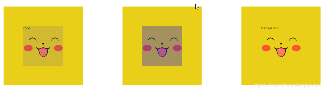
一、透明度的表示方式
代码示例如下:
<style>
        *{margin: 0;padding: 0;}
        div.box{
            width: 200px;
            height: 200px;
            background-image: url(../images/15.jpg);
            margin: 100px;
            padding: 100px;
            float: left;
        }
        /* rgba */
        .box:first-child div{
            width: 200px;
            height: 200px;
            /* .1表示透明度为0.1 */
            background-color: rgba(0,0,255,.1);
        }
        /* opacity */
        .box2{
            width: 200px;
            height: 200px;
            background-color: blue;

            opacity: .3;/* 不兼容IE */
            filter: alpha(opacity=30);/* 兼容IE的写法 */
        }
        /* transparent 完全透明  opacity=0 */
        .box:nth-child(3) div{
            width: 200px;
            height: 200px;
            background-color: transparent;
        }
    </style>

<body>
    <div class="box">
        <div>rgba</div>
    </div>

    <div class='box'>
       <div class="box2">opacity</div>
    </div>
    <div class="box">
        <div>transparent</div>
    </div>
</body>
结果如下:
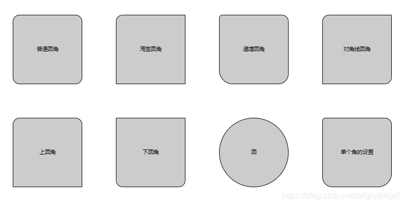
二、圆角属性
代码示例如下:
    <style>
        *{margin: 0;padding: 0;}
        div{
            width:200px;
            height:200px;
            background:#ccc;
            border: 1px solid black;
            margin:50px;
            float:left;
            line-height:200px;
            text-align: center;
        }
        /* 普通圆角 */
        div:first-of-type{
            border-radius: 20px;
        }
        /* 淘宝圆角 */
        div:nth-of-type(2){
            /* 顺时针 */
            border-radius: 20px 0 0 0;
        }
        /* 递增圆角 */
        div:nth-of-type(3){
            border-radius: 10px 20px 30px 40px;
        }
        /* 对角线圆角 */
        div:nth-of-type(4){
            border-radius: 20px 0 20px 0;
        }
        /* 上圆角 */
        div:nth-of-type(5){
            border-radius: 20px 20px 0 0;
        }
        /* 下圆角 */
        div:nth-of-type(6){
            border-radius: 0 0 20px 20px;
        }
        /* 圆 */
        div:nth-of-type(7){
            border-radius: 50%;
        }
        /* 单个圆角 */
        div:nth-of-type(8){
            border-top-left-radius: 10px;/* 左上角 */
            border-top-right-radius: 20px;/* 右上角 */
            border-bottom-left-radius: 30px;/* 右下角 */
            border-bottom-right-radius: 40px;/* 左下角 */
        }

    </style>

<body>
    <div>普通圆角</div>
    <div>淘宝圆角</div>
    <div>递增圆角</div>
    <div>对角线圆角</div>
    <div>上圆角</div>
    <div>下圆角</div>
    <div>圆</div>
    <div>单个角的设置</div>
</body>
</html>
结果如下:
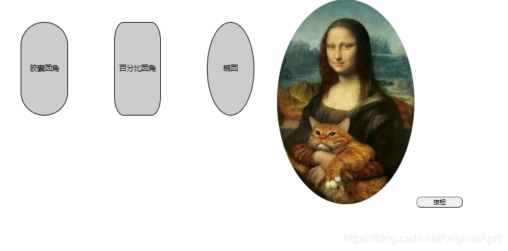
三、圆角属性延伸
代码示例如下:
    <style>
        *{margin: 0;padding: 0;}
        div{
            width:100px;
            height:200px;
            background:#ccc;
            border: 1px solid black;
            margin:50px;
            float:left;
            line-height:200px;
            text-align: center;
        }
        /* 胶囊圆角 */
        div:first-child{
            border-radius: 51px;
        }
        /* 百分比圆角 */
        div:nth-child(2){
            border-radius: 20%;
        }
        /* 椭圆 */
        div:nth-child(3){
            border-radius: 50%;
        }
        img{
            border-radius: 50%;
        }
        button{
            width: 100px;
            height: 24px;
            border-radius: 10px;
            /*
                outline (轮廓)是绘制于元素周围的一条线,
                位于边框边缘的外围,可起到突出元素的作用。
                可以按顺序设置如下属性:

                    outline-color
                    outline-style
                    outline-width
             */
            outline: 0 none;
        }
    </style>

<body>
    <div>胶囊圆角</div>
    <div>百分比圆角</div>
    <div>椭圆</div>
    <img src="../images/18.jpg"/>
    <button>按钮</button>
</body>
</html>
结果如下:
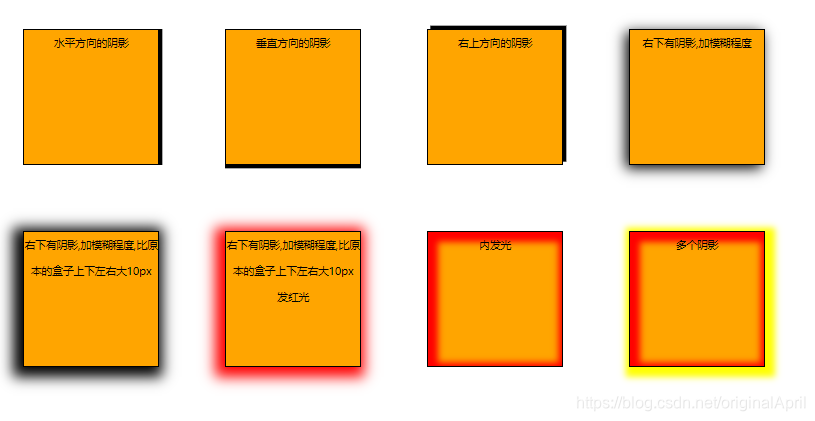
四、盒子阴影
代码是如下:
    <style>
         *{margin: 0;padding: 0;}
         div{
            width:200px;
            height:200px;
            background:orange;
            border: 1px solid black;
            margin:50px;
            float:left;
            line-height: 40px;
            text-align: center;
         }
         /*
        box-shadow: 右 下 羽化值 延展 颜色
         */
         /* 水平方向的阴影 */
         div:first-child{
             box-shadow: 5px 0; /*5px阴影右边  -5px 左边*/
         }
         /* 垂直方向的阴影 */
         div:nth-child(2){
             box-shadow: 0 5px; /*5px阴影下边  -5px 上边*/
         }
         /* 右上方向的阴影 */
         div:nth-child(3){
             box-shadow: 5px -5px;
         }
         /* 右下有阴影,加模糊程度 */
         div:nth-child(4){
             box-shadow: -5px 5px 20px;
         }
         /* 右下有阴影,加模糊程度,比原本的盒子上下左右大10px */
         div:nth-child(5){
             box-shadow: -5px 5px 20px 10px;
         }
         /* 右下有阴影,加模糊程度,比原本的盒子上下左右大10px 发红光  */
         div:nth-child(6){
             box-shadow: -5px 5px 20px 10px red;
         }
         /* 内发光 */
         div:nth-child(7){
             box-shadow:inset 5px 5px 10px 10px red;
         }
         /* 多个阴影 */
         div:nth-child(8){
             box-shadow:inset 5px 5px 10px 10px red,5px 5px 10px 10px yellow;
         }
    </style>

<body>
    <div>水平方向的阴影</div>
    <div>垂直方向的阴影</div>
    <div>右上方向的阴影</div>
    <div>右下有阴影,加模糊程度</div>
    <div>右下有阴影,加模糊程度,比原本的盒子上下左右大10px</div>
    <div>右下有阴影,加模糊程度,比原本的盒子上下左右大10px 发红光 </div>
    <div>内发光</div>
    <div>多个阴影</div>
</body>
</html>
结果如下:
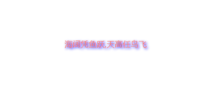
五、文本阴影
代码示例如下:
	<style>
        *{margin: 0;padding: 0;}
        p{
            font-style: 50px;
            margin: 100px auto;
            text-align: center;
            color: salmon;
            /* 语法:text-shadow: 右 下 羽化值 颜色 */
            text-shadow:  2px 2px 5px blue;
        }

    </style>

<body>
    <p>海阔凭鱼跃,天高任鸟飞</p>
</body>
结果如下:
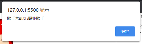
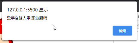
六、自定义属性
代码示例如下:
    <button>获取图片的自定义属性</button>
    <button>修改图片的自定义属性</button>
    <img src="../images/20/1.jpg"  data-her-name="韩红" data-career="歌手"  alt="">
    <script src="https://cdn.bootcdn.net/ajax/libs/jquery/3.6.0/jquery.js"></script>
    <script>
        // 原生js写法
        // window.οnlοad=function(){
        //     //querySelectorAll和querySelector也是html5对js的扩展获取节点的方式
        //     var buttons = document.querySelectorAll("button")
        //     var img = document.querySelector("img")
        //     //获取自定义图片
        //     buttons[0].οnclick=function(){
        //         alert("姓名是:"+img.dataset.herName+",职业:"+img.dataset.career)
        //     }
        //     // 修改图片的自定义属性
        //     buttons[1].οnclick=function(){
        //         img.dataset.herName="路人甲";
        //         img.dataset.career="厨师";
        //     }
        // }

        // jQuery写法
        $(function(){
            $("button:nth-child(1)").click(function(){
                // :eq(0) 匹配一个给定索引值的元素 匹配第一个img
                console.log($("img:eq(0)").data());
                alert("歌手名"+$("img:eq(0)").data("herName")+":职业"+$("img:eq(0)").data("career"))
            })
            $("button:nth-child(2)").click(function(){
                $("img:eq(0)").attr("data-her-name","路人甲")
                $("img:eq(0)").attr("data-career","厨师")
            })
        })
    </script>
直接点击获取,结果如下:
点击修改按钮之后,再点击获取:
七、背景复习
 			 /* 背景颜色 */
             background-color:black;
             /* 背景图片 */
             background-image: url(../images/22/tianjin.jpg);
             /* 图片重复 */
             background-repeat: no-repeat;
             /* 图片居中 */
             background-position:center top;
             /* 背景附着  fixed  默认:scroll */
             /* 设置背景图像是否固定或者随着页面的其余部分滚动。 */
             background-attachment:fixed;
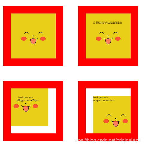
background-origin:
background-origin 属性规定 background-position 属性相对于什么位置来定位。
代码示例如下:
    <style>
        *{margin:0;padding:0}

        div{
            background-image:url(../images/23.jpg);
            background-repeat: no-repeat;
            background-position: left top;
            width:200px;
            height:200px;
            margin:50px;
            border:50px solid red;
            padding:50px;
        }
        /*
          真实width= border  + width + padding = 100+200+100=400
          内容width= padding + width  =  100 + 200 = 300
        */

        div:nth-child(2){
            background-origin: padding-box;
        }

        div:nth-child(3){
            background-origin: border-box;
        }

        div:nth-child(4){
            background-origin: content-box;
        }
    </style>

<body>
    <div></div>
    <div>背景相对于内边距进行定位</div>
    <div>background-origin:border-box</div>
    <div>background-origin:content-box</div>
</body>
</html>
结果如下;
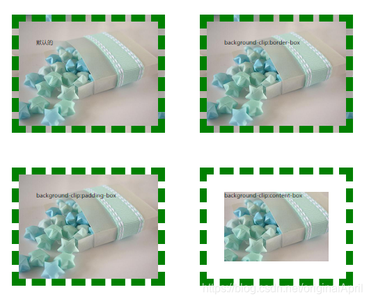
八、背景裁切
代码示例如下:
<style>
        *{margin:0;padding:0}
        div{
           width:300px;
           height:200px;
           background-image: url(../images/24.jpg);
           border:20px dashed green;
           padding:50px;
           margin:50px;
        }
        div:nth-child(2){
            background-clip: border-box;
        }
        div:nth-child(3){
            background-clip: padding-box;
        }
        div:nth-child(4){
            background-clip: content-box;
        }
    </style>

<body>
    <div>默认的</div>
    <div>background-clip:border-box</div>
    <div>background-clip:padding-box</div>
    <div>background-clip:content-box</div>
</body>
结果如下:
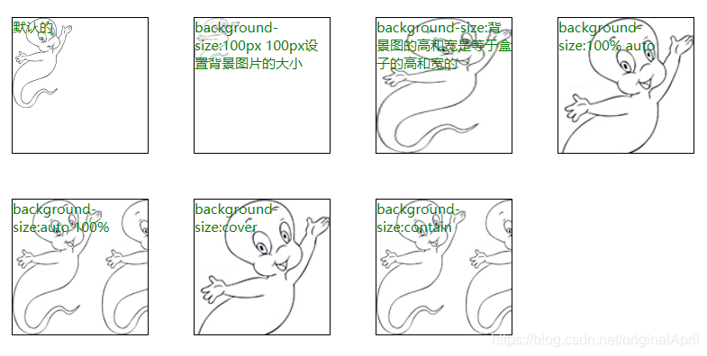
九、背景大小
代码示例如下:
<style>
        *{margin:0;padding:0}

        div{
           width:300px;
           height:300px;
           border:1px solid black;
           margin:50px;
           float:left;
           background-image: url(../images/25.jpg);
           font-size:30px;
           color:green
        }

        div:first-child{
            background-size:auto auto;
            background-repeat: no-repeat;
        }

        div:nth-child(2){
            background-size:100px 100px;
            background-repeat: no-repeat;
        }

        div:nth-child(3){
            background-size:100% 100%;
        }

        div:nth-child(4){
            background-size:100% auto;
        }

        div:nth-child(5){
            background-size:auto 100%;
        }

        div:nth-child(6){
            background-size:cover;
        }

        div:nth-child(7){
            background-size:contain;
        }

    </style>

<body>
    <div>默认的</div>
    <div>background-size:100px 100px设置背景图片的大小</div>
    <div>background-size:背景图的高和宽是等于盒子的高和宽的</div>
    <div>background-size:100% auto</div>
    <div>background-size:auto 100%</div>
    <div>background-size:cover</div>
    <div>background-size:contain</div>
</body>
结果如下:


 扫一扫
扫一扫


 441
441

 被折叠的 条评论
为什么被折叠?
被折叠的 条评论
为什么被折叠?
 到【灌水乐园】发言


