


 本文介绍如何使用CSS实现盒子的半透明效果和复杂多背景设计,包括使用opacity属性设置整体透明度,以及利用background复合属性结合图片和颜色创建多层次背景。
《2018年12月13日》【连续435天】
标题:盒子半透明,多背景;
内容:
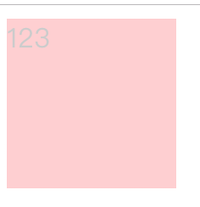
div {
			width: 100px;
			height: 100px;
			background-color: red;
			/*background: rgba(255,0,0, .2); 盒子背景半透明*/
			opacity: 0.2; /*盒子半透明*/
		}
div {
			width: 200px;
			height: 80px;
			border-radius: 20px;
			background: url(images/paopao.png) no-repeat top left,
			url(images/paopao.png) no-repeat right bottom;
			background-color: blue;
			transition: all 4s;
		}
		div:hover {
			background-position: right bottom ,left top;
		}


 扫一扫
扫一扫


 122
122

 被折叠的 条评论
为什么被折叠?
被折叠的 条评论
为什么被折叠?
 到【灌水乐园】发言


