


响应式
一、js 通用:
利用
媒体查询适配样式。
// css代码:
.folding {
	padding-left: 200px;
}
// 仅在屏幕宽度低于500px时生效:
@media screen and (max-width: 500px) {
	.folding {
		padding-left: 20px;
	}
}
二、vue 中:
监听。
<template>
<div>
<h2>{{ info }}</h2>
</div>
</template>
<script>
export default {
data() {
return {
info: "",
};
},
beforeMount() {
window.addEventListener("resize", this.handleResize);
},
created() {
this.handleResize();
},
beforeDestroy() {
window.removeEventListener("resize", this.handleResize);
},
methods: {
handleIsMobile() {
// 尺寸判断:
return document.body.getBoundingClientRect().width - 1 < 992;
},
handleResize() {
const isMobile = this.handleIsMobile();
let that = this;
if (isMobile) {
// 符合尺寸:
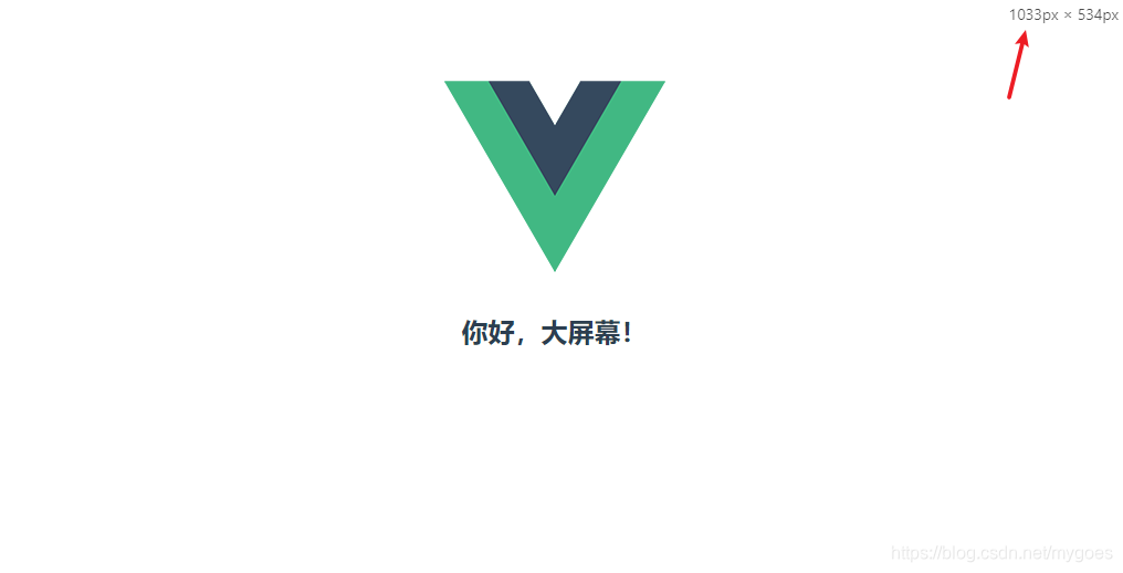
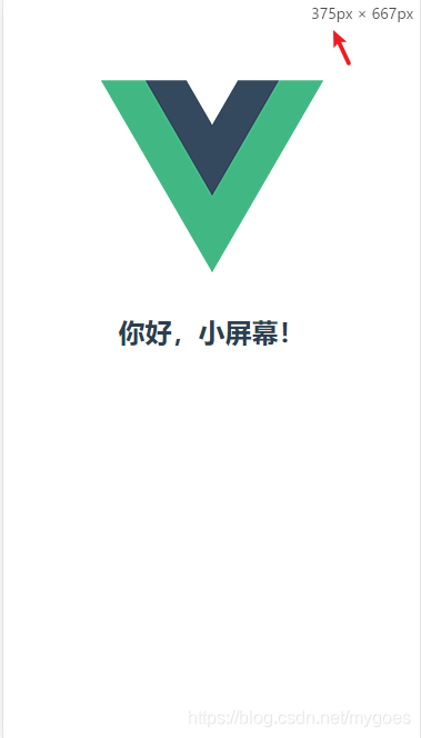
that.info = "你好,小屏幕!";
} else {
// 不符合尺寸:
that.info = "你好,大屏幕!";
}
},
},
};
</script>


 扫一扫
扫一扫


 被折叠的 条评论
为什么被折叠?
被折叠的 条评论
为什么被折叠?
 到【灌水乐园】发言


