


 本文介绍了如何使用CSS3创建各种半圆形状,并实现雷达扫描动态效果。通过示例代码,展示了如何利用border-radius、transform等属性来构造不同类型的半圆,以及如何结合keyframes动画制作雷达扫射动画。
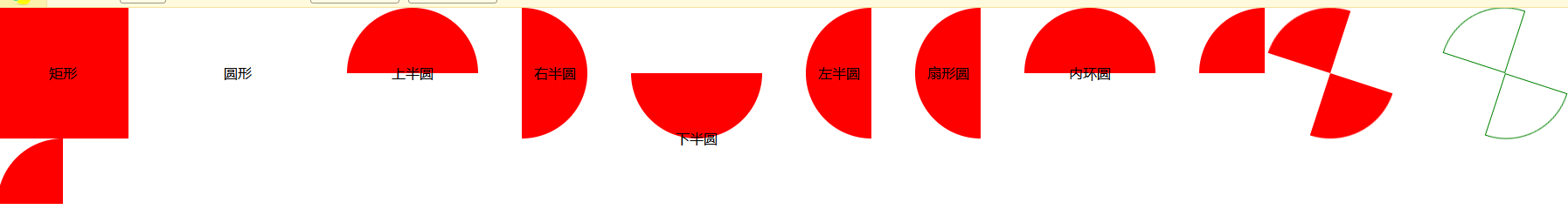
效果如下:
代码如下:
<!DOCTYPE html>
<html lang="en">
<head>
	<meta charset="UTF-8">
	<title>Document</title>
	<style type="text/css">
	*{margin: 0px; padding: 0px;}
		div{margin-right: 50px;}
		@keyframes change
{


 0%{transform:rotate(0deg);}


 25%{transform:rotate(90deg);}


 50%{transform:rotate(180deg);}

 75%{transform:rotate(270deg);}


 100%{transform:rotate(360deg);}


}
		#Rectangle{
			width: 150px;
			height: 150px;
			border: #fff;
			background-color: red;
			text-align: center;
			line-height: 150px;
			float: left;
		}
		#Circular{
			width: 150px;
			height: 150px;
			border-radius: 75px;
			border: #fff;
			/*background-color: red;*/
			text-align: center;
			line-height: 150px;
			float: left;
			/*animation:change 1s linear infinite;*/
		}
		#Half_Top{
			width: 150px;
			height: 75px;
			border-radius: 75px 75px 0 0;
			border: #fff;
			background-color: red;
			text-align: center;
			line-height: 150px;
			float: left;
		}
		#Half_Top_Nei{
		width: 150px;
			height: 75px;
			border-radius: 75px 75px 0 0;
			border: #fff;
			background-color: red;
			text-align: center;
			line-height: 150px;

		}
		#Half_Right{
			width: 75px;
			height: 150px;
			border-radius: 0 75px 75px 0;
			border: #fff;
			background-color: red;
			text-align: center;
			line-height: 150px;
			float: left;

		}
		#Half_Bottom{
			width: 150px;
			height: 75px;
			margin-top: 75px;
			border-radius: 0 0 75px 75px;
			border: #fff;
			background-color: red;
			text-align: center;
			line-height: 150px;
			float: left;

		}
		#Half_Left{
			width: 75px;
			height: 150px;
			border-radius:75px 0 0  75px;
			border: #fff;
			background-color: red;
			text-align: center;
			line-height: 150px;
			float: left;

		}
		#Half_Shan{
			width: 75px;
			height: 150px;
			border-radius:75px 0 0  75px;
			border: #fff;
			background-color: red;
			text-align: center;
			line-height: 150px;
			float: left;

		}
		#Circular_ld{width: 150px;
			height: 150px;
			border-radius: 75px;
			border: #fff;
			/*background-color: red;*/
			text-align: center;
			line-height: 150px;
			float: left;
			animation:change 1s linear infinite;

		}
		#Half_TopLeft_90{
			width: 75px;
			height: 75px;
			border-radius:75px 0 0  0;
			border: #fff;
			background-color: red;
			text-align: center;
			line-height: 75px;
			float: left;
			margin-right: 0px;

		}
		#Half_TopLeft_90_dan{
			width: 75px;
			height: 75px;
			border-radius:75px 0 0  0;
			border: #fff;
			background-color: red;
			text-align: center;
			line-height: 75px;
			float: left;
			margin-right: 0px;
		}

		#Half_TopRight_90,#Half_BottomLeft_90{
			width: 75px;
			height: 75px;
			margin-right: 0px;
			float: left;
		}
		#Half_BottomRight_90{
			width: 75px;
			height: 75px;

			border-radius: 0 0 75px  0;
			border: #fff;
			background-color: red;
			text-align: center;
			line-height: 75px;
			float: left;
			margin-right: 0px;
				margin-right: 0px;
		}
		/*雷达2*/
		#Circular_ld2{width: 150px;
			height: 150px;
			border-radius: 75px;
			border: #fff;
			/*background-color: red;*/
			text-align: center;
			line-height: 150px;
			float: left;
			animation:change 1s linear infinite;

		}
		#Half_TopLeft_902{
			width: 73px;
			height: 73px;
			border-radius:73px 0 0  0;
			border: 1px solid green;

			text-align: center;
			line-height: 73px;
			float: left;
			margin-right: 0px;

		}

		#Half_TopRight_902,#Half_BottomLeft_902{
			width: 75px;
			height: 75px;
			margin-right: 0px;
			float: left;
		}
		#Half_BottomRight_902{
			width: 73px;
			height: 73px;

			border-radius: 0 0 73px  0;
			border:1px solid green;

			text-align: center;
			line-height: 73px;
			float: left;
			margin-right: 0px;

		}
		/*雷达2*/
		#Half_TopLeft_90_dan2{
			width: 75px;
			height: 75px;
			border-radius:75px 0 0  0;
			border: #fff;
			background-color: red;
			text-align: center;
			line-height: 75px;
			float: left;
			margin-right: 0px;


		}
	</style>
</head>
<body>
	<div id="Rectangle" >矩形</div>
	<div id="Circular" >
		圆形
	</div>
	<div id="Half_Top" >上半圆</div>
	<div id="Half_Right" >右半圆</div>
	<div id="Half_Bottom" >下半圆</div>
	<div id="Half_Left" >左半圆</div>
	<div id="Half_Shan" >扇形圆</div>
	<div id="Circular" >
		<div id="Half_Top_Nei" >内环圆</div>
	</div>
	<div id="Half_TopLeft_90_dan" ></div>
	<div id="Circular_ld" >
		<div id="Half_TopLeft_90" ></div>
		<div id="Half_TopRight_90" ></div>
		<div id="Half_BottomLeft_90" ></div>
		<div id="Half_BottomRight_90" ></div>
	</div>
	<!-- 雷达2 -->
	<div id="Circular_ld2" >
		<div id="Half_TopLeft_902" ></div>
		<div id="Half_TopRight_902" ></div>
		<div id="Half_BottomLeft_902" ></div>
		<div id="Half_BottomRight_902" ></div>
	</div>
	<!-- 雷达2 -->
	<div id="Half_TopLeft_90_dan2" ></div>
</body>
</html>


 扫一扫
扫一扫


 被折叠的 条评论
为什么被折叠?
被折叠的 条评论
为什么被折叠?
 到【灌水乐园】发言


