


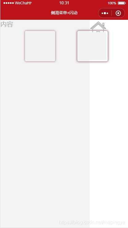
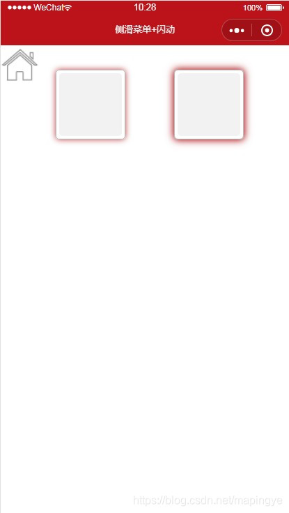
实现效果:
1、手指触摸滑动
主页中手指向右滑动屏幕出现操作菜单栏,向左滑动屏幕则隐藏菜单栏。
2、点击事件
点击页面操作按钮,滑出菜单栏,再点击一次,隐藏菜单栏。
3、闪动效果
主页div实现边框闪动,达到告警状态警示。
具体源码记录如下:
index.wxml
<!--pages/side/index.wxml-->

<view class="testSide">

<view class="side"><!--侧滑菜单-->

<text>菜单内容</text>

</view>

<view bindtouchmove="tap_move" bindtouchend="tap_end" bindtouchstart="tap_start" class="content {{side.newopen?'state':''}}">

<image style="height:100rpx;width:100rpx;" bindtap="tap_click" src="../../assets/images/home.png"></image>

</view>

<view style="margin-left:80rpx;">

<view class="avatar a1 {{alarm==1?'a1::before':''}}" ></view>

<view class="avatar a2 {{open==1?'a2::before':''}}"></view>

</view>

</view>
index.js
// pages/side/index.js

Page({


/**

* 页面的初始数据

*/

data: {

side: {//滑动操作

pageX: 0,

newpageX: 0,

open: false,

newopen: false,//判断侧边栏是否打开-显示

alarm : 1,

open:0

}

},

tap_click: function () {//点击菜单

this.data.side.open = !this.data.side.open;

this.setData({ 'side.newopen': this.data.side.open });

},

tap_start: function (e) {//touchstart事件

this.data.side.pageX = this.data.side.newpageX = e.touches[0].pageX;

},

tap_move: function (e) {//touchmove事件

this.data.side.newpageX = e.touches[0].pageX;

},

tap_end: function () {//touchend事件

if (this.data.side.pageX != this.data.side.newpageX) {

this.data.side.open = this.data.side.pageX < this.data.side.newpageX ? true : false;

this.setData({ 'side.newopen': this.data.side.open });

}

},


/**

* 生命周期函数--监听页面加载

*/

onLoad: function (options) {


},


/**

* 生命周期函数--监听页面初次渲染完成

*/

onReady: function () {


},


/**

* 生命周期函数--监听页面显示

*/

onShow: function () {


},


/**

* 生命周期函数--监听页面隐藏

*/

onHide: function () {


},


/**

* 生命周期函数--监听页面卸载

*/

onUnload: function () {


},


/**

* 页面相关事件处理函数--监听用户下拉动作

*/

onPullDownRefresh: function () {


},


/**

* 页面上拉触底事件的处理函数

*/

onReachBottom: function () {


},


/**

* 用户点击右上角分享

*/

onShareAppMessage: function () {


}

})
index.json
{

"navigationBarTitleText": "侧滑菜单+闪动",

"backgroundTextStyle": "dark"

}
index.wxss
/* pages/side/index.wxss */

.side{

height: 100%;

width: 750rpx;

position: fixed;

color:#A8A8A8;

background: #F3F3F3;

}

.content{

height: 100%;

width: 750rpx;

position: fixed;

background:#fff;

transition: All 0.5s ease;

-webkit-transition: All 0.5s ease;

}

.state{

transform: rotate(0deg) scale(1) translate(70%,0%);

-webkit-transform: rotate(0deg) scale(1) translate(70%,0%);

}

.avatar{

background-color: #f2f2f2;

width: 90px;

height: 90px;

display: inline-block;

margin: 40px;

position: relative;

z-index: 1;

border-radius: 10rpx;

}

.a1::before, .a2::before, .a2::after{

content: '';

position: absolute;

left: 0;

top: 0;

bottom: 0;

right: 0;

border: 1px solid #bbbbbb;

margin: -5px;

z-index: -1;

border-radius:10rpx;

}

.a1::before, .a2::before{

-webkit-animation: lineA 4s linear infinite;

animation: lineA 4s linear infinite;

}

.a2::after{

-webkit-animation: lineB 4s linear infinite;

animation: lineB 4s linear infinite;

}

@-webkit-keyframes lineA{

0% {-webkit-box-shadow: 0 0 5px #bbb;}

  25% {-webkit-box-shadow: 0 0 10px #BC131A;}

50%{-webkit-box-shadow: 0 0 10px #BC131A;}

100%{-webkit-box-shadow: 0 0 5px #bbb;}

}

@keyframes lineA{

0% {-webkit-box-shadow: 0 0 5px #bbb;}

  25% {-webkit-box-shadow: 0 0 10px #BC131A;}

50%{-webkit-box-shadow: 0 0 10px #BC131A;}

100%{-webkit-box-shadow: 0 0 5px #bbb;}

}

@-webkit-keyframes lineB{

0% {-webkit-box-shadow: 0 0 5px #bbb;}

  25% {-webkit-box-shadow: 0 0 10px #BC131A;}

50%{-webkit-box-shadow: 0 0 15px #BC131A;}

100%{-webkit-box-shadow: 0 0 5px #bbb;}

}

@keyframes lineB{

0% {-webkit-box-shadow: 0 0 5px #bbb;}

  25% {-webkit-box-shadow: 0 0 10px #BC131A;}

50%{-webkit-box-shadow: 0 0 15px #BC131A;}

100%{-webkit-box-shadow: 0 0 5px #bbb;}

}


 扫一扫
扫一扫


 565
565

 被折叠的 条评论
为什么被折叠?
被折叠的 条评论
为什么被折叠?
 到【灌水乐园】发言


