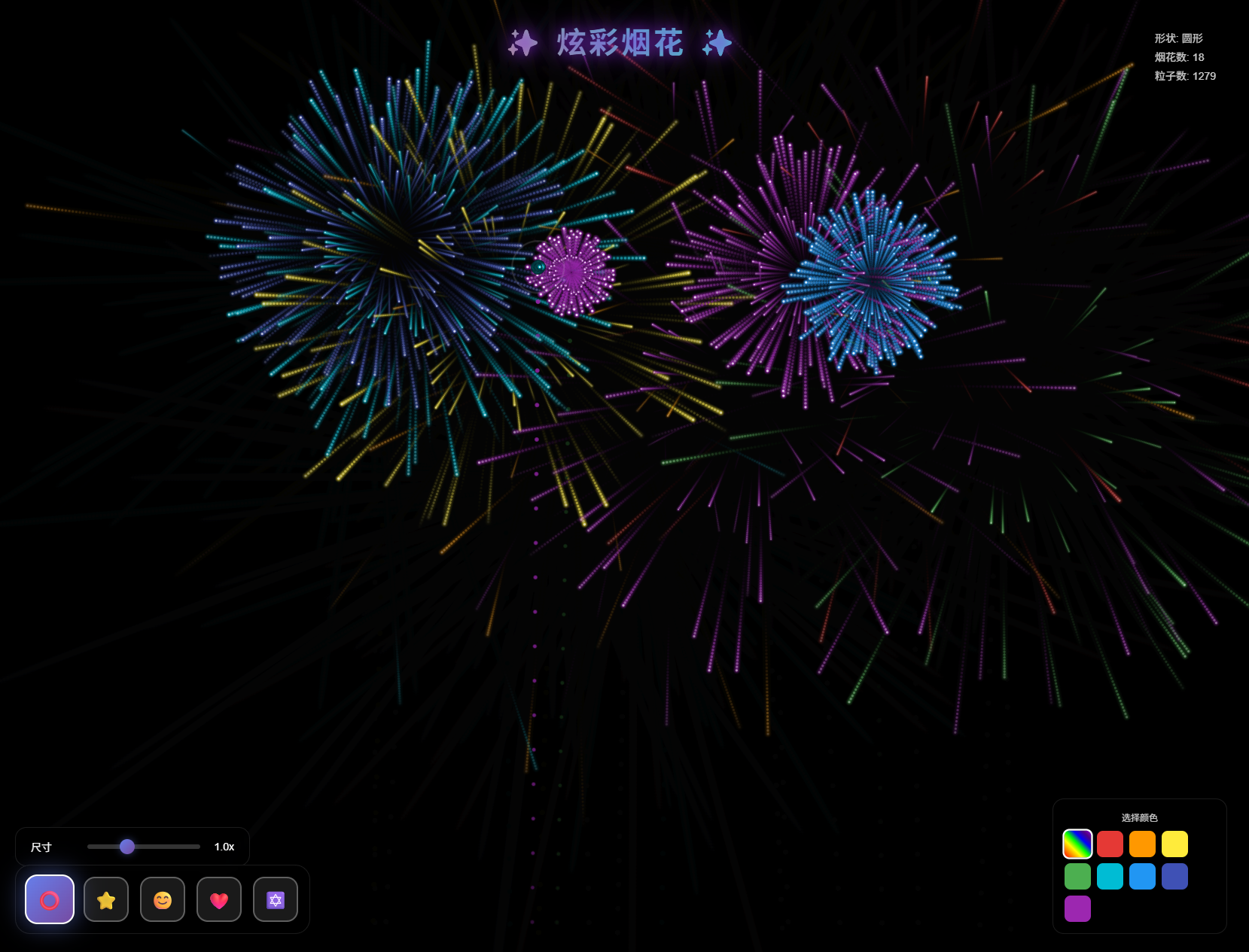
效果如图:
代码为:
<!DOCTYPE html>
<html lang="zh-CN">
<head>
<meta charset="UTF-8">
<meta name="viewport" content="width=device-width, initial-scale=1.0">
<title>炫彩烟花 - 形状绽放</title>
<style>
* {
margin: 0;
padding: 0;
box-sizing: border-box;
}
body {
background: #000;
overflow: hidden;
cursor: crosshair;
font-family: 'Arial', sans-serif;
position: relative;
}
.aurora-bg {
position: fixed;
top: 0;
left: 0;
width: 100%;
height: 100%;
background: linear-gradient(45deg,
#0a0a0a 0%,
#1a0033 25%,
#000d33 50%,
#001a1a 75%,
#0a0a0a 100%);
background-size: 400% 400%;
animation: aurora 15s ease infinite;
opacity: 0.3;
}
@keyframes aurora {
0% {
background-position: 0% 50%;
}
50% {
background-position: 100% 50%;
}
100% {
background-position: 0% 50%;
}
}
.light-beam {
position: fixed;
width: 2px;
height: 100%;
background: linear-gradient(to bottom,
transparent,
rgba(138, 43, 226, 0.3),
transparent);
animation: moveBeam 8s linear infinite;
filter: blur(2px);
}
@keyframes moveBeam {
0% {
transform: translateX(-100vw) rotate(45deg);
}
100% {
transform: translateX(100vw) rotate(45deg);
}
}
canvas {
position: relative;
z-index: 1;
}
.title {
position: fixed;
top: 30px;
left: 50%;
transform: translateX(-50%);
color: #fff;
font-size: 2.5em;
font-weight: bold;
text-shadow: 0 0 20px rgba(138, 43, 226, 0.8),
0 0 40px rgba(138, 43, 226, 0.5);
z-index: 10;
letter-spacing: 3px;
background: linear-gradient(45deg, #ff6b6b, #4ecdc4, #45b7d1, #96ceb4);
background-size: 300% 300%;
-webkit-background-clip: text;
background-clip: text;
-webkit-text-fill-color: transparent;
animation: gradientText 3s ease infinite;
}
@keyframes gradientText {
0% {
background-position: 0% 50%;
}
50% {
background-position: 100% 50%;
}
100% {
background-position: 0% 50%;
}
}
.shape-panel {
position: fixed;
bottom: 30px;
left: 30px;
display: flex;
gap: 15px;
z-index: 10;
background: rgba(0, 0, 0, 0.7);
padding: 15px;
border-radius: 20px;
backdrop-filter: blur(10px);
border: 1px solid rgba(255, 255, 255, 0.1);
}
.shape-btn {
width: 60px;
height: 60px;
border: 2px solid rgba(255, 255, 255, 0.3);
background: rgba(255, 255, 255, 0.1);
border-radius: 15px;
cursor: pointer;
display: flex;
align-items: center;
justify-content: center;
font-size: 24px;
color: #fff;
transition: all 0.3s ease;
position: relative;
overflow: hidden;
}
.shape-btn::before {
content: '';
position: absolute;
top: 50%;
left: 50%;
width: 0;
height: 0;
background: radial-gradient(circle, rgba(255, 255, 255, 0.3), transparent);
transform: translate(-50%, -50%);
transition: width 0.3s, height 0.3s;
}
.shape-btn:hover::before {
width: 100%;
height: 100%;
}
.shape-btn:hover {
transform: translateY(-5px);
border-color: rgba(255, 255, 255, 0.6);
box-shadow: 0 5px 20px rgba(255, 255, 255, 0.2);
}
.shape-btn.active {
background: linear-gradient(135deg, #667eea 0%, #764ba2 100%);
border-color: #fff;
transform: scale(1.1);
box-shadow: 0 0 30px rgba(102, 126, 234, 0.6);
}
.size-control {
position: fixed;
bottom: 120px;
left: 30px;
z-index: 10;
background: rgba(0, 0, 0, 0.7);
padding: 15px 20px;
border-radius: 15px;
backdrop-filter: blur(10px);
border: 1px solid rgba(255, 255, 255, 0.1);
display: flex;
align-items: center;
gap: 15px;
}
.size-label {
color: #fff;
font-size: 14px;
min-width: 60px;
}
.size-slider {
width: 150px;
height: 6px;
-webkit-appearance: none;
appearance: none;
background: rgba(255, 255, 255, 0.2);
border-radius: 3px;
outline: none;
transition: background 0.3s;
}
.size-slider:hover {
background: rgba(255, 255, 255, 0.3);
}
.size-slider::-webkit-slider-thumb {
-webkit-appearance: none;
appearance: none;
width: 20px;
height: 20px;
background: linear-gradient(135deg, #667eea 0%, #764ba2 100%);
border-radius: 50%;
cursor: pointer;
box-shadow: 0 0 10px rgba(102, 126, 234, 0.5);
transition: all 0.3s;
}
.size-slider::-webkit-slider-thumb:hover {
transform: scale(1.2);
box-shadow: 0 0 20px rgba(102, 126, 234, 0.8);
}
.size-value {
color: #fff;
font-size: 14px;
min-width: 30px;
text-align: right;
}
.color-panel {
position: fixed;
bottom: 30px;
right: 30px;
z-index: 10;
background: rgba(0, 0, 0, 0.7);
padding: 15px;
border-radius: 15px;
backdrop-filter: blur(10px);
border: 1px solid rgba(255, 255, 255, 0.1);
}
.color-title {
color: #fff;
font-size: 12px;
margin-bottom: 10px;
text-align: center;
opacity: 0.8;
}
.color-strip {
display: flex;
gap: 8px;
flex-wrap: wrap;
max-width: 200px;
}
.color-option {
width: 35px;
height: 35px;
border-radius: 8px;
cursor: pointer;
border: 2px solid transparent;
transition: all 0.3s ease;
position: relative;
overflow: hidden;
}
.color-option::after {
content: '';
position: absolute;
top: 50%;
left: 50%;
width: 0;
height: 0;
background: rgba(255, 255, 255, 0.3);
transform: translate(-50%, -50%);
transition: width 0.3s, height 0.3s;
border-radius: 50%;
}
.color-option:hover::after {
width: 100%;
height: 100%;
}
.color-option:hover {
transform: scale(1.1);
box-shadow: 0 0 15px currentColor;
}
.color-option.active


 最低0.47元/天 解锁文章


 扫一扫
扫一扫


 3260
3260

 被折叠的 条评论
为什么被折叠?
被折叠的 条评论
为什么被折叠?
 到【灌水乐园】发言


