


 该博客介绍了如何在Vue中创建一个自定义组件,该组件可以实现文本超出指定行数时自动省略,并通过Tooltip显示完整内容。组件支持动态绑定样式和点击链接跳转功能,当鼠标悬停在文本上时,如果文本超出限制,则显示Tooltip提示,否则不显示。文章还提供了详细的代码示例和使用方法。
转载根据需求适当做了调整
作者:ShineShadow
链接:https://juejin.cn/post/7007729080145543182
组件:
<template>
<el-tooltip :content="txtInfo" placement="top" effect="light" :disabled="isShow">
<!-- :style="dynamicSty"动态绑定样式 -->
<div class="contentnowrap" :style="dynamicSty" :class="{isLink: 'link-text'}" @mouseenter="isShowTooltip" @click="linkTo">
<span ref="contentRef">{{ txtInfo }}</span>
</div>
</el-tooltip>
</template>
<script>
export default {
name: 'toolTip',
props: {
txtInfo: {
type: String,
default: ''
},
num: {
type: Number,
default: 1
},
isLink: {
type: Boolean,
default: false
}
},
data () {
return {
isShow: false,
dynamicSty: {
'-webkit-line-clamp': this.num // 这里是超出几行省略
}
}
},
methods: {
isShowTooltip (e) {
const clientHeight = e.target.clientHeight
const scrollHeight = e.target.scrollHeight
const arrList = Array.from(e.target.classList)
// 文字超出隐藏并弹出tooltip提示,文字未超出则不弹出tooltip提示的判断条件
if (scrollHeight > clientHeight && this.$refs.contentRef.parentNode.offsetWidth > this.$refs.contentRef.offsetWidth) {
this.isShow = false
if (!arrList.includes('hover-blue')) {
e.target.classList.add('hover-blue')
}
} else {
this.isShow = true
e.target.classList.remove('hover-blue')
}
},
linkTo () {
if (this.isLink) {
this.$emit('linkTo')
}
}
}
}
</script>
<style lang="scss">
.contentnowrap{
padding: 2px 0;
word-break: break-all;
text-overflow: ellipsis;
display: -webkit-box;
-webkit-box-orient: vertical;
overflow: hidden;
}
.hover-blue:hover{
color: red;
}
.link-text{
color: red;
cursor: pointer;
}
.el-tooltip__popper{
font-size: 14px;
font-family: 'Microsoft YaHei';
}
</style>
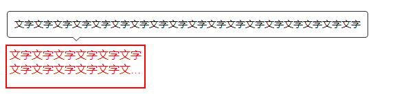
使用:
<template>
<div style="width:200px;height:60px;border:2px solid red;">
<tool-tip v-bind='{
txtInfo: "文字文字文字文字文字文字文字文字文字文字文字文字文字文字文字文字文字文字",
num:2
}'>
</tool-tip>
</div>
</template>
<script>
import toolTip from './components/toolTip.vue'
export default {
components: { toolTip },
data () {
return {}
}
}
</script>
<style>
</style>
效果展示:


 扫一扫
扫一扫


 305
305

 被折叠的 条评论
为什么被折叠?
被折叠的 条评论
为什么被折叠?
 到【灌水乐园】发言


