


 本文介绍如何使用Navisworks 2012的CommandHandlerPlugin插件创建自定义功能,包括定义命令、按钮、面板和选项卡,以及如何通过XAML配置用户界面。
A plug-in type called CommandHandlerPlugin has been introduced in Navisworks 2012. It allows you to create a plug-in with multiple commands, organize them in a custom tab that will be added to the ribbon user interface of the main product. It provides more sophistication than the basic AddInPlugin.
Overview
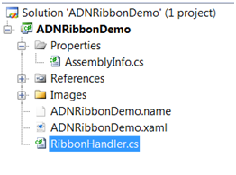
This plug-in has the following structure:
- plug-in class
- ribbon interface file (xaml)
- name file for localization
This plug-in class provides attributes to specify the basic properties, ribbon interface file, name file for localization, ribbon tabs and commands. Several functions are usually overridden to execute the command, update the command specified by the command Id, or toggle the visibility of the ribbon tab etc. The ribbon interface file uses Extensible Application Markup Language (XAML) to configure the ribbon layout. The name file for localization defines the localized text (display name, tooltip etc) for ribbon tabs and commands.
To work with this plug-in, we first need to create a class dll. – In this article, C# is used as the programming language and the sample is named ADNRibbonDemo.
Plug-In Class
This class must be derived from CommandHandlerPlugin.
Main plug-in attributes
Plugin: defines basic attributes such as name, developer ID etc.
[Plugin("ADNRibbonDemo", "ADSK", DisplayName = "ADNRibbonDemo")]Strings: identifies the *.name file which defines the localized text for ribbon (see section Name File for Localization). e.g.
[Strings("ADNRibbonDemo.name")]RibbonLayout: identifies an xaml file that defines the layout of associated custom ribbon(see section Ribbon Interface File). e.g.
[RibbonLayout("ADNRibbonDemo.xaml")]RibbonTab: defines a ribbon tab. It must be accompanied by a RibbonLayout attribute in order for the tab to appear in the GUI. The attributes include:
- Id: unique in the plug-in, and must correspond to the tab Id used in the xaml layout file.
- DisplayName: The text to display for this Ribbon tab
- LoadForCanExecute: if True, the plug-in is fully loaded to ensure that CanExecuteRibbonTab method is called. The method can be used to make a ribbon tab contextual i.e. only visible when specified conditions are met. Otherwise the tab is visible by default.
- CallCanExecute: determines the conditions in which CanExecuteRibbonTab should be called
e.g.
[RibbonTab("ID_CustomTab_1", DisplayName = "Custom Tab 1 - non-localised")]- Command: defines a command that will perform an action within the application. The attributes include:
- Id: unique in the plug-in and must correspond to the command Id used in the xaml layout file
- DisplayName: The text to display for command
- Icon: defines the standard image
- LargeIcon: defines the large image used for the command
- CanToggle: defines whether the button as it appears in the ribbon can toggle on and off.
- ToolTip: text that will appear when the user hovers over the command
- ExtendedToolTip: additional text that describes the purpose of the command
- Shortcut: a keyboard shortcut that can be used to activate the command
- CallCanExecute: determines the conditions in which CanExecuteCommand should be called. If the CanExecuteCommand is not called the default command state is disabled.
- LoadForCanExecute: commands are enabled by default, but if this is False the plug-in will not be fully loaded until the first time a command is executed. If this is True the plug-in will be fully loaded at application startup in order to call the CanExecuteCommand method.
e.g.
[Command("ID_Button_1",Icon="One_16.ico", LargeIcon = "One_32.ico",

             CanToggle = true, DisplayName = "Button 1 non-localized")
Some attributes specified in the plug-in class can be overridden by the localized name file or ribbon interface file (xaml), such as display name, images, tooltip, extended tooltip.
Main plug-in overridden functions
ExecuteCommand: Executes a command when a button is pressed. It identifies the command by the Id defined in the command attribute. e.g.
public override int ExecuteCommand(string commandId,

                            params string[] parameters)

{

    switch (commandId)

    {

        case "ID_Button_1":

            {

                // the flag is used to

                // set status of other commands

                m_toEnableButton =

                    !m_toEnableButton;

                break;

            }

        // dropdown commands

        case "ID_Button_4":

        case "ID_Button_5":

            {

                MessageBox.Show("he command with ID is clicked = '"

                    + commandId + "'");

                break;

            }

    }

    return 0;

}
CanExecuteCommand: updates the command specified by the command Id. The argument CommandState indicates if the command is enabled, checked (if a toggle command) and visible. e.g.
public override CommandState CanExecuteCommand(String commandId)

{

    CommandState state = new CommandState();

    switch (commandId)

    {

        case "ID_Button_3":

            {

                // button3 is disabled/enabled by a flag

                state.IsEnabled = m_toEnableButton;

                break;

            }

        default:

            {

                // other commands are all visible and enabled

                state.IsVisible = true;

                state.IsEnabled = true;

                state.IsChecked = false;

                break;

            }

    }

    return state;

}
CanExecuteRibbonTab: The return flag will tell if display the corresponding tab or not.
public override bool CanExecuteRibbonTab(String ribbonTabId)
{
// The second ribbon tab is visible or not
// by Button 2 toggles on/off
if (ribbonTabId.Equals("ID_CustomTab_2"))
{
return m_toShowTab;
}
return true;
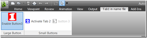
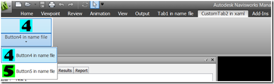
}In our sample, we define two tabs. Tab1 contains two panels (called Panel1 and Panel2). Panel1 has Button1 of large size. Panel2 has two buttons of small size (called Button2 Button3). Tab2 has one panel with two commands (called Button4, Button5), grouped as dropdown menu. Button1 enables/disables Button3. Button2 toggles the visibility of Tab2 to be on or off.
Ribbon Interface File
The technique to configure the ribbon interfaces uses Extensible Application Markup Language(XAML). Several main types of tag (nodes):
RibbonControl: This is the top most node. It defines the Ribbon’s unique name and necessary configurations for the xaml.
RibbonTab: configures the Ribbon tab. The attributes include:
- Id: defines a unique identifier for the ribbon tab - this must be identical to the ribbon tab Id in compiled code.
- Title: defines the text than appears on the tab. This overrides the DisplayName attribute in compiled code.
- KeyTip: the key or combination of keys that enables the tab to be activated using the keyboard rather than the mouse.
RibbonPanel: provides a distinct panel in the ribbon tab for a group of buttons. Only one attribute:
- x:Uid: unique id used in xmal file
RibbonPanelSource: defines the content and properties of its parent node RibbonPanel. Commands are defined with this node.
local:NWRibbonButton: indicates a button in the ribbon. The attributes include:
- x:Uid: unique id used in xmal file
- Id: Defines a unique identifier for the command
- Size: standard (default) or Large.
- Image: image to display. It overrides that defined by plug-in attributes in the compiled code. The image path defines the location relative to the ribbon definition file (XAML), hence our image path here indicates that the images are located in an Images subdirectory next to the sub-directory when the ribbon file is located. If you wish you can define the image location relative to the Roamer executable by using Image="pack://siteOfOrigin:,,,{image location}" where {image location} is the location of the icon (or png file) relative to the executable. Standard images must be 16x16 pixels. For large buttons specify Size="Large" and define a LargeImage attribute, which must be 32x32 pixels.
- KeyTip: the key or combination of keys that enables the button to be activated using the keyboard rather than the mouse. Keytips are made visible by pressing
- Orientation: "Horizontal" or "Vertical". Horizontal places the buttons side by side with the Text. Vertical places the buttons above the text.
- ShowText : indicates whether the button should display its Text with the button, or image only. Text: text displayed on the button if ShowText is true. It overrides that defined by plugin attributes in the compiled code)
local:NWRibbonSplitButton: As the name suggests, this defines the Split button. It can be defined as synchronized with current item (i.e. the last drop-down item clicked appears on the button), or not synchronized with the current item. The button can be clicked independently from the drop-down menu. Most attributes are same to local:NWRibbonButton.
- IsSynchronizedWithCurrentItem: synchronized or non- synchronized
- IsSplit: indicates that the button can be clicked independently from the drop down, thus activating the current item.
e.g.
<?xml version="1.0" encoding="utf-8" ?>
<RibbonControl
    x:Uid="ADNRibbonDemo" xmlns="clr-namespace:Autodesk.Windows;assembly=AdWindows"
    xmlns:wpf="http://schemas.microsoft.com/winfx/2006/xaml/presentation"
    xmlns:adwi="clr-namespace:Autodesk.Internal.Windows;assembly=AdWindows"
    xmlns:system="clr-namespace:System;assembly=mscorlib"
    xmlns:x="http://schemas.microsoft.com/winfx/2006/xaml"
       xmlns:local="clr-namespace:Autodesk.Navisworks.Gui.Roamer.AIRLook;assembly=navisworks.gui.roamer">
    <RibbonTab Id="ID_CustomTab_1" KeyTip="T1">
        <RibbonPanel x:Uid="RibbonPane1_1">
            <RibbonPanelSource x:Uid="RibbonPanelSource_RibbonPanel_1" KeyTip="C1" Title="Large Button">
                <local:NWRibbonButton x:Uid="Button_1" Id="ID_Button_1"
                                    Size="Large"
                                    KeyTip="B1"
                                    ShowText="True"
                                    Text="Button 1 in xaml"
                                    Orientation="Vertical"/>

            </RibbonPanelSource>

        </RibbonPanel>

     </RibbonTab>

 </RibbonControl>
In our sample, the grouped buttons (Button4 and Button5) are designed as Synchronize.
Name File for Localization
This is a text file with the extension *.name. It defines the localized text for ribbon tabs and commands. The strings defined in the xaml layout file overrides strings defined in the name file. That implies that Navisworks will ignore the strings in *.name file if you specify the strings in xaml. So the name file is not required when the xaml file is language-specific. The name file in our sample provides display names for all tabs and buttons. This file uses UTF8 encoding. Lines starting with # or $, or ending with = means do not need translating. e.g.
# This is comments

$ This is comments

ID_CustomTab_2.DisplayName=

Tab2 in name file

ID_Button_1.DisplayName=

Button1 in name file
In general, the icon of the command is specified with a relative path, while the root path is where the plug-in dll resides in. It is recommended to create one sub-folder for storing these images.
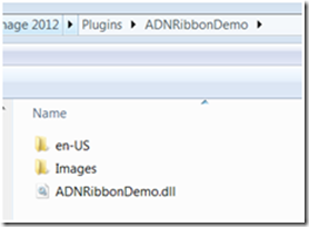
Now that the whole application is available. We shall build the project to generate the ADNRibbonDemo.dll.
Locations of xaml and Name File
This plug-in dll should be put under the folder
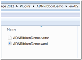
<Navisworks 2012 Installation Path>\Plugins\ADNRibbonDemo. In addition, the xaml and name file must reside in the sub-folder of the plug-in dll. The sub-folder name needs to be a Language Code such as: en-US >> English version, zh-CN >> Chinese (PRC) version.
By default, Navisworks will try to load the xaml and *.name files from the subfolder that corresponds to the current language version. For example, if you are using the Chinese version and there are two sub-folders called en-US and zh-CN. If zh-CN is available and the files do not cause any errors, Navisworks loads the dll with the zh-CN files. Otherwise, Navisworks will check if en-US is available and the files do not cause any problem. If none of files of either version are available or problematic, Navisworks will not load the plug-in dll.
Priority of Strings
For display names or tooltips, Navisworks check the xaml file first. If it does not specify the strings, it checks the sub-folder for localization and gets names from *.name. If both are not available, it will use the names defined in plug-in class. The advantage of defining button Text in the xaml or name file is that the plug-in can be localized. In addition, the display name of Command can be overridden dynamically by CommandState.OverrideDisplayName in function CanExecuteCommand. For image, Navisworks will check the xaml first, and then the attributes specified in the plug-in class.
e.g. in our sample:
Display Names of Tabs
| ribbon elements | xaml | *.name | attributes in compiling code | result in ribbon |
| Tab 1 | “Tab1 in name file” | “Custom Tab 1 - non-localised” | “Tab1 in name file” | |
| Tab 2 | “CustomTab2 in xaml” | “Tab2 in name file” | “Custom Tab 2 - non-localised” | “CustomTab2 in xaml” |
Display Names of Commands
| ribbon elements | Dynamic override | attributes in compiling code | xaml | *.name | result in ribbon |
| Button 1 | “Disable Button3” or “Enable Button3” | “Button1 in name file” | “Button1 in name file” | “Disable Button3” or “Enable Button3” | |
| Button 2 | |||||
| Button 3 | “Button 3 non-localized” | “button 3” | “Button3 in name file” | “button 3” | |
| Button 4 | “Button4 in name file” | “Button4 in name file” | |||
| Button 5 | “Button4 in name file” | “Button4 in name file” |
Finally you will see the custom ribbon as shown below:
Before toggle Ribbon Tab 2
After toggle Ribbon Tab 2
Please refer to the sample codes for more details. The sample hard codes the actions of copying the dll, xaml and name file to “C:\Program Files\Autodesk\Navisworks Manage 2012\Plugins” in post-build event. Please adjust with your own path.
Further reading
The SDK sample called CustomRibbon shows some more types of custom buttons.


 扫一扫
扫一扫


 167万+
167万+

 被折叠的 条评论
为什么被折叠?
被折叠的 条评论
为什么被折叠?
 到【灌水乐园】发言


