


 本文介绍了CSS盒模型的基本概念及box-sizing属性的作用。通过示例展示了如何使用box-sizing:border-box来更直观地控制元素的实际大小,特别是在布局设计中解决元素尺寸计算的问题。
如下就是常见的盒子模型。
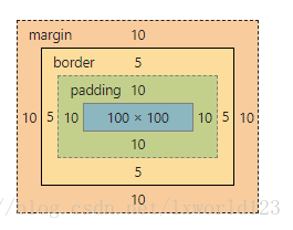
设定大小就是给最中间的内容添加。box-sizing就是改变设定大小的对象。
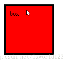
<!DOCTYPE html>
<html>
	<head>
		<meta charset="UTF-8">
		<title></title>
		<style type="text/css">
			#box{
				background: red;
				width: 100px;
				height: 100px;
				padding: 10px;
				border: 5px solid #000000;
				margin: 10px;

			}
		</style>
	</head>
	<body>
		<div id="box">
			box
		</div>
	</body>
</html>
添加box-sizing属性;
				/*
				 * content-box 默认,设置width,height就是内容区(content)的大小
				 * barder-box 设置width,height包含了border+padding+content(ie6下默认模式)
				 * padding-box 浏览器不一定支持,设置width,height包含了padding+content
				 * */
				/*默认*/
				/*box-sizing: content-box;*/
在样式中添加 box-sizing: border-box;
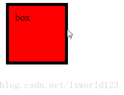
明显变小了
使用场景:
<!DOCTYPE html>
<html>
	<head>
		<meta charset="UTF-8">
		<title></title>
		<style type="text/css">
			#box{
				background: red;
				width: 100px;
				height: 100px;
				padding: 10px;
				border: 5px solid #000000;
				margin: 10px;
				/*
				 * content-box 默认,设置width,height就是内容区(content)的大小
				 * barder-box 设置width,height包含了border+padding+content(ie6下默认模式)
				 * padding-box 浏览器不一定支持,设置width,height包含了padding+content
				 * */
				/*默认*/
				/*box-sizing: content-box;*/

				box-sizing: border-box;
			}

			#footer{
				overflow: hidden;
				padding: 10px;
				background: #CCCCCC;
			}
			#footer div{
				float: left;
				width: 50%;
			}
			#left{
				background: blue;
			}
			#right{
				background: green;
			}
		</style>
	</head>
	<body>
		<div id="box">
			box
		</div>
		<hr />
		<div id="footer">
			<div id="left">
				left
			</div>
			<div id="right">
				right
				<ul>
					<li>1</li>
					<li>2</li>
					<li>3</li>
					<li>4</li>
				</ul>
			</div>
		</div>
	</body>
</html>
但如果要在中间添加一个分割线
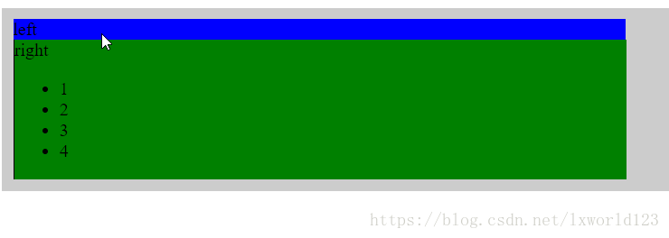
它会因为超出而换行
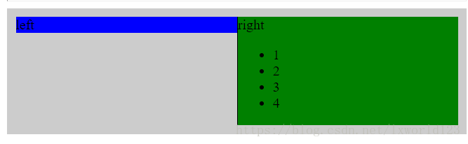
添加box-sizing: border-box后可以解决


 扫一扫
扫一扫


 3851
3851

 被折叠的 条评论
为什么被折叠?
被折叠的 条评论
为什么被折叠?
 到【灌水乐园】发言


