


 本文详细介绍了SVG(可缩放矢量图形)的概念、HTML中的基础用法,包括基本形状绘制、渐变、动画示例,以及SVG在动画中的应用,如路径动画和变换。此外,还提到了SVG的扩展性和在工作中的应用场景,如Twaverd3.js等库的使用。
1、SVG 概念
svg 是指可伸缩矢量图形, 图像在放大或改变尺寸的情况下其图形质量不会有损失。 是万维网联盟的标准。 作为标签可直接 嵌入到 html 中。
2、基础案例
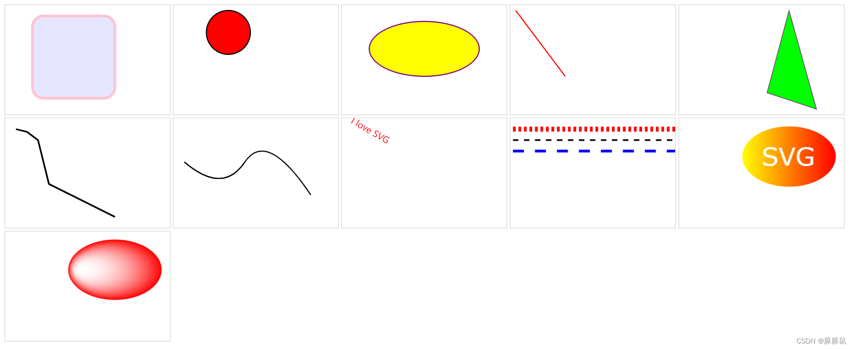
💡 Tips:实现 矩形、圆形、椭圆、直线、多边形、路径、文本、渐变 等基础图形
<!DOCTYPE html>
<html lang="en">
  <head>
    <meta charset="UTF-8" />
    <meta http-equiv="X-UA-Compatible" content="IE=edge" />
    <meta name="viewport" content="width=device-width, initial-scale=1.0" />
    <title>Document</title>
    <style>
      svg {
        width: 300px;
        height: 200px;
        border: 1px solid #ccc;
      }
    </style>
  </head>
  <body>
    <!-- 矩形 -->
    <!--
       x 属性定义矩形的左侧位置
       y 属性定义矩形的顶端位置
       rx 和 ry 属性可使矩形产生圆角
       fill 属性定义矩形的填充颜色
       fill-opacity 属性定义填充颜色透明度
       stroke-width 属性定义矩形边框的宽度
       stroke 属性定义矩形边框的颜色
       stroke-opacity 属性定义轮廓颜色的透明度
       opacity 属性用于定义了元素的透明值
     -->
    <svg xmlns="http://www.w3.org/2000/svg" version="1.1">
      <rect
        x="50"
        y="20"
        rx="20"
        ry="20"
        width="150"
        height="150"
        style="fill: blue; fill-opacity: 0.1; stroke-width: 5; stroke: pink; stroke-opacity: 0.9"
      />
    </svg>

    <!-- 圆形 -->
    <!-- cx和cy属性定义圆点的x和y坐标,r属性定义圆的半径 -->
    <svg xmlns="http://www.w3.org/2000/svg" version="1.1">
      <circle cx="100" cy="50" r="40" stroke="black" stroke-width="2" fill="red" />
    </svg>

    <!-- 椭圆 -->
    <!-- cx、cy为椭圆圆心,rx水平半径,ry垂直半径 -->
    <svg xmlns="http://www.w3.org/2000/svg" version="1.1">
      <ellipse cx="150" cy="80" rx="100" ry="50" style="fill: yellow; stroke: purple; stroke-width: 2" />
    </svg>

    <!-- 直线 -->
    <svg xmlns="http://www.w3.org/2000/svg" version="1.1">
      <line x1="10" y1="10" x2="100" y2="130" style="stroke: rgb(255, 0, 0); stroke-width: 2" />
    </svg>

    <!-- 多边形 -->
    <!-- points 属性定义多边形每个角的 x 和 y 坐标 -->
    <svg xmlns="http://www.w3.org/2000/svg" version="1.1">
      <polygon points="200,10 250,190 160,160" style="fill: lime; stroke: purple; stroke-width: 1" />
    </svg>

    <!-- 多线段 -->
    <svg xmlns="http://www.w3.org/2000/svg" version="1.1">
      <polyline points="20,20 40,25 60,40 80,120 120,140 200,180" style="fill: none; stroke: black; stroke-width: 3" />
    </svg>

    <!-- path路径 -->
    <!-- 可实现自定义画图,包含直线,曲线,形状等 -->
    <!-- https://blog.youkuaiyun.com/u012576295/article/details/122544558 -->
    <svg xmlns="http://www.w3.org/2000/svg" version="1.1">
      <path d="M20 80 Q90 140, 130 80" stroke="#000000" fill="none" style="stroke-width: 2px" />
      <path d="M20 80 Q90 140, 130 80 T250 140" stroke="#000000" fill="none" style="stroke-width: 2px" />
    </svg>

    <!-- 文本 -->
    <svg xmlns="http://www.w3.org/2000/svg" version="1.1">
      <text x="0" y="15" fill="red" transform="rotate(30 20,40)">I love SVG</text>
    </svg>

    <!-- stroke -->
    <svg xmlns="http://www.w3.org/2000/svg">
      <g fill="none" stroke="black" stroke-width="9" stroke-dasharray="5,5">
        <path d="M5 20 300 20" stroke="red" />
        <path d="M5 40 300 40" stroke="black" stroke-width="3" stroke-dasharray="10,10" />
        <path d="M5 60 300 60" stroke="blue" stroke-width="5" stroke-dasharray="20,20" />
      </g>
    </svg>

    <!-- 线性渐变 -->
    <svg xmlns="http://www.w3.org/2000/svg" version="1.1">
      <defs>
        <linearGradient id="grad1" x1="0%" y1="0%" x2="100%" y2="0%">
          <stop offset="0%" style="stop-color: rgb(255, 255, 0); stop-opacity: 1" />
          <stop offset="100%" style="stop-color: rgb(255, 0, 0); stop-opacity: 1" />
        </linearGradient>
      </defs>
      <ellipse cx="200" cy="70" rx="85" ry="55" fill="url(#grad1)" />
      <text fill="#ffffff" font-size="45" font-family="Verdana" x="150" y="86">SVG</text>
    </svg>

    <!-- 径向渐变 -->
    <!-- https://www.cnblogs.com/xiaohuochai/p/7495894.html -->
    <svg xmlns="http://www.w3.org/2000/svg" version="1.1">
      <defs>
        <radialGradient id="grad2" cx="50%" cy="50%" r="50%" fx="10%" fy="50%">
          <stop offset="0%" style="stop-color: rgb(255, 255, 255); stop-opacity: 0" />
          <stop offset="100%" style="stop-color: rgb(255, 0, 0); stop-opacity: 1" />
        </radialGradient>
      </defs>
      <ellipse cx="200" cy="70" rx="85" ry="55" fill="url(#grad2)" />
    </svg>
  </body>
</html>
效果图如下:
3、SVG 动画
<!DOCTYPE html>
<html lang="en">
  <head>
    <meta charset="UTF-8" />
    <meta http-equiv="X-UA-Compatible" content="IE=edge" />
    <meta name="viewport" content="width=device-width, initial-scale=1.0" />
    <title>Document</title>
    <style>
      svg {
        width: 300px;
        height: 200px;
        border: 1px solid #ccc;
      }
    </style>
  </head>
  <body>
    <!-- 动画 -->
    <!-- https://blog.youkuaiyun.com/weixin_70815247/article/details/125822190 -->
    <!--
      SVG动画属性
        attributeType: CSS/XML规定的属性值的名称空间
        attributeName: 规定元素的哪个属性会产生动画效果
        from/to: 从哪到哪
        dur: 动画时长
        fill: 动画结束之后的状态,保持freeze结束状态/remove回复初始状态
     -->
    <svg xmlns="http://www.w3.org/2000/svg" version="1.1">
      <circle id="circle1" cx="100" cy="100" r="5">
        <animate attributeName="r" attributeType="XML" from="0" to="30" begin="click" dur="5" fill="freeze"></animate>
        <animate
          attributeName="fill"
          attributeType="XML"
          from="yellow"
          to="orange"
          begin="3"
          dur="5"
          fill="freeze"
        ></animate>
        <animate
          id="toRight"
          attributeName="cx"
          attributeType="XML"
          from="100"
          to="200"
          begin="click;toLeft.end"
          dur="5"
          fill="freeze"
        ></animate>
        <animate
          id="toLeft"
          attributeName="cx"
          attributeType="XML"
          from="200"
          to="100"
          begin="toRight.end"
          dur="5"
          fill="freeze"
        ></animate>
      </circle>
    </svg>

    <!-- 动画上一个目标元素变换属性,从而使动画控制平移,缩放,旋转或倾斜 -->
    <svg xmlns="http://www.w3.org/2000/svg" version="1.1">
      <rect x="100" y="100" width="300" height="200" fill="blue">
        <animateTransform
          attributeName="transform"
          type="rotate"
          from="0 100 100"
          to="360 100 100"
          dur="3"
          begin="click"
          fill="freeze"
        ></animateTransform>
      </rect>
    </svg>

    <!-- 使元素沿着动作路径移动 -->
    <svg width="800" height="800" viewBox="-100 -100 500 500">
      <path d="M0 0 c0 300 300 300 300 0" stroke="red" stroke-width="2" fill="none"></path>
      <rect x="0" y="0" width="40" height="40" fill="lightgreen">
          <animateMotion path="M0 0 c0 300 300 300 300 0" dur="3" begin="click" fill="freeze" retate="auto"><animateMotion/>
      </rect>
    </svg>
  </body>
</html>
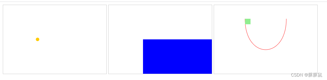
效果图如下:
4、扩展
- svg 可实现各种矢量图,不失真,代码体积小,扩展性强。
- 现成的基于 svg 的二次封装库也有很多,工作中常见的如下:
Twaver
d3.js - svg 学习链接如下:
SVG 教程 | 菜鸟教程
path 路径用法-优快云博客
SVG渐变 - 小火柴的蓝色理想 - 博客园
SVG 参考手册 | 菜鸟教程


 扫一扫
扫一扫


 2160
2160

 被折叠的 条评论
为什么被折叠?
被折叠的 条评论
为什么被折叠?
 到【灌水乐园】发言


