


示例
:has用于选择具有某个子元素的父元素,还可以选择后面紧跟着某个元素的当前元素。
参考:https://blog.youkuaiyun.com/qq_24956515/article/details/147512895
选择具有某个子元素的父元素
父元素内包含子元素
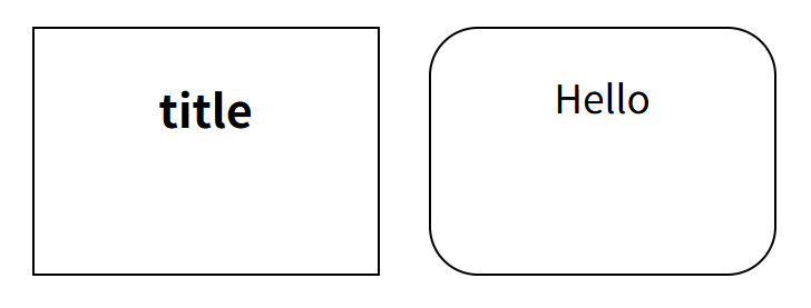
下面代码选择包含子元素p的div,为其设置圆角边框:
<!DOCTYPE html>
<html lang="en">
  <head>
    <meta charset="UTF-8" />
    <meta name="viewport" content="width=device-width, initial-scale=1.0" />
    <title>Document</title>
    <style>
      div {
        width: 140px;
        height: 100px;
        border: 1px solid #000;
        margin: 10px;

        text-align: center;
        float: left;
      }
      div:has(p) {
        border-radius: 20px;
      }
    </style>
  </head>
  <body>
    <div>
      <h3>title</h3>
    </div>
        <div>
      <p>Hello</p>
    </div>
  </body>
</html>
效果图:
父元素内包含子元素伪类
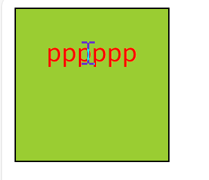
当鼠标悬浮在子元素p上面时,设置父元素div的背景颜色:
<!DOCTYPE html>
<html lang="en">
  <head>
    <meta charset="UTF-8" />
    <meta name="viewport" content="width=device-width, initial-scale=1.0" />
    <title>Document</title>
    <style>
     div{
      width: 100px;
      height: 100px;
      border: 1px solid #000;
      text-align: center;
     }
     p:hover{
      color: red;
     }
     div:has(p:hover){
      background-color: yellowgreen;
     }

    </style>
  </head>
  <body>
    <div>
      <p>pppppp</p>
    </div>
  </body>
</html>
效果图:
选择后面紧跟着某个元素的当前元素
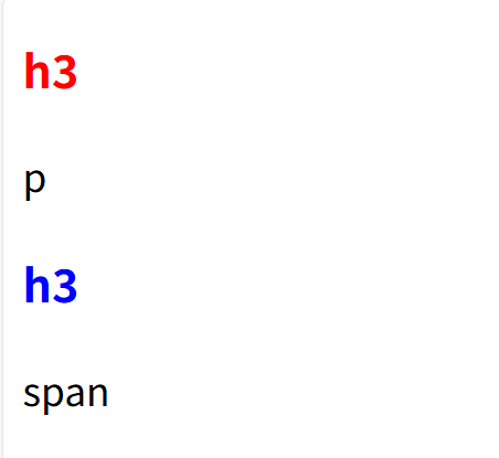
为后面紧跟p元素的h3设置红色,为后面紧跟span元素的h3设置蓝色:
<!DOCTYPE html>
<html lang="en">
  <head>
    <meta charset="UTF-8" />
    <meta name="viewport" content="width=device-width, initial-scale=1.0" />
    <title>Document</title>
    <style>
      h3:has(+p){
        color:red;
      }
      h3:has(+span){
        color:blue;
      }
    </style>
  </head>
  <body>
    <h3>h3</h3>
    <p>p</p>
    <h3>h3</h3>
    <span>span</span>
  </body>
</html>
效果图:


 扫一扫
扫一扫


 8352
8352

 被折叠的 条评论
为什么被折叠?
被折叠的 条评论
为什么被折叠?
 到【灌水乐园】发言


