


 本文介绍了一种使用CSS实现文本渐变颜色的效果方法,通过设置背景渐变并结合background-clip和-webkit-background-clip属性将渐变应用于文本本身,同时保持字体颜色透明。此方法在Chrome、Edge及360浏览器上表现良好。
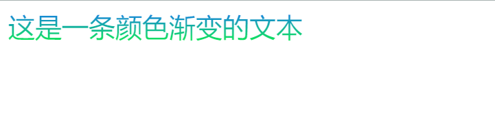
实现效果:
样式配置:
.title {
      font-size: 26px;
      background: linear-gradient(
        to bottom,
        #1770f5,
        #10f14b
      ); /* 设置背景为渐变 */
      background-clip: text; /* 设置背景绘制区域为text */
      -webkit-background-clip: text;
      color: transparent; /* 设置字体颜色为透明 */
    }
缺点:兼容性可能不是很好(background-clip: text),但目前测试在chorme,edge,360中效果都正常(不排除低版本无法识别的可能)
<!--
 * @Author: your name
 * @Date: 2021-05-27 15:18:20
 * @LastEditTime: 2021-06-26 22:00:20
 * @LastEditors: Please set LastEditors
 * @Description: In User Settings Edit
 * @FilePath: \test\index.html
-->
<!DOCTYPE html>
<html lang="en">
  <head>
    <meta charset="UTF-8" />
    <meta http-equiv="X-UA-Compatible" content="IE=edge" />
    <meta name="viewport" content="width=device-width, initial-scale=1.0" />
    <title>Document</title>
  </head>
  <style>
    .title {
      font-size: 26px;
      background: linear-gradient(
        to bottom,
        #1770f5,
        #10f14b
      ); /* 设置背景为渐变 */
      background-clip: text; /* 设置背景绘制区域为text */
      -webkit-background-clip: text;
      color: transparent; /* 设置字体颜色为透明 */
    }
  </style>
  <body>
    <div class="title">这是一条颜色渐变的文本</div>
  </body>
</html>


 扫一扫
扫一扫


 2827
2827

 被折叠的 条评论
为什么被折叠?
被折叠的 条评论
为什么被折叠?
 到【灌水乐园】发言


