


 在静态页面设计中,当需要对绝对定位的元素进行布局时,其父元素通常设置为相对定位,导致容器脱离文档流。如何使这种情况下容器水平居中成为一个挑战。通过移除容器的`flex-direction: row`并添加`justify-content: center`,成功解决了这个问题,实现了理想的水平居中效果。
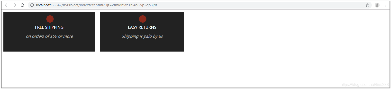
在设计静态页面时,有一部分布局需要使用绝对定位,那么它的父元素就要使用相对定位,这样一来就使承载绝对定位元素的容器脱离了文档流,现在让容器水平居中难倒了我这小菜鸡。它就一直这个样子:
这是源码:
<!doctype html>
<html lang="zh">
<head>
    <meta charset="UTF-8">
    <meta name="viewport"
          content="width=device-width, user-scalable=no, initial-scale=1.0, maximum-scale=1.0, minimum-scale=1.0">
    <meta http-equiv="X-UA-Compatible" content="ie=edge">
    <title>Document</title>
    <style>
        *,*:before,*:after {
            box-sizing: border-box;
        }
        .container3 {
            display: flex;
            flex-direction: row;
            align-items: center;
        }

        .left-black-box,.right-black-box {
            text-align: center;
            vertical-align: middle;
            background-color: #222222;
            float: left;
            padding: 30px 40px;
            position: relative;
            display: inline-block;
            left: 0;
            right: 0;
        }
        .right-black-box {
            margin-left: 20px;
        }
        .container3 .inner-word {
            width: 80%;
            display: table-cell;
            vertical-align: middle;
            padding: 22px;
            border-top:1px solid rgba(160, 160, 160, 0.82);
            border-bottom: 1px solid rgba(160, 160, 160, 0.82);
        }
        .container3 .inner-word span:nth-of-type(1) {
            color: #fff;
            display: block;
            margin-bottom: 1rem;
        }
        .container3 .inner-word span:nth-of-type(2) {
            color: #bebebe;
            display: block;
        }
        .red-circle-container {
            position: absolute;
            display: table;
            width: 50px;
            height: 50px;
            padding:10px;
            margin-left: 50%;
            border-radius: 50%;
            transform: translate(-125%,-50%);
            background-color: #222222;
        }
        .red-circle {
            display: table-cell;
            vertical-align: middle;
            background-color: #8b291b;
            border-radius: 50%;
        }
    </style>
</head>
<body>
    <div class="container3">
        <div class="left-black-box">
            <div class="red-circle-container">
                <div class="red-circle"></div>
            </div>
            <div class="inner-word">
                <span>FREE SHIPPING</span>
                <span><i>on orders of $50 or more</i></span>
            </div>
        </div>

        <div class="right-black-box">
            <div class="red-circle-container">
                <div class="red-circle"></div>
            </div>
            <div class="inner-word">
                <span>EASY RETURNS</span>
                <span><i>Shipping is paid by us</i></span>
            </div>
        </div>
    </div>
</body>
<ml>
自己实在不行了,开始积极找大佬请教,去了一行,又加了一行,完美搞定
就是去掉容器的flex-direction: row,加上了justify-content: center
.container3 {
            overflow: hidden;
            display: flex;
            justify-content: center;
            align-items: center;
        }
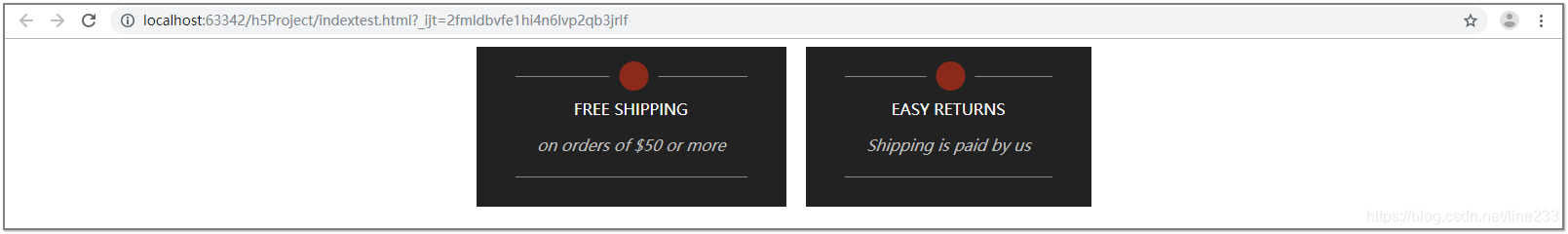
以上是改后的效果图,


 扫一扫
扫一扫


 902
902

 被折叠的 条评论
为什么被折叠?
被折叠的 条评论
为什么被折叠?
 到【灌水乐园】发言


