


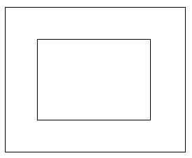
水平垂直居中
.flex-center {
    display: flex;
    justify-content: center; // 水平居中
    align-items: center; // 垂直居中
}
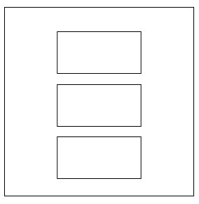
换行垂直居中
.flex-center-vertical {
    display: flex;
    flex-flow: column; //或flex-direction: column;
    align-items: center;
    justify-content: center;
}
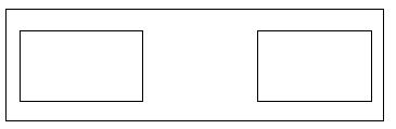
左右两端对齐
.box {
	display: flex;
    flex-flow:  row nowrap;
    justify-content: space-between;
}
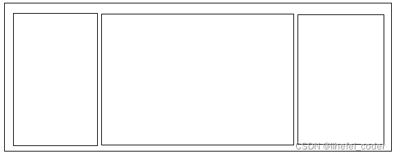
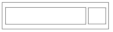
左右固定宽度,中间宽度自适应
.box {
	display: flex;

	.left,
	.right {
	    width: 80px;
	}
	.center {
	    flex:1
	}
}
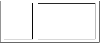
左右两端对齐,左侧占用剩余空间
.box {
	display: flex;
    flex-flow:  row nowrap;
    justify-content: space-between;

	.left{
	    flex: 1;
	}
}
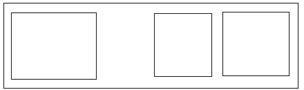
按比例分配宽度
left的宽度:0.5/(0.5+1)*300=100
right的宽度:1/(0.5+1)*300=200
.box {
	display: flex;
    width: 300px;
	.left{
	    flex: 0.5;
	}
	.right{
	    flex: 1;
	}
}
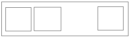
第一个子元素靠左,其他子元素靠右
.box {
	display: flex;
	justify-content: flex-end;
}
.box {
	.item:first-child{
	    margin-right: auto;
	}
}
最后一个子元素靠右,其他子元素靠左
.box {
	display: flex;
}
.box {
	.item:last-child{
	    margin-left: auto;
	}
}
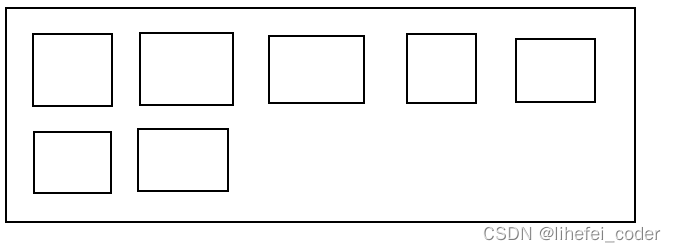
子元素横排,自动换行
.box {
	display: flex;
    flex-flow: wrap;
}
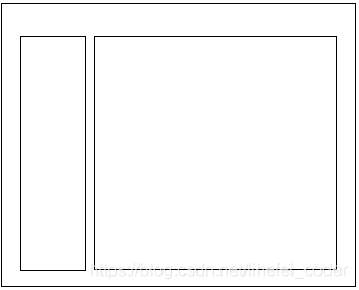
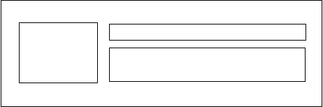
左右两个元素高度同步
<div class="flex-container">
    <div class="flex-aside">flex-aside</div>
    <div class="flex-main">flex-main</div>
</div>

<style>

.flex-container {
    display: flex;
    flex-direction: row;
    flex: 1;
    flex-basis: auto;

    .flex-aside,
    .flex-main {
        overflow: auto;
    }

    .flex-aside {
        flex-shrink: 0;
        width: 200px;
        height: 500px;
        background-color: #d6d7d8;
    }
    .flex-main {
        display: block;
        flex: 1;
        flex-basis: auto;
        background-color: #e9eef3;
    }
}
</style>
左边子元素文字自适应溢出隐藏,右边子元素固定宽度
.box {
	display: flex;
	flex-direction: row;
}
.box {
	.left {
		flex: 1;
	    overflow: hidden;
	    text-overflow: ellipsis;
	    white-space: nowrap;
	}
	.right {
		width: 80px;
        text-align: right;
	}
}
左边子元素文字自适应溢出隐藏,右边子元素固定宽度,但空余宽度会被左边子元素挤占
.box {
	display: flex;
	flex-direction: row;
}
.box {
	.left {
	    overflow: hidden;
	    text-overflow: ellipsis;
	    white-space: nowrap;
	}
	.right {
		width: 80px;
        text-align: right;
	}
}
给子元素设置宽度
flex-shrink:表示在父元素宽度不够的情况下是否自动收缩,取值:0表示不自动收缩,1表示自动收缩
<ul>
	<li>aaaaaa</li>
	<li>bbbbbb</li>
<ul>
<style>
ul {
	display: flex;
}
li {
	flex-shrink: 0;
}
</style>
多行溢出隐藏
.box {
    overflow: hidden;
    text-overflow: ellipsis;
    display: -webkit-box;
    -webkit-line-clamp: 2;
    -webkit-box-orient: vertical;
}
11.常见媒体布局
<div class="media">
    <div class="media-face"><img src="xxx" /></div>
    <div class="media-body">
        <h3 class="media-title">标题</h3>
        <div class="media-content">内容</div>
    </div>
</div>

<style>
.media {
    display: flex;
    overflow: hidden;
    .media-face {
        width: 64px;
        height: 64px;
        margin-right: 8px;
    }
    .media-body {
        flex: 1;
        position: relative;
        overflow: hidden;

        .media-title {
            font-size: 14px;
            line-height: 24px;
            color: #333;
            overflow: hidden;
            text-overflow: ellipsis;
            white-space: nowrap;
        }
        .media-content {
            margin-top: 8px;
            color: #666;
            font-size: 12px;
            line-height: 16px;
        }
    }
}
</style>
常见媒体布局:多行溢出隐藏
<div class="media">
    <div class="media-face"><img src="xxx" /></div>
    <div class="media-body">
        <h3 class="media-title">标题</h3>
        <div class="media-content">内容</div>
    </div>
</div>

<style>
.media {
    display: flex;
    .media-face {
        width: 64px;
        height: 64px;
        flex-shrink: 0;
    }
    .media-body {
        flex: 1;
        margin: 0 0 0 10px;
        overflow: hidden;
        text-overflow: ellipsis;

        .media-title {
            overflow: hidden;
            text-overflow: ellipsis;
            white-space: nowrap;
            color: #333;
        }
        .media-content {
            display: -webkit-box;
            -webkit-line-clamp: 2;
            -webkit-box-orient: vertical;
            margin-left: 0;
            color: #999;
            line-height: 1.5;
        }
    }
}
</style>
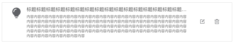
常见媒体布局3
<div class="recommend-card">
    <div class="recommend-media">
        <div class="media-face">
            <i class="el-icon-s-opportunity" />
        </div>
        <div class="media-body">
            <h3 class="media-title">
                标题标题标题标题标题标题标题标题标题标题标题标题标题标题标题标题标题标题标题标题标题标题标题标题标题标题标题标题
            </h3>
            <div class="media-content">
                内容内容内容内容内容内容内容内容内容内容内容内容内容内容内容内容内容内容内容内容内容内容内容内容内容内容内容内容内容内容内容内容内容内容内容内容内容内容内容内容内容内容内容内容内容内容内容内容内容内容内容内容内容内容内容内容内容内容内容内容内容内容内容内容内容内容内容内容内容内容内容内容内容内容内容内容内容内容内容内容内容内容内容内容内容内容内容内容内容内容内容内容内容内容内容内容
            </div>
        </div>
    </div>
    <div class="recommend-tools">
        <span class="recommend-tool"><i class="el-icon-edit-outline"/></span>
        <span class="recommend-tool"><i class="el-icon-delete"/></span>
    </div>
</div>
<style lang="scss" scoped>
.recommend-card {
    display: flex;
    flex-flow: row nowrap;
    justify-content: space-between;
    padding: 10px 25px;
    border: 1px solid #ddd;

    .recommend-media {
        display: flex;
        flex: 1;
        overflow: hidden;

        .media-face {
            display: flex;
            align-items: center;
            justify-content: center;
            width: 48px;
            height: 48px;
            margin-right: 8px;

            & > i {
                font-size: 40px;
            }
        }
        .media-body {
            flex: 1;
            position: relative;
            overflow: hidden;

            .media-title {
                overflow: hidden;
                text-overflow: ellipsis;
                white-space: nowrap;
                font-size: 16px;
                line-height: 24px;
                color: #333;
                font-weight: normal;
            }
            .media-content {
                margin-top: 5px;
                color: #666;
                font-size: 12px;
                line-height: 16px;
            }
        }
    }

    .recommend-tools {
        display: flex;
        align-items: center;
        justify-content: center;
        margin-left: 25px;

        .recommend-tool {
            padding: 15px;
            & > i {
                font-size: 18px;
            }
        }
    }
}
</style>
设置flex-direction: column;后,子孙元素设百分比无效的解决方法
百分比用不了就用 height: 100vh
<!DOCTYPE html>
<html lang="en">

<head>
    <meta charset="UTF-8">
    <meta name="viewport" content="width=device-width, initial-scale=1.0">
    <meta http-equiv="X-UA-Compatible" content="ie=edge">
    <title>Document</title>
    <style>
        html,
        body {
            height: 100%;
            margin: 0;
        }

        .app {
            height: 100%;
        }

        .main {
            display: flex;
            -webkit-box-flex: 1;
            -webkit-box-orient: vertical;
            -webkit-box-direction: normal;
            flex-direction: column;
            flex: auto;
            min-height: 0;
            height: auto;
            background: red;
            overflow-x: hidden;
            box-sizing: border-box;
        }

        .layout {
            display: flex;
            -webkit-box-flex: 1;
            -webkit-box-orient: vertical;
            -webkit-box-direction: normal;
            flex-direction: column;
            flex: auto;
            min-height: 0;
            height: auto;
            background: red;
            overflow-x: hidden;
            box-sizing: border-box;
            min-height: 100vh;
        }

        .layout-content {
            -webkit-box-flex: 1;
            flex: auto;
            min-height: 0;
            background: green;
            height: 100%;
        }

        .content {
            position: relative;
            height: 100%;
            height: 100vh;
            background: cyan;
        }
    </style>
</head>

<body>
    <div class="app">
        <div class="main">
            <div class="layout">
                <div class="layout-content">
                    <div class="content">
                    </div>
                </div>
            </div>
        </div>
    </div>
</body>

</html>


 扫一扫
扫一扫


 3932
3932


 到【灌水乐园】发言


