


BFC全称是Block Formatting Context,意思就是块级格式化上下文。你可以把BFC看做一个容器,容器里边的元素不会影响到容器外部的元素。
BFC有什么特性?
-
BFC是一个块级元素,块级元素在垂直方向上依次排列。
-
BFC是一个独立的容器,内部元素不会影响容器外部的元素。
-
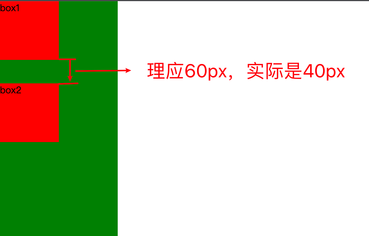
属于同一个BFC的两个盒子,外边距margin会发生重叠,并且取最大外边距。
-
代码:
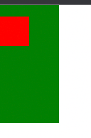
<!DOCTYPE html> <html lang="en"> <head> <meta charset="UTF-8"> <meta http-equiv="X-UA-Compatible" content="IE=edge"> <meta name="viewport" content="width=device-width, initial-scale=1.0"> <title>Document</title> <style> body { margin: 0; padding: 0; } .continer{ width: 200px; height: 400px; background-color: green; overflow: hidden; } .continer .box1 { width: 100px; height: 100px; margin-bottom: 20px; background-color: red; } .continer .box2 { width: 100px; height: 100px; margin-top: 40px; background-color: red; } </style> </head> <body> <div class="continer"> <div class="box1">box1</div> <div class="box2">box2</div> </div> </body> </html> -
视图:
-
-
计算BFC高度时,浮动元素也要参与计算。
如何创建BFC?
给父级元素添加以下任意样式
- overflow: hidden;
- display: flex;
- display: inline-flex;
- display: inline-block;
- position: absolute;
- position: fixed;
Tip:记住这几个常用的就可以了。
BFC有什么作用?
-
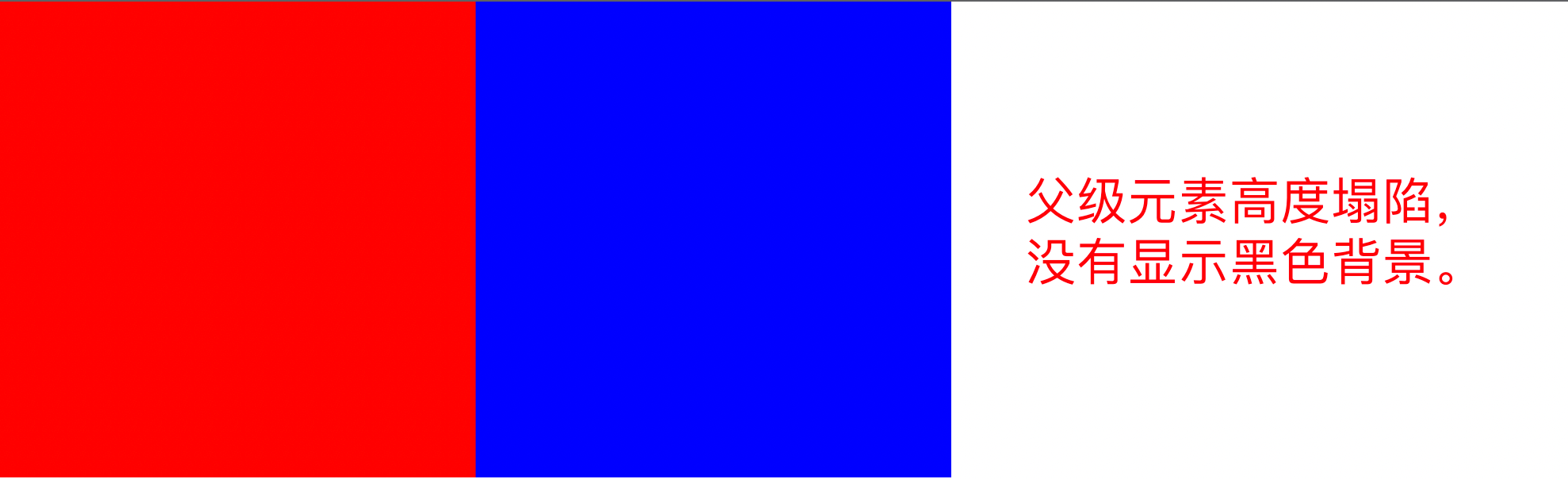
解决当父级元素没有高度时,子级元素浮动会使父级元素高度塌陷的问题
-
解决前代码:
<!DOCTYPE html> <html lang="en"> <head> <meta charset="UTF-8"> <meta http-equiv="X-UA-Compatible" content="IE=edge"> <meta name="viewport" content="width=device-width, initial-scale=1.0"> <title>Document</title> <style> body { margin: 0; padding: 0; } .continer{ width: 900px; background: black; }.box1{ height: 300px; width: 300px; background: red; float: left; } .box2{ height: 300px; width: 300px; background: blue; float: left; } </style>
-
</head>
<body>
<div class=“continer”>
<div class=“box1”></div>
<div class=“box2”></div>
</div>
</body>
</html>
-
解决前视图:
-
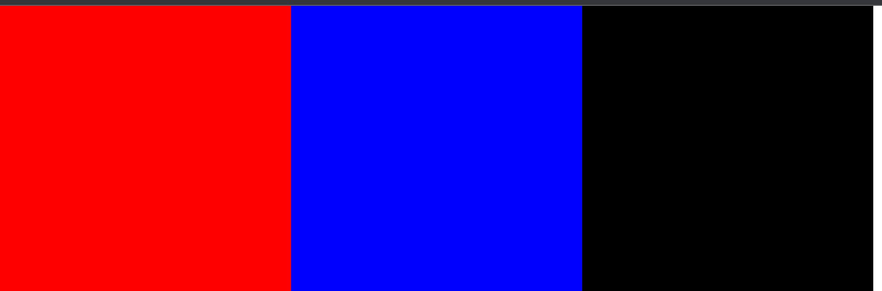
解决后代码:
<!DOCTYPE html>

<html lang=“en”>

<head>

<meta charset=“UTF-8”>

<meta http-equiv=“X-UA-Compatible” content=“IE=edge”>

<meta name=“viewport” content=“width=device-width, initial-scale=1.0”>

<title>Document</title>

<style>

body {

margin: 0;

padding: 0;

}

.continer{

width: 900px;

background: black;

overflow: hidden;

} -
    .box1{
        height: 300px;
        width: 300px;
        background: red;
        float: left;
    }

    .box2{
        height: 300px;
        width: 300px;
        background: blue;
        float: left;
    }
</style>
</head>
<body>
<div class=“continer”>
<div class=“box1”></div>
<div class=“box2”></div>
</div>
</body>
</html>
-
解决后视图:
-
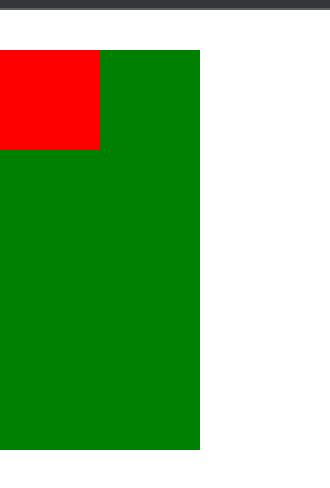
解决子级元素外边距会使父级元素塌陷的问题
-
-
解决前源码:
<!DOCTYPE html> <html lang="en"> <head> <meta charset="UTF-8"> <meta http-equiv="X-UA-Compatible" content="IE=edge"> <meta name="viewport" content="width=device-width, initial-scale=1.0"> <title>Document</title> <style> body { margin: 0; padding: 0; } .continer{ width: 100px; height: 200px; background: green; }.box{ margin-top: 20px; height: 50px; width: 50px; background: red; } </style>
</head>
<body>
<div class=“continer”>
<div class=“box”></div>
</div>
</body>
</html>
-
-
解决前视图:
-
解决后源码:
<!DOCTYPE html>

<html lang=“en”>

<head>

<meta charset=“UTF-8”>

<meta http-equiv=“X-UA-Compatible” content=“IE=edge”>

<meta name=“viewport” content=“width=device-width, initial-scale=1.0”>

<title>Document</title>

<style>

body {

margin: 0;

padding: 0;

}

.continer{

width: 100px;

height: 200px;

background: green;

overflow: hidden;

} -
    .box{
        margin-top: 20px;
        height: 50px;
        width: 50px;
        background: red;
    }
</style>
</head>
<body>
<div class=“continer”>
<div class=“box”></div>
</div>
</body>
</html>
-
解决后视图
Tip:当然这个问题也可以通过将子级元素的margin-top改为父级元素的padding-top来解决。


 扫一扫
扫一扫


 3122
3122

 被折叠的 条评论
为什么被折叠?
被折叠的 条评论
为什么被折叠?
 到【灌水乐园】发言


