


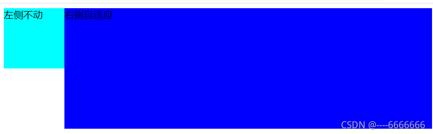
一:运用BFC的overflow:hidden
    <style>
        .left {
            width: 100px;
            height: 100px;
            background-color: aqua;
            float: left;
        }

        .main {
            background-color: blue;
            height: 200px;
            overflow: hidden;
            /* 要加 否则自适应元素包括浮动元素 */
        }
    </style>
<body>
    <div class="left">左侧不动</div>
    <div class="main">右侧自适应</div>
</body>
二:给右侧自适应盒子加margin-left:不动盒子的宽度
    <style>
        .left {
            width: 100px;
            height: 100px;
            background-color: aqua;
            float: left;
        }

        .main {
            margin-left: 100px;
            background-color: blue;
            height: 200px;
        }
    </style>
<body>
    <div class="left">左侧不动</div>
    <div class="main">右侧自适应</div>
</body>
三:有一个共同的父元素,给他设置高度500px,设置相对定位;padding-left:不动元素的宽度,, 左侧元素设置宽高并相对定位 top:0;left:0; 右侧元素只设置高度
    <style>
        .father {
            height: 500px;
            position: relative;
            padding-left: 100px;
            background-color: pink;
        }
        .left {
            width: 100px;
            height: 100px;
            background-color: aqua;
            position: absolute;
            top: 0;
            left: 0;
        }
        .main {
            background-color: blue;
            height: 200px;

        }
    </style>
    <div class="father">
        <div class="left">左侧不动</div>
        <div class="main">右侧自适应</div>
    </div>
四:利用display:flex给父元素设置为弹性盒子,左侧宽度写死,右侧占所有剩余空间
容器的高度是根据最大的那个来确定的
    <style>
        .father {
            height: 500px;
            background-color: pink;
            display: flex;
        }

        .left {
            width: 100px;
            height: 100px;
            background-color: aqua;
        }

        .main {
            background-color: blue;
            height: 200px;
            flex: 1;
        }
    </style>
    <div class="father">
        <div class="left">左侧不动</div>
        <div class="main">右侧自适应</div>
    </div>
五:父元素display: table; 子元素 display: table-cell;
    <style>
        .father {
            display: table;
        }
        .left {
            display: table-cell;
            background-color: aqua;
        }
        .main {
            width: 100%;
            display: table-cell;
            background-color: blue;
        }
    </style>
    <div class="father">
        <div class="left">左侧不动</div>
        <div class="main">右侧自适应</div>
    </div>


 扫一扫
扫一扫


 1476
1476

 被折叠的 条评论
为什么被折叠?
被折叠的 条评论
为什么被折叠?
 到【灌水乐园】发言


