<!DOCTYPE html>
<html>
	<head>
		<meta charset="utf-8">
		<title>扇形导航</title>
		<style type="text/css">
			*{
				margin: 0;
				padding: 0;
			}
			html,body{
				height: 100%;
				overflow: hidden;
			}
			#wrap{
				height: 50px;
				width: 50px;
				/* background-color: pink; */
				position: fixed;
				right: 15px;
				bottom: 15px;
				/* overflow: hidden; */
			}
			#wrap>.home{
				height: 49px;
				width: 49px;
				/* margin: auto; */
				background: url(img/home.png) ;
				background-position: center;
				border-radius: 50%;
				transition: 1s;
				position: absolute;
				z-index: 1;
			}
			#wrap>.nav{
			height: 100%;
			position: relative;
			}
			#wrap>.nav>img{
				position: absolute ;
				right: 0px;
				bottom: 0px;
				margin: 4px;
				border-radius: 50% ;
			}
			.home:hover{
				transform: rotate(360);
			}
		</style>
	</head>
	<body>
		<div id="wrap">
			<div class="home"></div>
			<div class="nav">
				<img src="img/clos.png" >
				<img src="img/full.png" >
				<img src="img/open.png" >
				<img src="img/prev.png" >
				<img src="img/refresh.png" >
			</div>
		</div>
	</body>
	<script type="text/javascript">
		window.onload =function(){
			var homeEle = document.querySelector("#wrap>.home");
			var flag= true;
			var imgs =document.querySelectorAll("#wrap>.nav>img");


			function fn(){
				this.style.transition=0.3+"s";
				this.style.transform ="rotate(-360deg) scale(1)";
				this.style.opacity =1;
				this.removeEventListener("transitionend",fn);
			}

			for (var i=0;i<imgs.length;i++) {
				imgs[i].onclick =function(){
					this.style.transform ="rotate(-360deg) scale(2)";
					this.style.transition ="0.3s";
					this.style.opacity =0.1;

					this.addEventListener("transitionend",fn);
				}
			}

			homeEle.onclick =function(){
				console.log(imgs.length);
				if(flag){
					this.style.transform="rotate(-720deg) ";
					imgs.forEach((index,No)=>{
						imgs[No].style.right = getLocation(140,No*22.5/180*Math.PI).left+"px";
						imgs[No].style.bottom = getLocation(140,No*22.5/180*Math.PI).top+"px";
						imgs[No].style.transform ="rotate(-360deg) scale(1)";
						imgs[No].style.transition ="1s "+No*0.1+"s";
					});
				}else{
					this.style.transform="rotate(0)";
					imgs.forEach((index,No)=>{
						imgs[No].style.right = 0+"px";
						imgs[No].style.bottom = 0+"px";
						imgs[No].style.transform ="rotate(0deg) scale(1)";
						imgs[No].style.transition="1s "+(0.4-No*0.1)+"s";
					});
				}
				flag =!flag;
			}

			var getLocation =function(r,deg){
				var x =Math.round(r*Math.sin(deg));
				var y =Math.round(r*Math.cos(deg));
				return{left:x,top:y};
			}

		}

	</script>
</html>
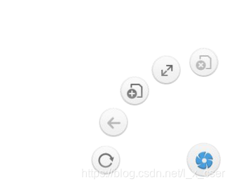


 本文详细介绍了如何结合CSS和JavaScript技术,实现一个创新的扇形导航菜单,包括菜单项的旋转动画和交互效果,为网页增添独特视觉体验。


 扫一扫
扫一扫


 510
510

 被折叠的 条评论
为什么被折叠?
被折叠的 条评论
为什么被折叠?
 到【灌水乐园】发言


