


 博客主要讲述了在前端开发中,当父元素设置display:flex后,子元素超出父元素宽度会被压缩的问题及解决办法,即给子元素设置使其按实际宽度展示,不采用弹性布局。
    .line {
      width: 200px;
      background: #1677ee;
      position: relative;
      margin-bottom: 34px;
      transform-origin: top left;
      height: 4px;
      border-radius: 2px;
      flex-shrink: 0;

    }

    .endStaion {
      width: 200px;
      background: #1677ee;
      transform-origin: top left;
      height: 4px;
      border-radius: 2px;
      flex-shrink: 0;
      transform: rotate(-30deg);
      position: relative;
      top: -16px;
      left: -3px
    }
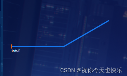
父元素设置了display:flex之后子元素超出父元素宽度被压缩现象解决
只需要给子元素设置
flex-shrink: 0;
意思就是不要弹性 按照实际的宽度进行展示


 扫一扫
扫一扫


 1693
1693

 被折叠的 条评论
为什么被折叠?
被折叠的 条评论
为什么被折叠?
 到【灌水乐园】发言


