


一、开篇:当一个组件想“搞特殊”时…
朋友们,想象这个画面:你吭哧吭哧写了个<Button>组件,结果产品经理拍桌要求——这个按钮既要能放图标又要能显示加载动画!你内心OS:“难道要写<ButtonWithIcon>、<ButtonWithLoading>二十个组件吗?!”
停!是时候请出插槽(Slots)这个救场王了!
它就像给组件开了个“任意门”,门外的人可以往里塞任何内容——文本、图片、甚至另一个组件!举个栗子🌰:
<!-- 万能按钮组件 -->
<template>
  <button class="my-btn">
    <!-- 这里是插槽入口,等着被投喂内容 -->
    <slot></slot>
  </button>
</template>
<!-- 使用时的魔法时刻 -->
<MyButton>
  <img src="icon.png"> 点击抽奖! <!-- 随便塞内容! -->
</MyButton>
是不是瞬间想起小时候玩的乐高?插槽就是让组件从“预制水泥块”升级成“万能积木”的神器!
二、插槽三大门派:从青铜到王者的进阶之路
1. 默认插槽:组件里的“占位符”
最适合插槽萌新的基础款,相当于给组件预留了个内容黑洞:
<!-- 组件:MessageBox.vue -->
<template>
<div class="message-box">
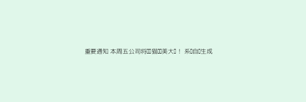
<h3>重要通知</h3>
<div class="content">
<slot></slot> <!-- 内容将出现在这里 -->
</div>
<footer>系统自动生成</footer>
</div>
</template>
<!-- 使用示例 -->
<MessageBox>
<!-- 下面这堆内容会精准注入插槽 -->
<p>本周五公司将举办<span class="fun">猫咪选美大赛</span>!</p>
<ul>
<li>参赛选手:全体办公室猫猫</li>
<li>奖品:全年免费猫罐头</li>
</ul>
</MessageBox>
效果预览:
💡 避坑指南:如果组件调用时没传内容,<slot>标签内的默认内容就会显示:
<slot>这里是默认提示文本,像备胎一样随时待命</slot>
2. 具名插槽:组件中的“分房间术”
当你的组件需要多个内容插入点时,就该具名插槽登场了!比如这个<BlogPost>组件:
<!-- 组件:BlogPost.vue -->
<template>
  <article class="blog-post">
    <header>
      <slot name="header"></slot>
    </header>

    <main>
      <slot></slot> <!-- 默认插槽 -->
    </main>

    <footer>
      <slot name="footer"></slot>
    </footer>
  </article>
</template>
使用时需要带着身份证(v-slot)对号入座:
<BlogPost>
  <template v-slot:header>
    <h1>程序员生存指南</h1>
    <p>作者:代码界的段子手</p>
  </template>
  <!-- 默认插槽内容,不用套template -->
  <p>当你发现bug时的心理活动:这不可能→有点意思→我裂开了</p>
  <template v-slot:footer>
    <div class="post-stats">
      <span>点赞 1.3万</span>
      <span>收藏 8千</span>
    </div>
  </template>
</BlogPost>
语法糖警报:v-slot:header 可以简写成 #header,键盘寿命直接+1秒!
3. 作用域插槽:最烧脑也最强大的“跨界快递”
这是插槽界的碟中谍——允许子组件向父组件传递数据!想象一下:子组件对父组件说:“内容你定,但数据我提供!”
经典场景:一个负责遍历数据,但渲染方式交给使用者的组件:
<!-- 组件:DataList.vue -->
<template>
  <ul>
    <li v-for="item in items" :key="item.id">
      <!-- 把item数据打包发给使用方 -->
      <slot :item="item" :index="index"></slot>
    </li>
  </ul>
</template>
<script setup>
defineProps(['items'])
</script>
使用时父组件就能接收数据并自由定制显示:
<DataList :items="userList">
  <template v-slot="slotProps">
    <!-- 现在可以随意使用item数据啦 -->
    <div class="user-card">
      <Avatar :src="slotProps.item.avatar" />
      <span>{{ slotProps.item.name }} - 年龄{{ slotProps.item.age }}</span>
    </div>
  </template>
</DataList>
🎯 进阶技巧:解构赋值让代码更清爽:
<template #default="{ item, index }">
  <div>第{{ index + 1 }}名:{{ item.name }}</div>
三、组合API + 插槽 = 如虎添翼
在Vue 3的<script setup>里,插槽用起来更加丝滑:
<!-- 组件:Tabs.vue -->
<script setup>
import { ref } from 'vue'

const tabs = ref(['首页', '热榜', '话题'])
const activeTab = ref(0)

// 暴露状态给插槽使用
defineExpose({ activeTab })
</script>
<template>
  <div class="tabs">
    <nav>
      <button
        v-for="(tab, index) in tabs"
        :key="index"
        @click="activeTab = index"
      >
        {{ tab }}
      </button>
    </nav>
    <div class="tab-content">
      <slot :activeTab="activeTab"></slot>
    </div>
  </div>
</template>
使用时轻松获取内部状态:
<Tabs v-slot="{ activeTab }">
  <div v-if="activeTab === 0">推荐内容...</div>
  <div v-if="activeTab === 1">热门榜单...</div>
</Tabs>
四、实战演练:两大完整示例
示例1:可变服装模特组件(具名插槽经典案例)
<!-- OutfitModel.vue -->
<template>
  <div class="model">
    <div class="head">
      <slot name="head"></slot>
    </div>
    <div class="body">
      <slot name="body"></slot>
    </div>
    <div class="accessories">
      <slot name="accessories"></slot>
    </div>
  </div>
</template>
<!-- 使用 -->
<OutfitModel>
  <template #head>
    <img src="cowboy-hat.png" alt="牛仔帽">
  </template>

  <template #body>
    <img src="punk-jacket.png" alt="皮夹克">
  </template>

  <template #accessories>
    <img src="guitar.png" alt="吉他">
    <img src="dog.png" alt="宠物狗">
  </template>
</OutfitModel>
示例2:智能待办清单(作用域插槽实战)
<!-- TodoList.vue -->
<script setup>
import { ref } from 'vue'

const todos = ref([
  { id: 1, text: '学习Vue插槽', done: true },
  { id: 2, text: '写段子让代码有趣', done: false },
  { id: 3, text: '教会家里的猫用插槽', done: false }
])

const toggleTodo = (id) => {
  const todo = todos.value.find(t => t.id === id)
  if (todo) todo.done = !todo.done
}
</script>
<template>
  <div class="todo-list">
    <slot :todos="todos" :toggleTodo="toggleTodo"></slot>
  </div>
</template>
使用时完全自定义UI:
<TodoList v-slot="{ todos, toggleTodo }">
  <div class="custom-todos">
    <div
      v-for="todo in todos"
      :key="todo.id"
      @click="toggleTodo(todo.id)"
    >
      <!-- 完全自由的渲染方式 -->
      <span :class="['emoji', todo.done ? '✅' : '📝']"></span>
      <span :style="todo.done ? 'text-decoration: line-through' : ''">
        {{ todo.text }}
      </span>
    </div>

    <p>统计:{{ todos.filter(t => t.done).length }}/{{ todos.length }} 完成</p>
  </div>
</TodoList>
五、结语:插槽,让组件关系更健康
记住这个公式:
插槽 = 组件界的社交牛逼症
它让父子组件从“冷漠的数据传递”变成“默契的内容合作”
下次当你:
- 需要组件容器化 → 默认插槽
- 组件有多个内容区 → 具名插槽
- 子组件数据父组件渲染 → 作用域插槽
现在就去给你的组件加上插槽超能力吧!毕竟,不会用插槽的Vue程序员,就像不会讲段子的脱口秀演员——代码少了一半灵魂🎉
彩蛋:在作用域插槽里使用组合API的computed,体验双倍快乐!
<script setup>
import { computed } from 'vue'

const formattedItems = computed(() =>
  props.items.map(item => ({ ...item, fullName: `${item.firstName} ${item.lastName}` }))
)
</script>


 扫一扫
扫一扫


 被折叠的 条评论
为什么被折叠?
被折叠的 条评论
为什么被折叠?
 到【灌水乐园】发言


