


 近期,Google日历进行了多项视觉及功能上的更新,包括新的颜色方案、事件模糊处理、弹性的界面设计以及改进的日历网格显示效果。这些变化旨在提升用户体验并优化信息展示。
Updates to the look of Google Calendar
As most of you have seen by now, Google Calendar (along with other Google products ) has been getting somewhat of a facelift in recent weeks. We wanted to outline some of the changes that we've made:
New colors
Google Calendar now has an updated color palette:
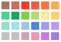
The color of each of your calendars has been updated to use the closest possible color from the new palette. The new colors will only be available in the web interface (for example, you won't see these colors if you're accessing Calendar via your mobile phone).
Event dimming
Dimmed events help you focus on what's important. Learn more about this new feature here .
Elastic interface
We heard feedback that you'd like your calendar to display more information, so we made this possible using an "elastic" interface. The elastic interface aims to optimize the amount of information viewable given your screen resolution. See the elasticity in action by resizing your browser.
New look for events in the calendar grid
To make it easier to differentiate among various events, we've implemented a new look for events in the calendar grid:
- Overlapping events now feature a white border to add contrast and make viewing them easier.
- Events which you cannot edit will feature striping to make them easy to distinguish from events you are able to edit:

- Events responded 'No' are now somewhat transparent:

- Event icons are now available on-hover:
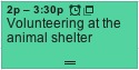
- It's easier to distinguish events which you've responded 'Maybe' to from those which you've not yet responded to.
- Events responded 'Maybe' to display a question mark:

- Events not yet responded to display a back arrow:

- Events responded 'Maybe' to display a question mark:


 5万+
5万+

 被折叠的 条评论
为什么被折叠?
被折叠的 条评论
为什么被折叠?
 到【灌水乐园】发言


